December 15, 2015
Serif TV Walks Fine Line Between Innovation and Nostalgia
Samsung’s new Serif TV walks a fine line between innovation and nostalgia.

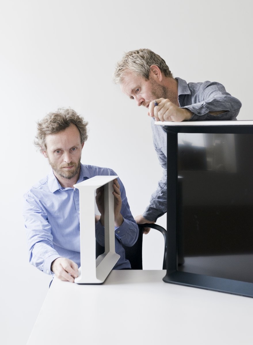
The Bouroullec brothers, Erwan (left) and Ronan (right), inspect a mock-up of Serif, which was unveiled at this year’s London Design Festival.
All photography courtesy Studio Bouroullec
It will not have escaped even the most casual observer that televisions have been following a doggedly single-minded trajectory for more than a decade. Each year they get thinner and thinner, and bigger and bigger. Samsung’s 9000 series of flat-screens comes in a 75-inch version— the equivalent of a shortish basketball player stretched diagonally across your wall— that is only 0.31 inches thick. Once the proud hearth of the home, the gogglebox has been trying to replace the wallpaper.
The television’s aspiration toward pure surface has felt consistent with the dematerialization of objects in our lives more generally: the disappearance of diaries, cameras, calculators, and what have you behind the black glass of the mobile phone. At some point, buying a TV became not that different from buying advertising in Times Square—your expenditure was determined by surface area and the means of distributing light across it. Those means included neon gas (used in plasma screens), liquid crystal (LCDs), light-emitting diodes (LEDs), and organic LEDs (OLED), with a choice of resolutions including HD, UHD, and now SUHD (the “S” being unspecified but presumably meaning super-ultrahigh definition). With the object flattened to a screen, the only thing left to fetishize was the resolution.
One can see how this happened. In the early 2000s the television manufacturing industry started investing billions in flat-screen technology, building larger and larger factories to bring down costs, then investing more billions to get the screens ever thinner and bigger until at some point the tanker became too big to turn around. And Samsung controls by far the largest share of the flat-screen market, at nearly 30 percent. But rather than rest on its laurels, it has just thrown a wild card on the table.
In September, Samsung launched the Serif TV at the London Design Festival. Designed by Ronan and Erwan Bouroullec, it caught the media’s attention for two reasons: partly because the Paris-based brothers had never designed electronic devices, but mostly because it marks a shift away from flat-screen TVs back toward the object we knew in the 20th century. Is this nostalgia, or is it just that if you ask furniture designers to design a TV you get a piece of furniture?
Erwan confesses that he knew almost nothing about TVs when Samsung approached them and gave them carte blanche to design one. “They wanted us not to know anything,” he says over the phone, “so we would have a different vision.” The brothers started by trying to redesign the TV from the inside out, rethinking the software so that it could retrieve your emails, alert you to meetings, and generally live up to its potential as the ultimate “smart” interface. But they quickly realized that this would be difficult without being inside the company, and that took the pressure off. “It’s important to be relaxed about the electronics—you start off thinking you’re going to change the world,” says Erwan. “It doesn’t promise a new future, it’s just what it is. We made a frame for pictures, a story older than television.”
In some ways, flat-screens elide the inherent problem of the TV as an object. TVs were always bulky and clunky, so that no matter how much money you spent, there was really no way to introduce one into a refined or even remotely stylish interior without somehow lowering the tone. In that sense, the problem that the Bouroullecs set out to solve is as old as television itself. The artist Donald Judd wrote of trying to buy a TV in the 1970s: “All were made of plastic imitating wood, some like your Anglo grandmother’s sideboard, some like your Italian grandmother’s credenza, some like your Latino grandmother’s aparador.” The idea that the machine had to disguise itself as a family heirloom was, said Judd, a product of “the myth of the old home.” The Bouroullecs have a healthy respect for that myth. While their office furniture was quick to capture the flexible working patterns of the 21st century, their armchairs and home furnishings have an intuitive, almost bucolic understanding of comfort. In 2001 they designed a vase for Galerie kreo in the shape of a TV, suggesting that this venerable domestic object might be refined into something more contemplative, an objet d’art. Their approach to Serif was similar: to treat it as a frame, something to be looked at, on or off. “We wanted it to have a better conversation with the surrounding environment,” says Erwan.
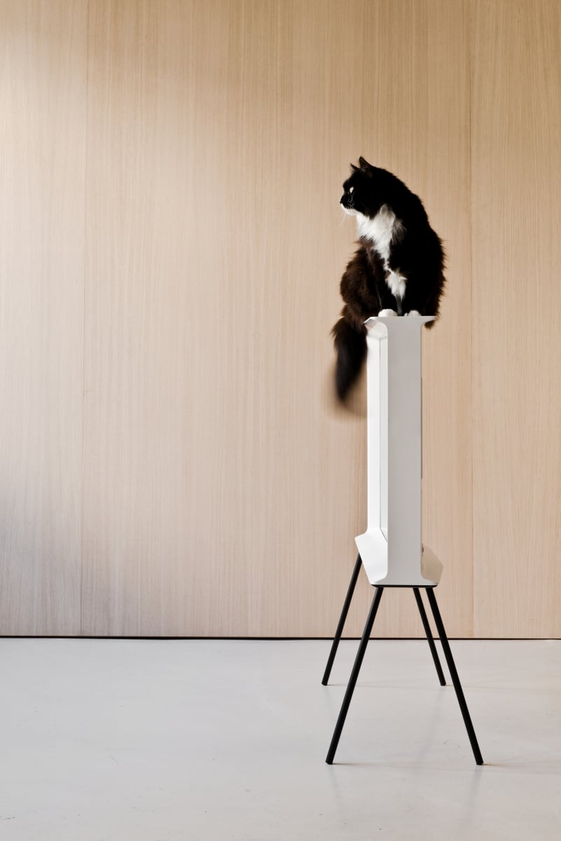
As they would with any product, the brothers began by modeling prototypes out of wood and clay. The form resolved itself quite quickly, in a few months, followed by two years of development. It has been widely reported that Serif was inspired by typography—in profile the frame resembles a capital I in a serif font—but this is no more true than that Mies’ love of I-beams was inspired by the letter “I.” It was simply a satisfying form and suggested a good name. In fact those serifs are functional, giving the TV its base so that it can be set on a table or shelf, and a mantel so that objects can be set on top of it. That ability to coexist with other objects, on them or under them, is what makes it such a hospitable design.
Alternatively, Serif can be raised up on a pair of legs, and here we really are back in the 1950s—with one difference: Serif is one of the few TVs ever made that look good in the round. The messy cable ports that dog the back end of TVs are concealed behind a fabric swatch attached with magnets. And that fabric motif is continued in the interface, which the brothers also designed. One of Serif’s most endearing features is a “curtain mode,” which, not unlike a screensaver, draws a translucent veil over anything you don’t particularly want to watch, like the ads. The designers tested it on America’s Got Talent and other shows with what Erwan describes as “extremely emotive images,” so that you can still sense the rhythm but no image. “That’s the difference with mobile technology. It’s easy to go in and out of media with a mobile; you just put it in your pocket,” he says. “While with a TV it’s not so easy.”
Serif is also a response to the fact that we now consume media on all sorts of devices, from giant UHD flat-screens to laptops, tablets, and phones. As media gravitates to whatever is closest to hand in an on-the-move, instant-gratification culture, Serif is an attempt to return the television to a hearthlike condition. The Bouroullecs have picked up on the fact that, despite the Space Race for perfect screen resolution, we don’t upgrade our TVs the way we do our phones, and realized that it is worth designing something timeless.
Historically, TV design has been anonymous. There were exceptions— Marco Zanuso and Richard Sapper’s Brionvega, Philippe Starck’s woodchip-clad Thomson—but they were the exceptions that prove the rule that iconic design does not always conquer the market. Serif may be a masterstroke that pivots the TV market away from screens and back to well-rounded objects. Or Samsung may just be taking a long shot on a nostalgic flight of fancy. Either way, I do not own a TV, but Serif is the first I’ve seen in years that might make me reconsider.
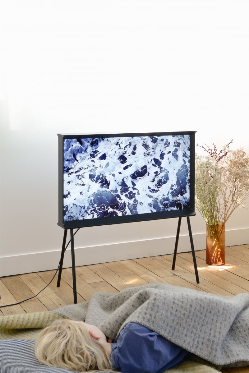
The Serif TV can be fitted with legs to create an “in the round” viewing experience.
