May 3, 2016
Q&A: Legendary Graphic Designer Lance Wyman
Lance Wyman explains how riding in cop cars and constantly getting lost have helped him produce some of his best work.
Image courtesy Malcolm Kirk
If you’re a graphic design aficionado, Lance Wyman is a legend—he was a prominent designer at a time when most institutions didn’t even offer graphic design studies yet. If you don’t know Wyman, you’ve likely come into contact with his work without realizing it. Wyman most famously developed the graphic identity for the 1968 Mexico City Olympics, one of the most celebrated visual branding efforts in the history of the games. And if you live in Washington, DC, Detroit, San Antonio, Hoboken, Albuquerque, or Mexico City, Wyman’s wayfinding and transit identity work guides you on a daily basis.
I recently connected with Wyman to learn more about the relationship between urban identity and graphic design—and how riding around in cop cars has inspired some of his greatest ideas.
Rebecca Greenwald: What is your process like getting to know the cities you’re designing for?
Lance Wyman: I never start from the top down. Sometimes you start like that because you’re fortunate enough to be hired by the Mayor’s office or something. But what I like to do is get in a cop car with a couple of cops and drive around. The hardest thing is to convince them that you’re not doing a report on them or something. But once you get past that, you get the best information in the world from the cops. I mean, they know everything and they know all the logistics of what works, what doesn’t works, what people like, what’s not liked, and so forth.
I’ve learned that actually working in institutions like museums. The security people, they deal with the public, they know; if you go to the volunteers, they’re there, they’ve devoted themselves to dealing with the public. They know what the design office or the president’s office doesn’t know. All the outreach people in public relations and everything—there’s a lot of things that go down that they don’t know about. So I get what they know, but I also get what’s actually happening. So it really makes a big difference.
RG: What do you think are some of the best branded cities in the world?
LW: The first thing that comes to my mind is the Eiffel Tower representing Paris, and actually it’s those types of landmarks and street furniture—like if you think of the British telephone booth, that kind of represents London. The entrance for the metro in Paris, lovely art nouveau structures. They only represent a small percentage of the actual street furniture in Paris, but they’re iconic. Now why can’t street furniture be designed to represent more? To support a specific city image.
RG: Much of your most iconic work – the 1968 Olympics, the way-finding and signage for Mexico City’s metro system, and the DC Subway map- explores the connection between cities and graphic design. How does the city or environment that you’re creating in inspire or impact your creative process? Do you draw inspiration from those cities?
LW: Oh absolutely, that’s where the inspiration comes from. Cities are like people. They have quite a diverse degree of difference in their personalities; their stories are different.
It’s really interesting to talk about city living, city planning, city image-ing. I love cities. Because we all deal with this stuff, we all know about it. And the more you can chip away at it and get into the fabric—it’s not so much the history only, it’s not so much the people that are trying to make the future of the city, it’s just the everyday life and the everyday reality of a place.
An urban place has so many layers of things that go on. That’s part of what I’m working to capture. It’s an urban image element that’s out in the street furniture. And I think Paris and London have been aware of these elements for a long time. So how do you take something like that and then build it into a system now? We’re trying to do that in Mexico City right now. If we can design street furniture that does have the quality and the memory attachment to the city, why not integrate that as part of the urban image? It’s not just graphics that communicate this kind of urban image.

Image courtesy Lance Wyman
RG: One of your most recognizable works is the transit map for the DC metro. What are some of the things that you think about when designing maps in particular?
LW: I’ve been lucky with designing maps because, as my wife says, I get lost all the time anyway whenever we travel. I figure if I can understand a map that I design, there’s a good chance that everyone else is going to understand it.
With many of the environments you’re designing for, especially with transit and wayfinding projects including your work on Mexico City’s subway system, you don’t even bother to use language, instead opting for symbols.
There’s something very basic about images, about iconic images as far as representing very basic things like identifying something, giving something a sense of movement, giving something a sense of quality or non-quality. Not only that, you can do it in a way that’s not relying on any one particular spoken language.
There are a lot of layers that go into designing, especially an icon. For example, you go to Mexico City from China and may not understand or know how to read either Spanish or the Roman alphabet or the language written in letters. But if you could just realize that you want to meet your friend at Candelaria station, and you could understand that a duck represented that station, you could tell your friend in Chinese ‘I’ll meet you at the station with the duck symbol’ and that would work, and in fact it does work.
RG: Any dream projects that you haven’t worked on that you would love to?
LW: I’ve had things that got started and were never finished, like in Santa Cruz and Toronto. Santa Cruz is a lovely little city, and we had some very nice icons being developed and I had a typography that would’ve worked well for them. And it never happened. I’ve had those type of experiences. We were working in Toronto to do a system for the Toronto subway, and that never happened for one reason or another. So there have been things that never got off the ground that I’m sorry about.
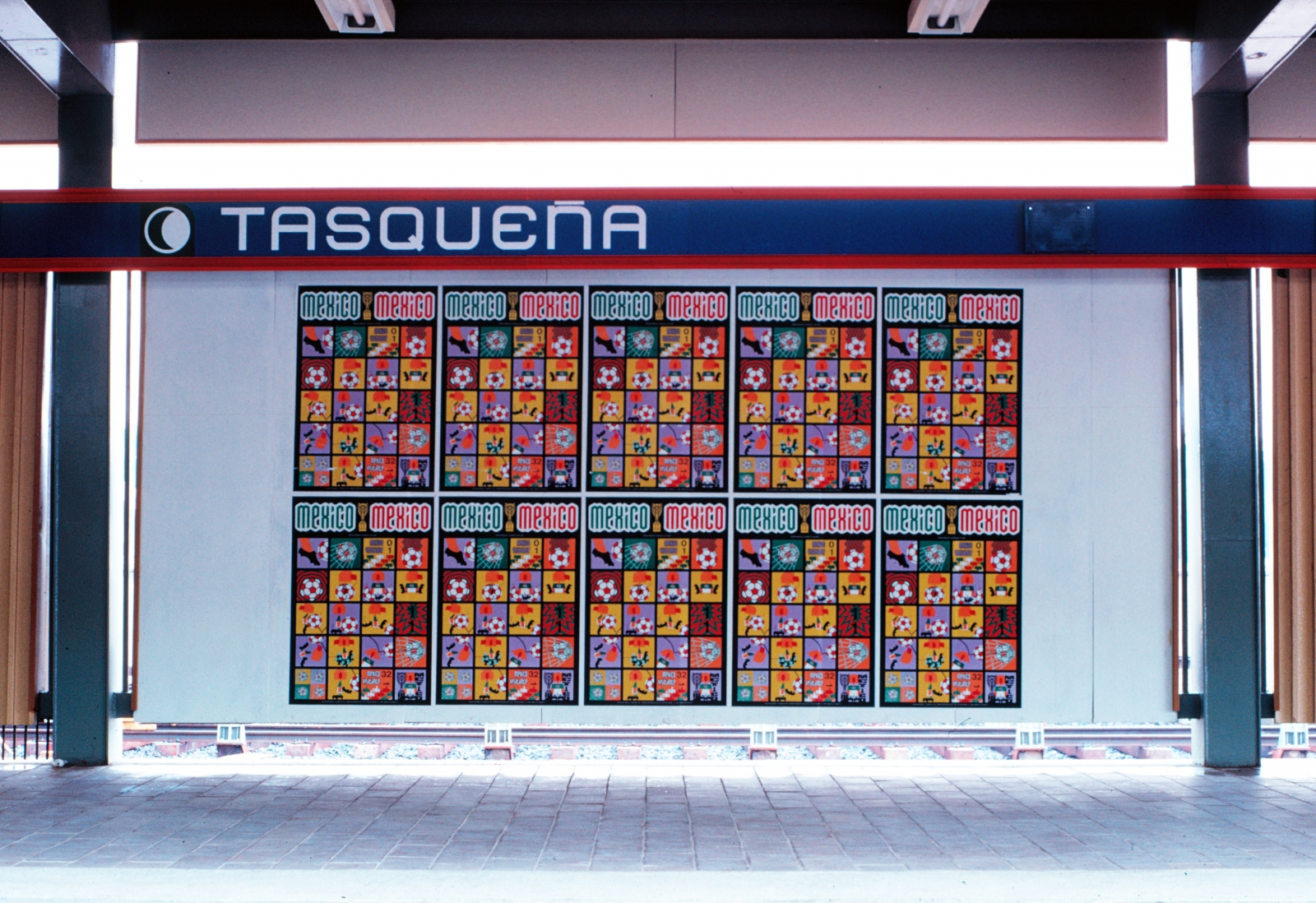
Image courtesy Robin Bath
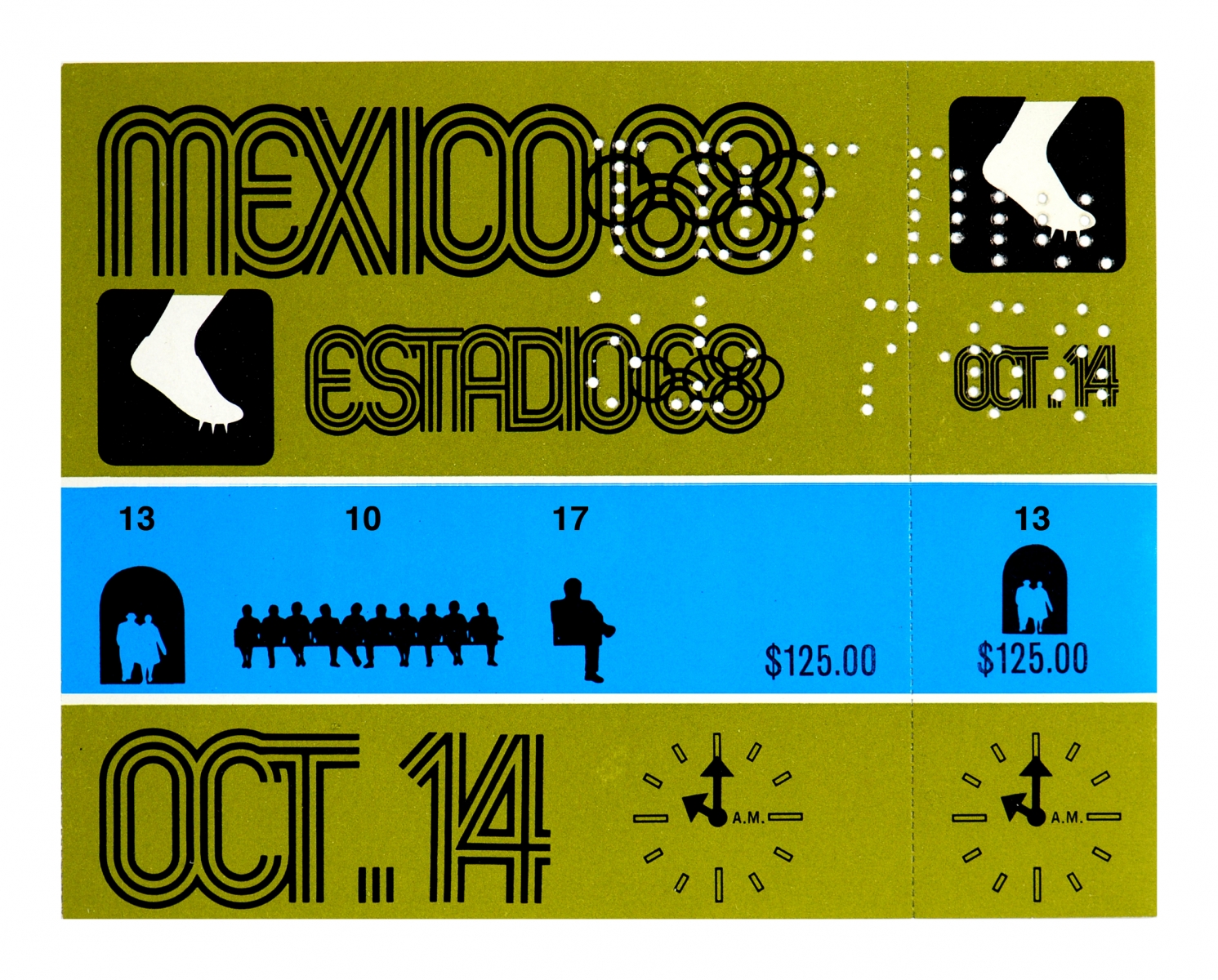
Image courtesy Lance Wyman

Image courtesy Lance Wyman
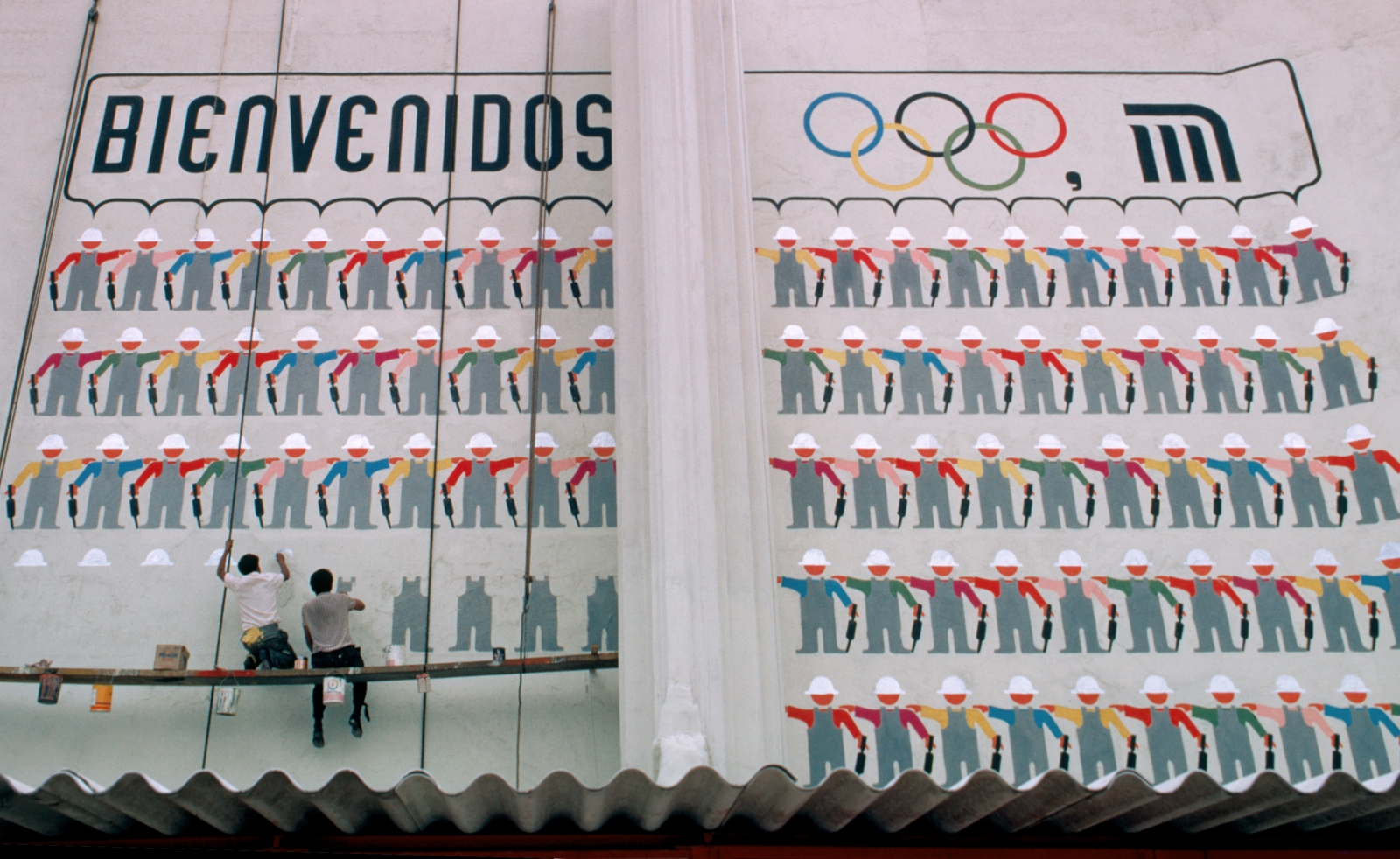
Image courtesy Lance Wyman
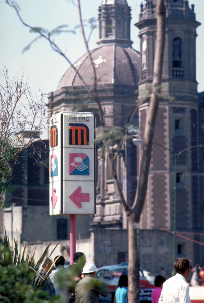
Image courtesy Lance Wyman
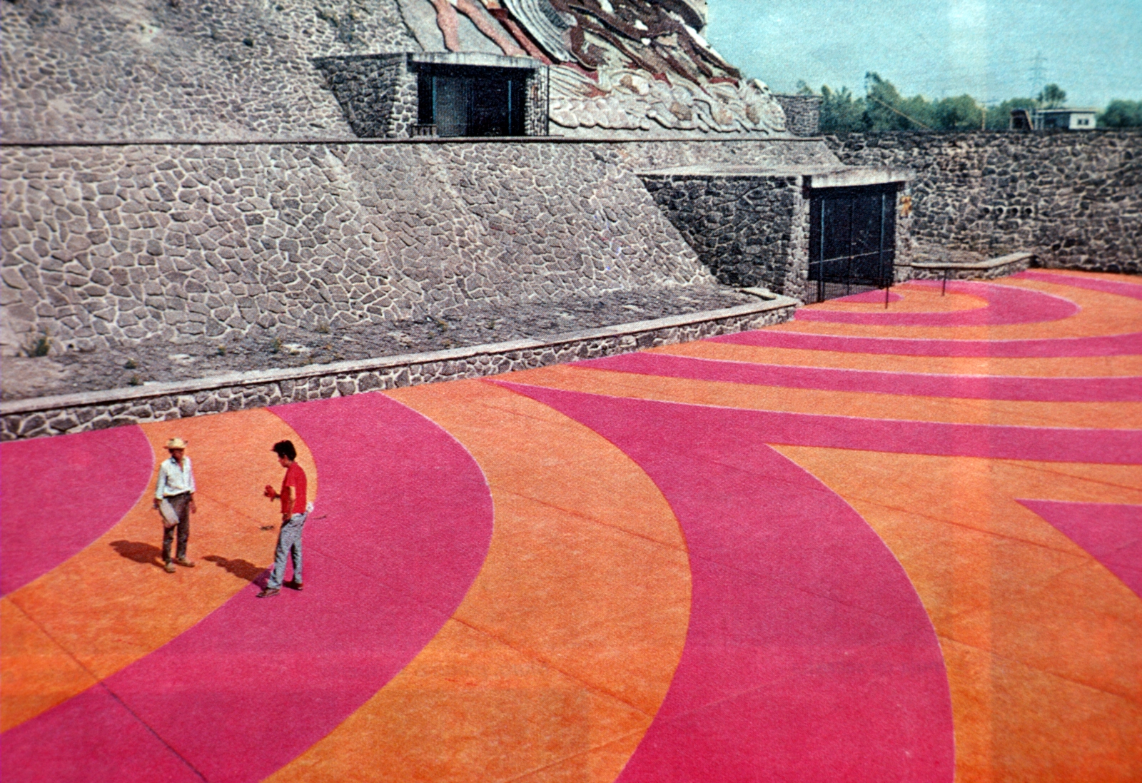
Image courtesy Lance Wyman Archive

Image courtesy Lance Wyman

Image courtesy Lance Wyman Archive
