December 2, 2021
Tim Fendley Explains why Analog Wayfinding Tools Matter in a Digital World

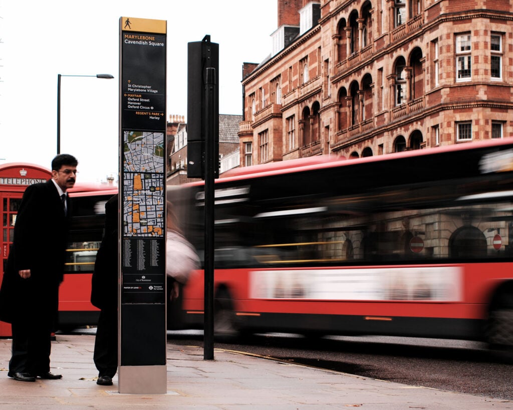
GD: Tell me about the different maps on the Legible London panels? Why did you need two?
TF: There’s an overview map at the top and a more detailed map at the bottom, which is an analog version of a digital zoom actually. What we realized when we did the research was that some people are looking to do a bigger journey, like a 15-minute walk, while others are ‘where the hell am I’ and ‘I know it’s around here somewhere’. And so those different needs, different questions, require two maps. Originally there was a third map on top, which was basically a map of how London is laid out, but not enough people found it useful. The center of London is such a big place that it takes an hour and a half to walk from one side of it to the other. There are very few people who want to do that!
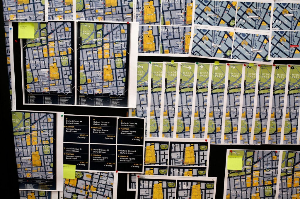
GD: You went through 293 iterations of the Legible London panels before you came up with the final version. Can you summarize some of the main phases?
TF: Our work is very much a confluence of user interface design, product design, architecture, and information design. If you were doing designing an interface for an app or a website, you’d start with the basics of creating a wireframe, what it needs to do, how to structure it and so on, and that’s how we started too. We started with an information architecture and then we began applying graphics to that. We also did a lot of studying of London maps. We rated them all and then took the best out of those and started to design a map for people who don’t normally look at maps. Because people who are used to looking at maps, like for example people in the military, know what little clues are on a map, but we wanted the maps to work for people who aren’t used to those things.
GD: What elements do you take from product design to create wayfinding systems?
TF: The big one is prototyping. The only way to design anything good is to prototype it. Look at software. Look at the iPhone 11. The big advantage people like Google and Facebook have is that they develop a new product and test it on the market and within 20 days they know whether it’s working or not. Then they either cut it or grow it. One of the problems with transit systems, is they haven’t got a culture of prototyping. As soon as you’ve decided on a project, that’s it. You can’t prototype it…all you can do is guess whether people will like it or use it.
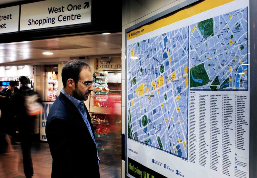
GD: How do you prototype a city wayfinding project?
TF: With Legible London we designed 19 signs and put them up on Bond Street. There was just one borough involved, Westminster City Council. And then we did an exhibition about it and told all the boroughs ‘the system is designed for all of you, but we are trialing it here in Westminster’. We showed them how well it worked, how many people recognized and used it, how much quicker it was to get to places if you used it. And then all the other boroughs went, ‘Oh, well if it looks like it may work, we want it too’. So, what we’re doing in Seattle at the moment is two pilot projects, the phase after the prototyping, and in Madrid we are still prototyping.
GD: There seem to be a lot of information systems out there that just don’t work!
TF: Usability isn’t a balanced curve. It’s a complete and utter cliff! Think about the apps or the websites that you use, the ones that are useful you keep using. But there are others that you’ve tried to use, and you’ll never look at again. And a lot of people who develop these information pieces, which can be digital or physical, only go halfway; they create something that’s almost useful. The structure of Legible London, the core architecture, is really useful.
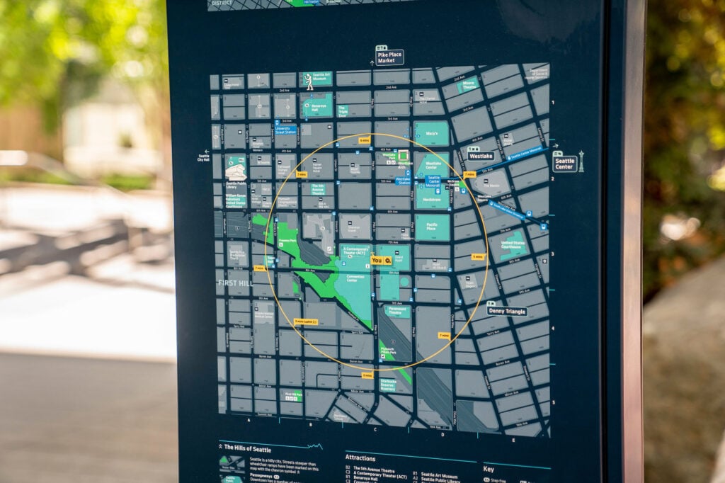
GD: Many people complain that they don’t know how to map read anymore because digital maps have impacted on their ability to navigate. What do you say to that?
TF: The ability to navigate, to create and remember landmarks, to remember directions, is innate because it is about survival. I meet people who say, ‘I can’t read a map, I am useless at it’. And I ask them, ‘if your child was on the other side of London, in hospital and in trouble, would you be able to get there? Or would you say you are not able to map read?’ The second thing is that map reading is a learnt skill. People are out of practice, that’s all. Digital has come along and tapped into the human desire to not have to think.
GD: Why are maps not innate?
TF: Because people weren’t built for cities. They were built for wide open spaces offering views into the distance. That’s why people like being on the side of a hill and sea views, because they are tapping into that human desire for safety, to be able to see and survey. In cities you can’t see very far. We can’t change that, but we can give people the feeling that they understand cities, a feeling of confidence and less uncertainty. When people are confident in a place, they do things.
Would you like to comment on this article? Send your thoughts to: [email protected]
Latest
Viewpoints
Milan Design Week: 7 New Sustainable Products and Perspectives
At Salone del Mobile and Fuorisalone, installations and booths showcase lower-impact materials and products—from pollinator baths to recyclable polyester padding.
Projects
Electrolit’s Houston Headquarters Brings Guadalajaran Craft to a Texan Landmark
For Electrolit’s growing US operations, a team of Mexican, Spanish, and American architects reimagined a 1930 Spanish Revival structure in Houston
Products
11 Products That Shape Space Through Texture
Wool, velvet, bouclé, chenille—this spring’s textile launches blend soft touch with stimulating visuals to create memorable, tactile interiors.


