March 12, 2014
Deborah Sussman Loves L.A. (and She Always Has)
In her illustrious career, Deborah Sussman has not only reshaped graphic design but also helped to rebrand the resurgent city of Los Angeles.

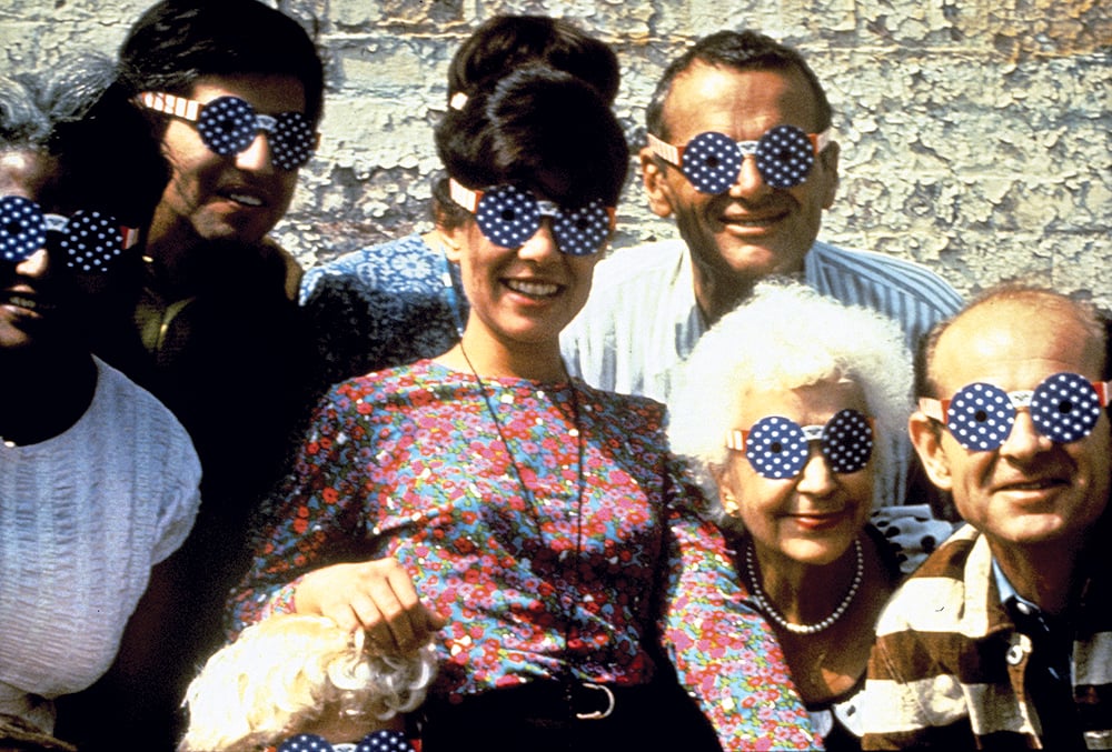
The Eames Office wearing “Independent Shades,” which were designed by Sussman in 1965.
All images courtesy Sussman/Prejza Archive, unless noted otherwise
There were some outward signs, truth be told, that it might not have been the ideal day for an interview. Deborah Sussman—the pioneering Los Angeles designer and one of the creators of that hybrid of architecture and large-scale signage known as supergraphics—was in the middle of moving offices, transferring decades of material from a space on the edge of Culver City to a smaller one in L.A.’s Chinatown. The previous couple of weeks had also been busy—with opening parties, and Q&As with reporters from a range of publications, for a new exhibition on Hollywood Boulevard in a small gallery run by the architecture department at Woodbury University, celebrating the first three decades of her prolific and influential career. In addition, Sussman, who grew up in New York and moved to California in 1953 to take a summer job with Charles and Ray Eames, is 82. There was also, ahem, the fact that I had already asked her to move the date of our meeting. Twice.
But when I went to speak with her at the modestly scaled and stylish West Los Angeles house she shares with her husband, Paul Prejza—a partner since 1980 in the firm Sussman/Prejza & Co—Sussman was as upbeat, talkative, and quick-witted as I’d remembered. And as feisty. Having ordered in a rather fancy Japanese lunch in preparation for one of the earlier meetings I’d had to cancel, Sussman betrayed irritation with me only when it came to the choice of food she had laid out: some good cheese and crackers and other “little nibbles,” as she put it. “I wasn’t about to order a full lunch again,” she told me with a wry smile, a few minutes after I’d arrived. With that small (and deserved) jab out of the way, Sussman was ready to discuss the range of her design work, which has included—once she left the Eames office in 1968—transforming the interior of the Forum in Inglewood for a Rolling Stones tour in 1975; collaborations with Frank Gehry, Norman Foster, and a number of other architects; signage and wayfinding for new public projects in Los Angeles; and, most famously of all, colorful and light-on-their-feet designs with Jon Jerde for the 1984 Summer Olympics in Los Angeles.
Prejza, a friendly and largely soft-spoken man who trained as an architect and planner, drifted in and out of the living room while Sussman and I were talking; her assistant, Alexis Hyde, hovered ready to pluck an image from the computer in Sussman’s office. I sneaked in a question now and then, and gave her my thoughts, when she inquired, about some Los Angeles architects past and present. Hyde and Sussman had laid out images from a few projects—which included the Olympics, but also more recent commissions—on a glass-topped coffee table in the center of the smallish living room, and the collection of photographs acted as a loose guide for the conversation.
Mostly, though, Sussman—wearing oversize round black glasses, à la Le Corbusier, and a scarf that she described as having been designed for “a major global client headquartered in the Midwest,” that she couldn’t name thanks to a nondisclosure agreement—was the one clearly holding court. And after some namedropping seemingly tailored for me personally—“See that Picasso jug? That was a gift from Esther McCoy”—she was very direct about the points she wanted to make.
First, though she was truly thrilled with the recent Woodbury exhibition—curated by the Los Angeles architect Barbara Bestor in collaboration with Catherine Gudis, Thomas Kracauer, and Shannon Starkey—she wanted to stress that her output has in no way diminished since 1984, the year the show comes to a close. Indeed, even now she is past 80, Sussman and Prejza’s firm remains the go-to office when a certain kind of high-profile Los Angeles civic project—a new park, say, or subway line—needs graphic design, branding, or wayfinding help.
For the year-old Grand Park, a much anticipated space that stretches down Bunker Hill between Grand Avenue, the site of Frank Gehry’s Walt Disney Concert Hall, and the Los Angeles City Hall, Sussman/Prejza designed squared-off green-and-silver totem poles, illuminated from within, that spell out the phrase “the park for everyone” in dozens of different languages. The goal was not just to design the various entrances, but, in a very basic sense, to let the city know the park was there, since it occupies a rather awkward sloping site wedged between a couple of unfortunately large and blocky county buildings from the 1960s.
For the Metropolitan Transportation Authority, which runs Los Angeles’ mass-transit system, the firm has collaborated with the architecture firm Johnson Fain on a new kit of parts meant to unify the design of new light-rail and subway systems. The graphics were watered down a bit as the project moved through the MTA bureaucracy, but in their clarity, directness, and sense of youthful energy, they are full of Sussman trademarks.
In both of those recent projects, the firm had been doing work that is crucial to Los Angeles’ sense of self. The city, having grown more crowded and less suburban, is trying to create in its civic sphere the same sort of inventiveness and creative energy that has long animated its residential architecture. And much of that effort hinges on the message that important new public projects turn to the public. Indeed, if Sussman complained a bit that she has less design freedom than she once had, the work she is doing now is every bit as meaningful. In fact, the stakes may even be higher now, given that Los Angeles now faces some fundamental questions about what kind of place it is going to be: how vertical in the face of its horizontal past, and how connected and public in the face of its deep historic privatization and obsession with the automobile.
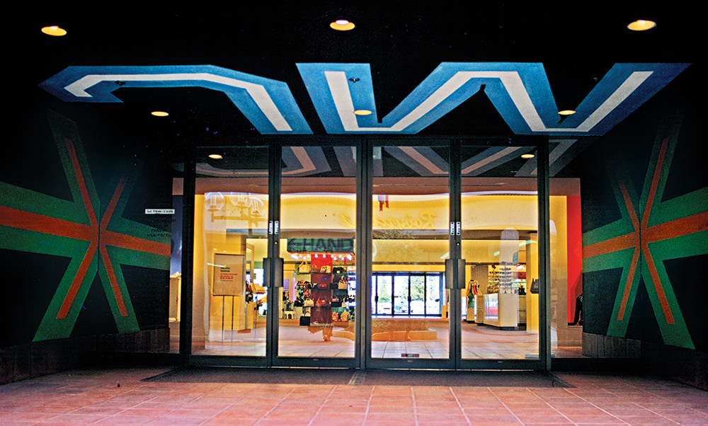
That said, it’s not as though she was ruling out the early work as a topic of conversation. Her work in the late 1960s with Gehry on a series of J. Magnin stores was one of her first real breakthroughs; the giant Js and Ms stenciled on the side of the stores in pinks, oranges, greens, browns, and blues were a precursor to the supergraphics she’d use regularly later on. Recalling that project prompted her to reminisce about a kind of collaboration she no longer sees in the design world. “In those early days,” she said, “the designers were not separated from landscape architects, bona fide architects, and mere graphic designers—or from artists and writers. We all hung out together.”

She was certainly happy to talk about the Olympics—especially the undervalued role that the entertainment lawyer Harry Usher, a top aide to Peter Ueberroth in planning the games, had played in protecting her designs from troublesome meddling. Her description of Usher was as concise a definition of a good design patron as I think I am ever likely to hear. For any ambitious design project to succeed, Sussman told me, you need “one person who supports good ideas and who has the power and the clout to say yes.”
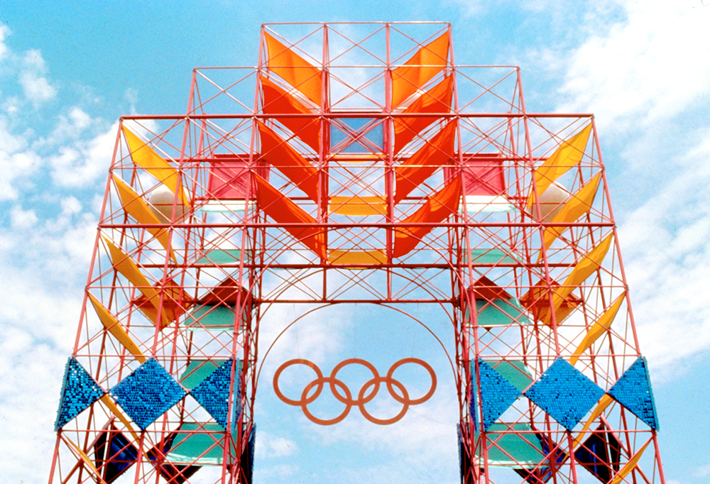
Usher didn’t just say yes—he kept expanding the role that Sussman/Prejza, first hired to design some signage for the athletes’ village at UCLA, would play. In the end, the firm with Jerde—produced a collection of lightweight and reconfigurable signs and structures that were placed all over the region. Sussman created those items (in a bright palette of magentas, oranges, reds, and pinks) with television in mind. A dry run of sorts in 1983 gave her and Jerde a clear sense of how the designs would play on-screen. “We worked very closely with ABC,” she said. “We knew what every camera angle would be.”

Sussman’s Olympic designs essentially took the idea of supergraphics and made it the basis of a wide-ranging design strategy for medal stands, temporary seating, and signs of all scales. Those objects, in turn, helped cement a certain idea of Los Angeles—informal, optimistic, international, forward-looking—that would rule in the public imagination until the 1992 riots brought a more troubled view to the fore.
Not that her Olympics work was universally cheered by other designers in L.A. “The old-boys graphic design network in Los Angeles had its nose out of joint because this little woman was in charge,” she told me. “The old boys said: ‘We need gray to make it work.’ But the color I use is always conceptual as well as visual—there is always a reason for it.” In the case of the Olympics, she said, the palette was drawn from both personal experience and research about the design details in important public rituals in a number of Pacific Rim countries, including Mexico, Japan, and the U.S. Her graphics suggested not Kenneth Frampton’s “critical regionalism” but a kind of celebratory regionalism—upbeat and cannily carefree.
It was not long after the Olympics that Apple hired the firm to produce new graphic design and wayfinding for the company’s Cupertino Campus. The project began after Steve Jobs had been forced out of Apple in 1985. Sussman/Prejza’s concept took icons from the Macintosh screen—arrows, numbers, and even the small animal Apple aficionados know as the “dogcow”—and blew them up to a scale of ten- or 15-feet high. As a result, they became cartoonishly pixelated. When Jobs came back to Apple from professional exile and saw the design, Prejza told me, “He said he didn’t like it.” Added Sussman, “He said it was the past.” To my eye, though, the Apple designs looked as fresh as anything from the Sussman/Prejza back catalogue, a kind of 80s-revival-meets-New Aesthetic mash-up.
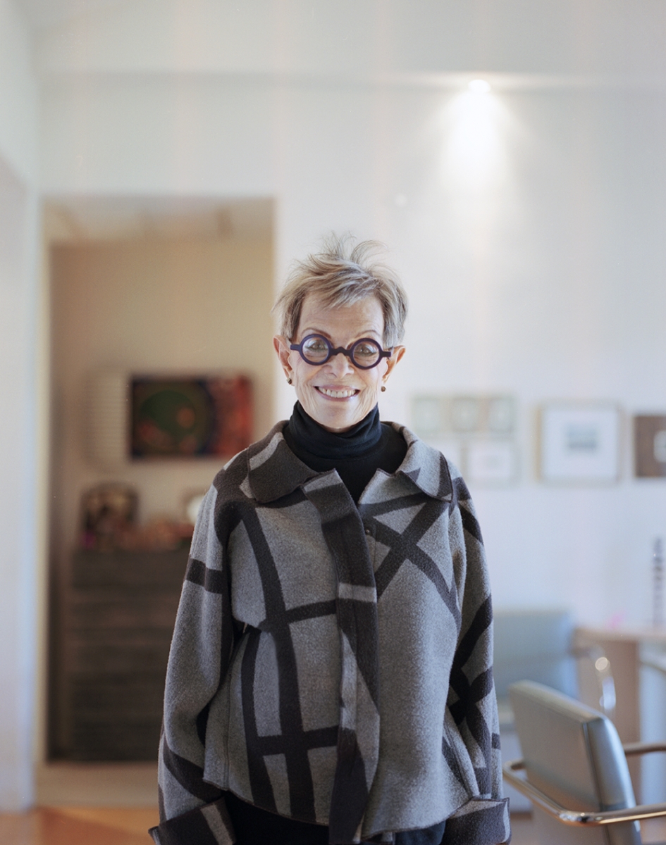
Sussman—wearing oversize round black glasses, à la Le Corbusier—photographed in her home in Los Angeles’ Palms neighborhood.
Portrait by Soohang Lee
And about her time with Charles and Ray Eames? It’s hard to think that Sussman could ever tire of that topic. And why would she? Who wouldn’t want to talk about coming to Los Angeles in 1953 as a 22-year-old aspiring designer and finding a productive place in a multidisciplinary office that was busy rewriting the rules of design practice, and churning out furniture, films, toys, packaging, and architecture? Sussman was, of course, clever and determined enough to use that very springy launching pad to forge her own career and sensibility—one that from the vantage point of 2014 looks as instrumental to L.A.’s civic self image as even the Eameses were.
In fact, Sussman told me I wasn’t allowed to leave until I’d looked at a letter she’d sent to her parents in the fall of 1954, when she was 23, while housesitting at the Eames house and studio in Pacific Palisades. I sat next to her on the sofa while she unfolded the letter, whose paper was cracked and peeling. (There was a moment of panic when page three couldn’t be located; it was later found, intact.) Sussman held the letter up, so that I could see its still youthful handwriting, and began to read.
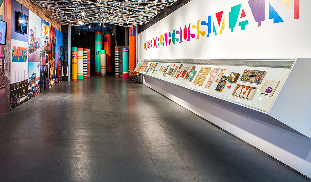
Courtesy Laurie Joilet
“Dear Folks,” she read. “Could life be more beautiful? I am living at the Eames house, since Friday….Right now I am seated in a cozy alcove—an Eames built-in sofa covered with brilliant Indian blankets and silken pillows.” Every day, Sussman told her parents, she had the luxury of waking up in a house filled with “huge lanterns,” “giant philodendrons,” “dozens of Indian Kachina dolls,” and “Chinese pots and books,” and of “looking out at eucalyptus trees touching the glass walls—trees 90-feet high—looking through them over a long, wide meadow. And beyond that, the sea….” Sussman paused and looked at me, eyes full of light, all those files packed for the office move no longer a worry, the stresses of uncooperative clients (and unreliable journalists!) momentarily forgotten. “I mean, twenty-three years old. Can you imagine?”


