June 2, 2022
Stokes Architecture + Design Create a Pop Sensibility at Kpod Restaurant
Chef Peter Serpico, an alum of David Chang’s Momofuku group who went on to establish his own reputation in Philly, came on board to create a constantly changing menu that explores his Korean heritage. Through the design, Saunders and team aimed to support Serpico’s culinary agenda.
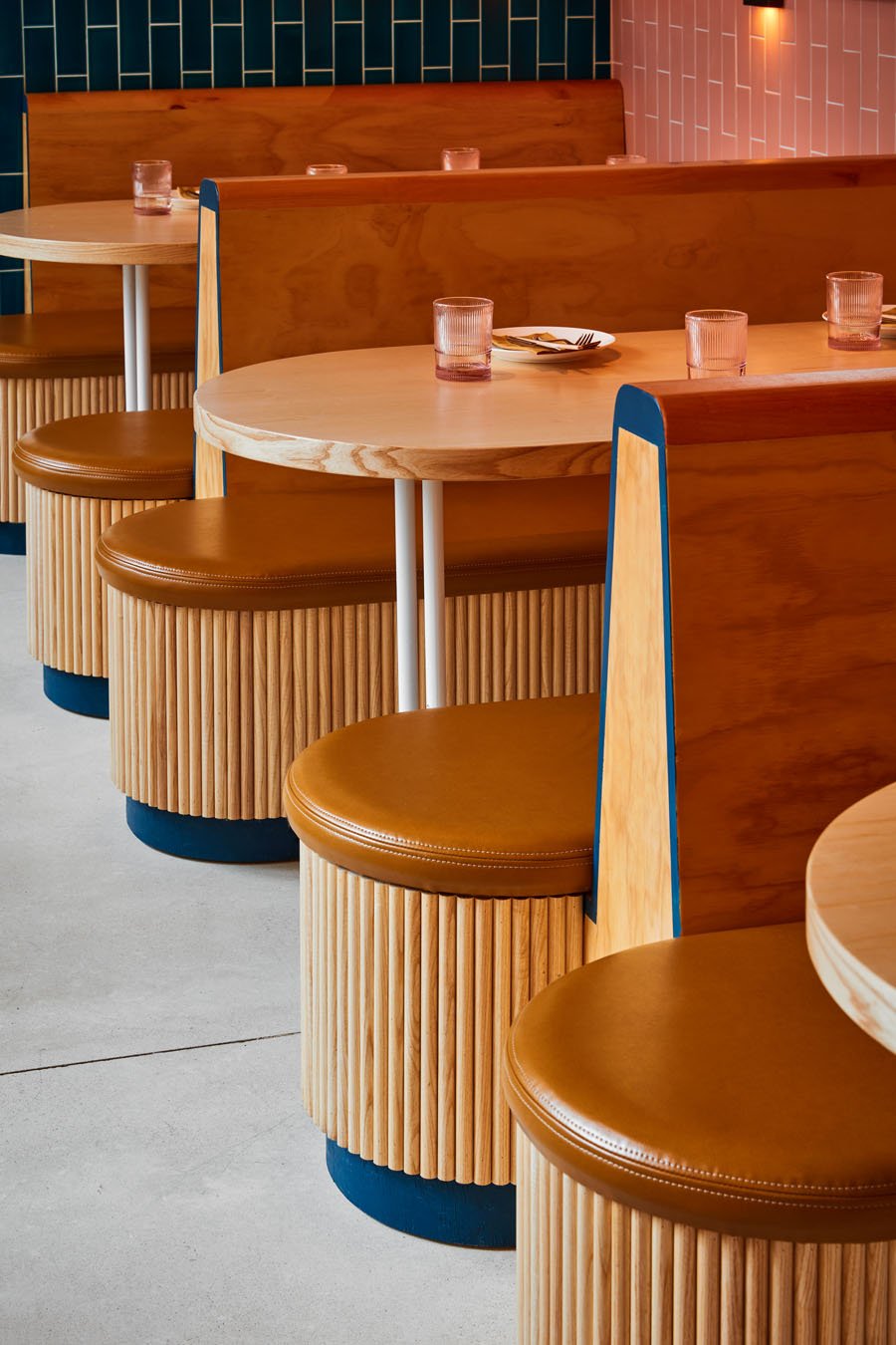
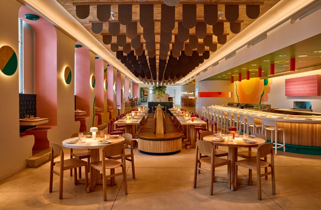
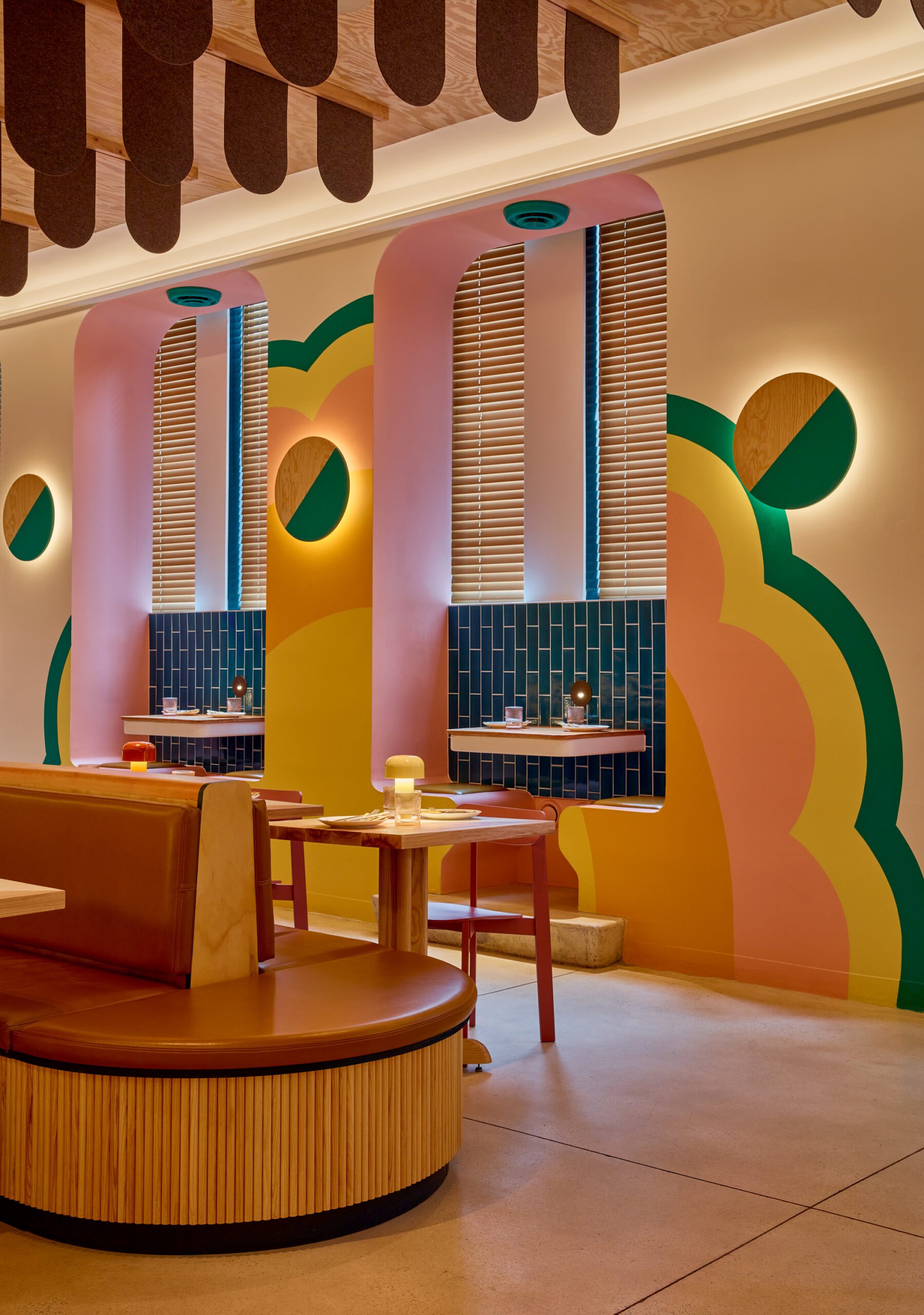
Once the new name and concept were identified, the designers took on the tricky task of figuring out how to reference K-pop music in the context of hospitality design without verging on kitsch. “There’s no one thing you can look at and say, ‘That aesthetic is K-pop,'” Saunders explains. After watching hours of music videos, he narrowed in on, “really bold shapes, pops of color, and warmth.”
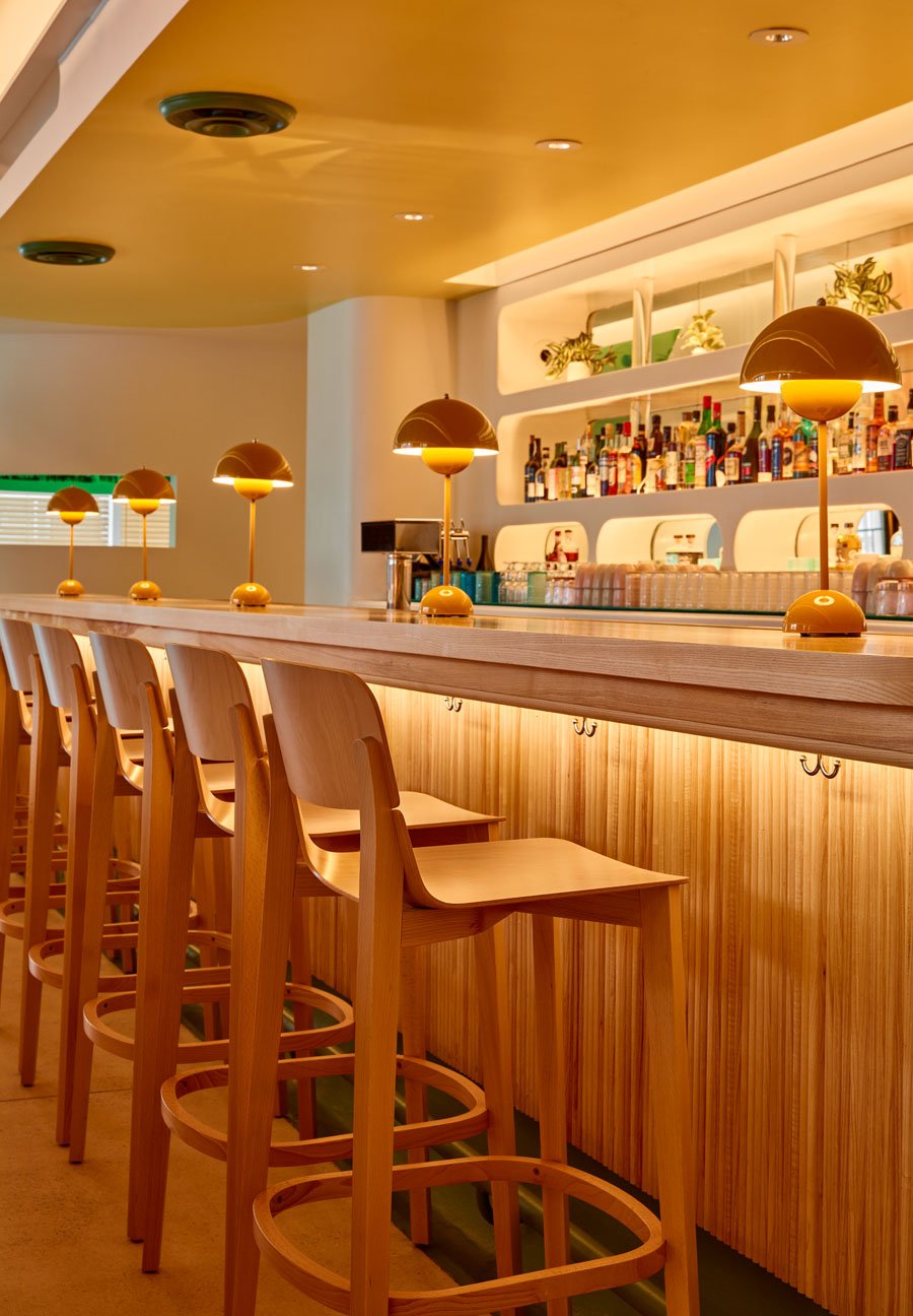
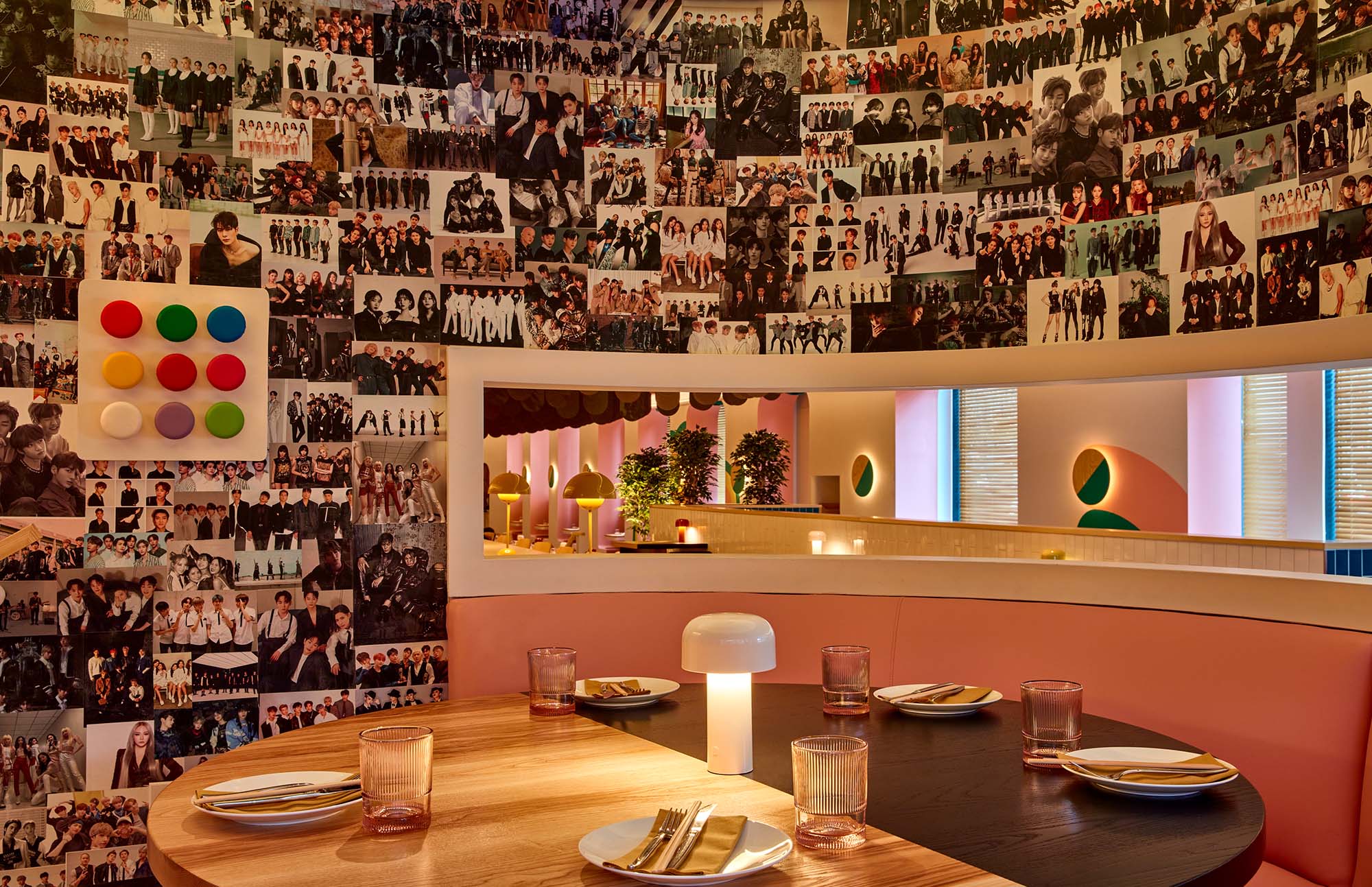
Extant features including the bar, banquette niches, and the continuous racetrack ceiling were modified and resurfaced. Materials such as wood, rows of ceiling-mounted earth-toned felt flaps, and contrasting tile are playful and warm, and new lighting by L’Observatoire International transforms the ambiance. Hundreds of images of K-pop stars dramatically blanket the larger private banquette niche and is the only overt reference to the musical genre but a reel-to-reel points to the restaurant’s musical inspiration.
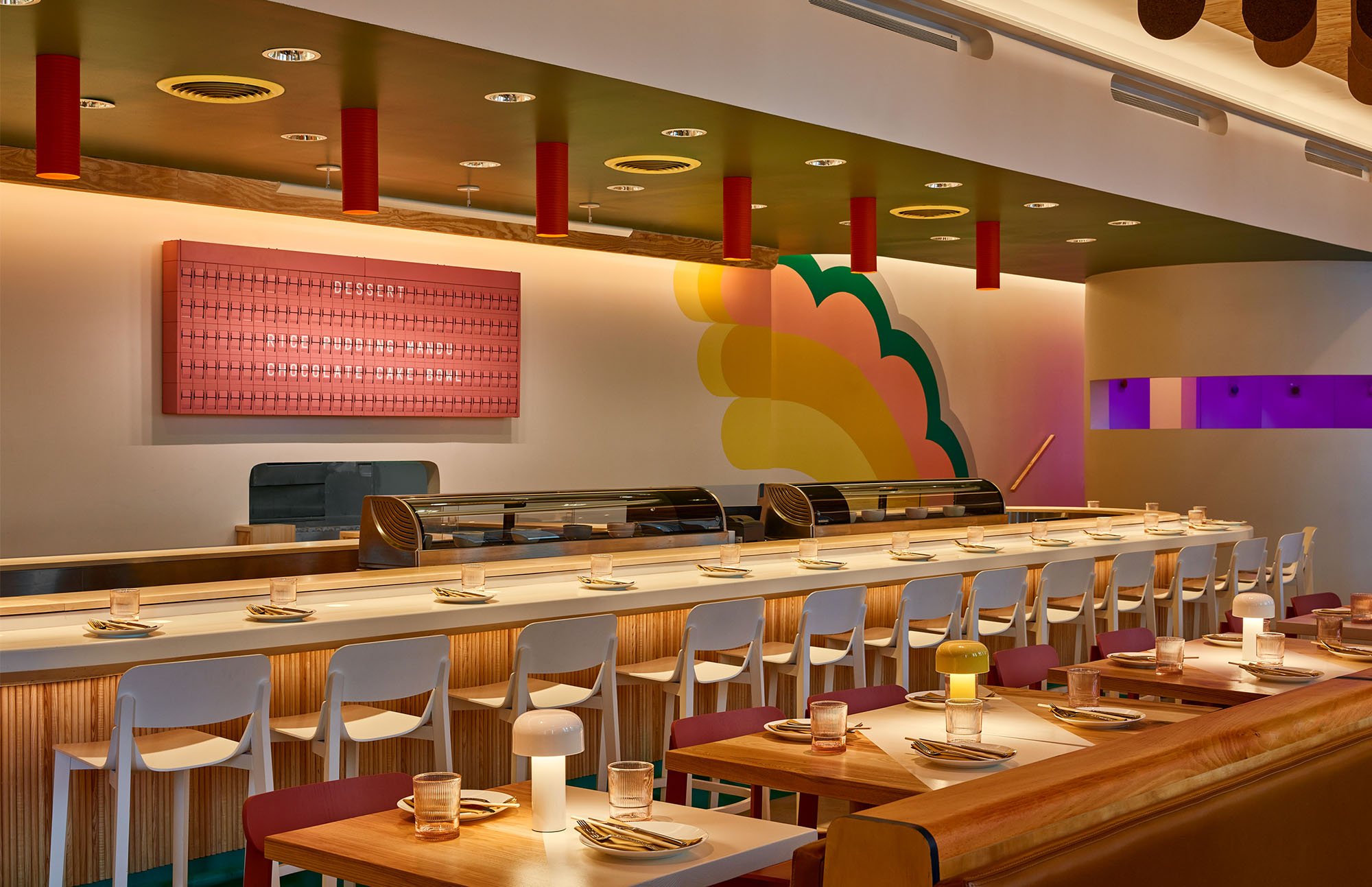
Another insider’s element at Kpod is the hot pink split-flap sign made by Oat Foundry–––placed behind the sushi bar, it displays menu items and can be programmed to have an interactive element with customers. Saunders notes it’s the only such sign that exists in this color and serves as a nod to the Philadelphia 30th Street Station, where the iconic board was removed in early 2019. A mural by artist David Guinn is another flourish that complements the lively color scheme.
Chef Serpico’s evolving menus, Kpod’s exuberant atmosphere, and an accessible price point all contribute to the upbeat, celebratory vibe that speaks to the current moment. “After two-and-a-half years of the pandemic, we wanted it to be fun,” Saunders says. “We wanted to make people happy to go out to a restaurant and bring people a little bit of joy.”
Would you like to comment on this article? Send your thoughts to: [email protected]
Related
Profiles
Designing Architecture in Dialogue with Water
METROPOLIS Future100 2026 honoree Kimhour Lor examines Cambodia’s complex and evolving relationship with water amid the climate crisis.
Profiles
Meet the 2026 Planet Positive Awards Jurors
METROPOLIS announces the esteemed jurors for the 2026 Planet Positive Awards, honoring excellence in sustainable design.
Viewpoints
The Productive Tension of Prefabrication
Casa Guadalupe by HANGHAR pairs the logic of industrial building with a softer domestic language, revealing how prefab architecture, and design practices, can negotiate both rigor and warmth.


