January 21, 2014
M is for Mies: The ABCs of Famous Architects
A graphic designer has devised a visual alphabet of architects and their most famous works.
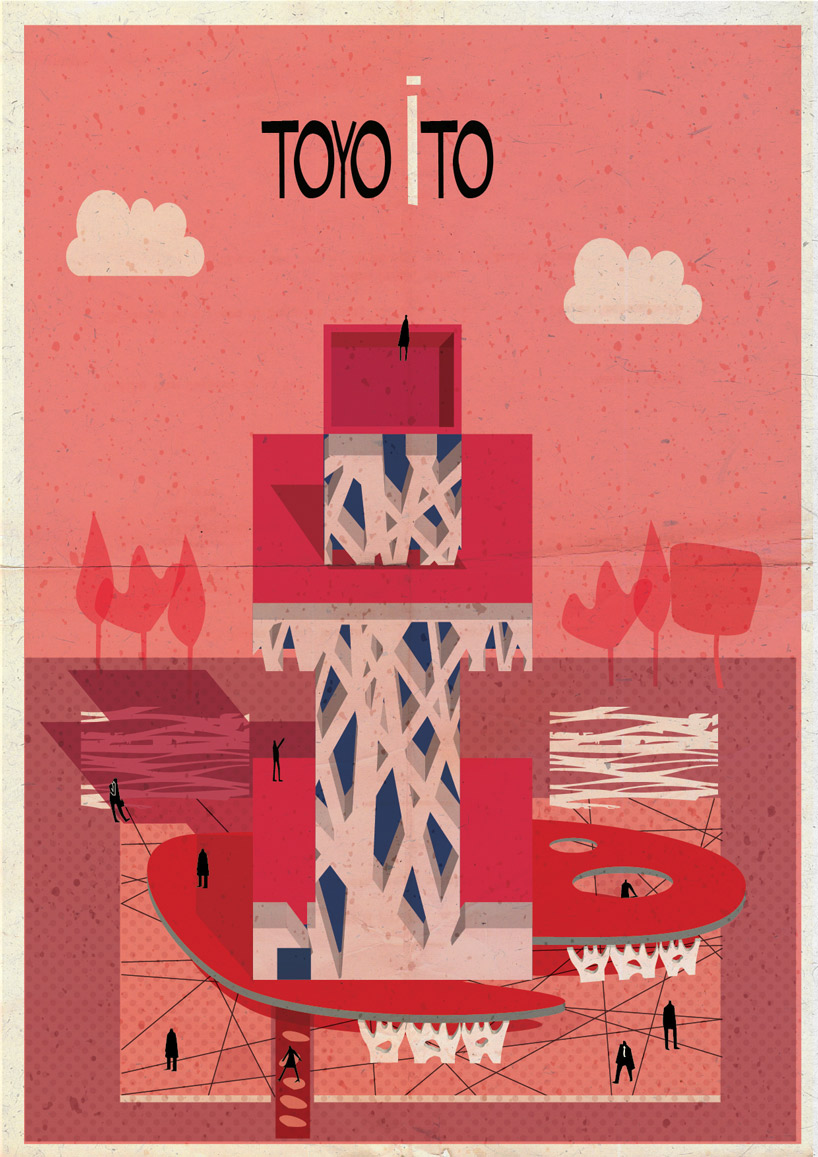
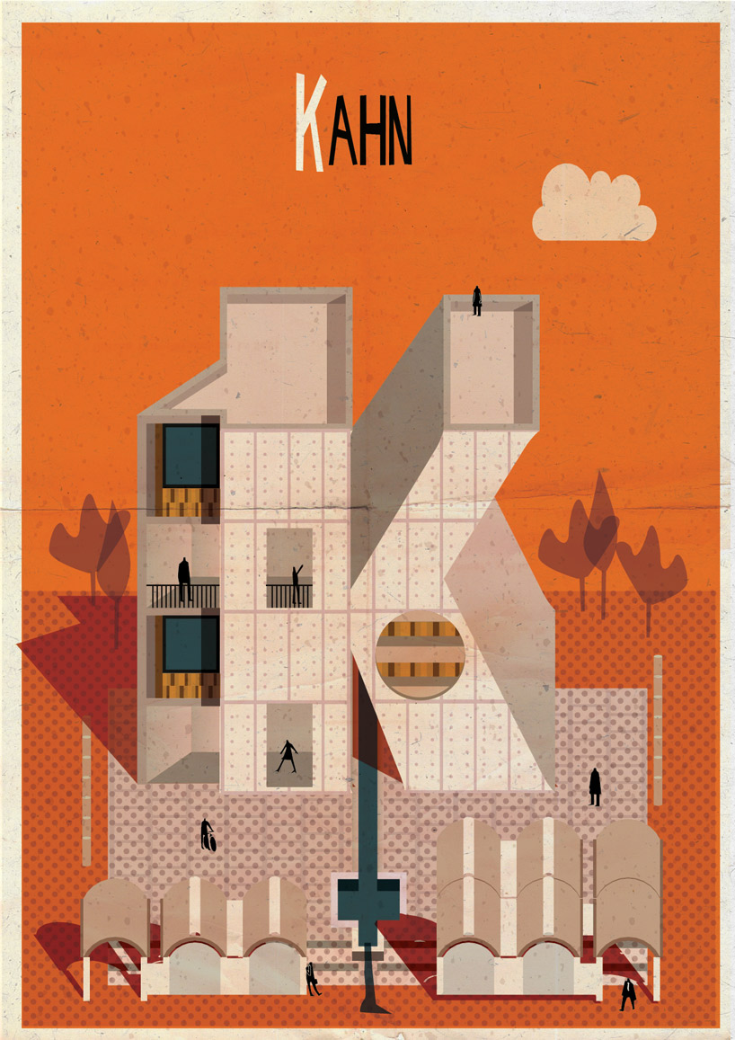
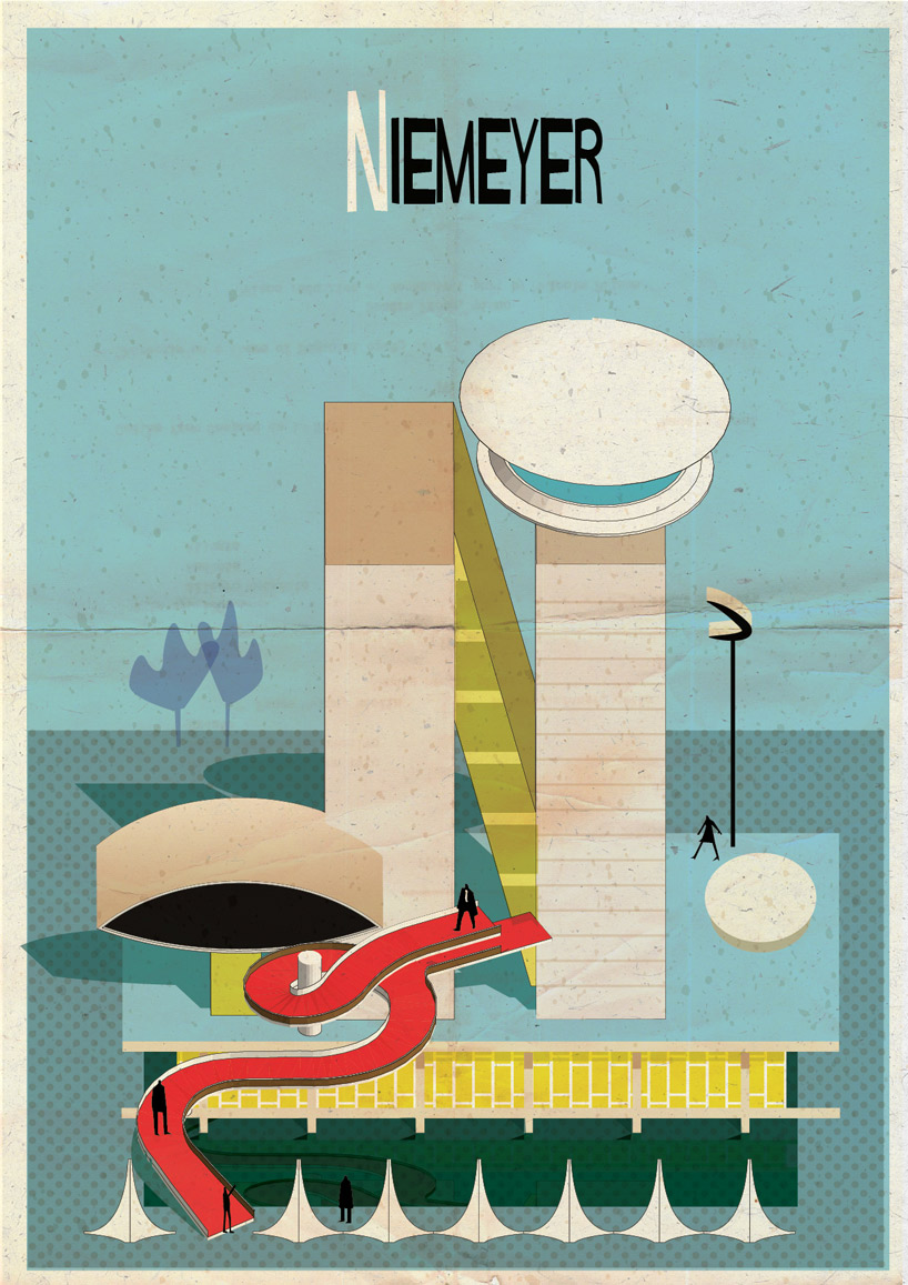
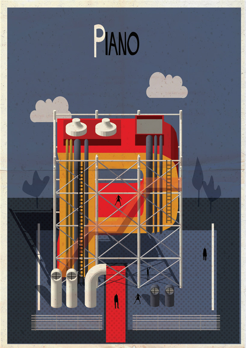
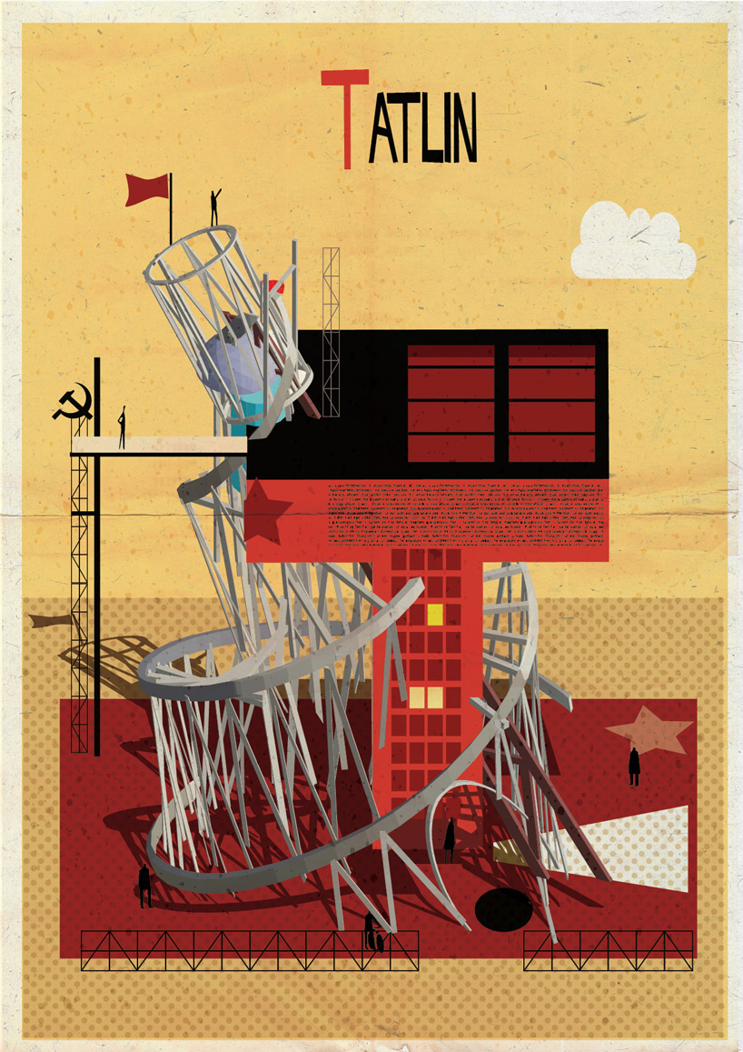
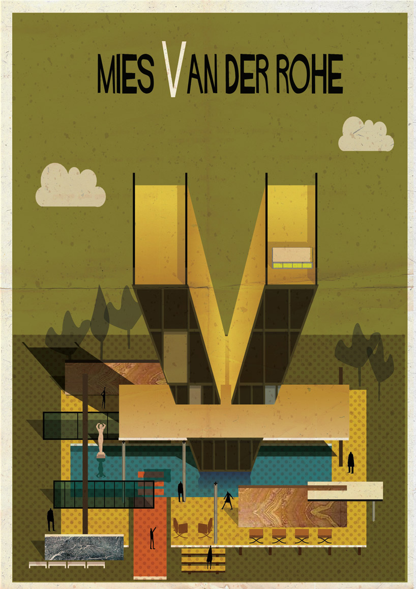
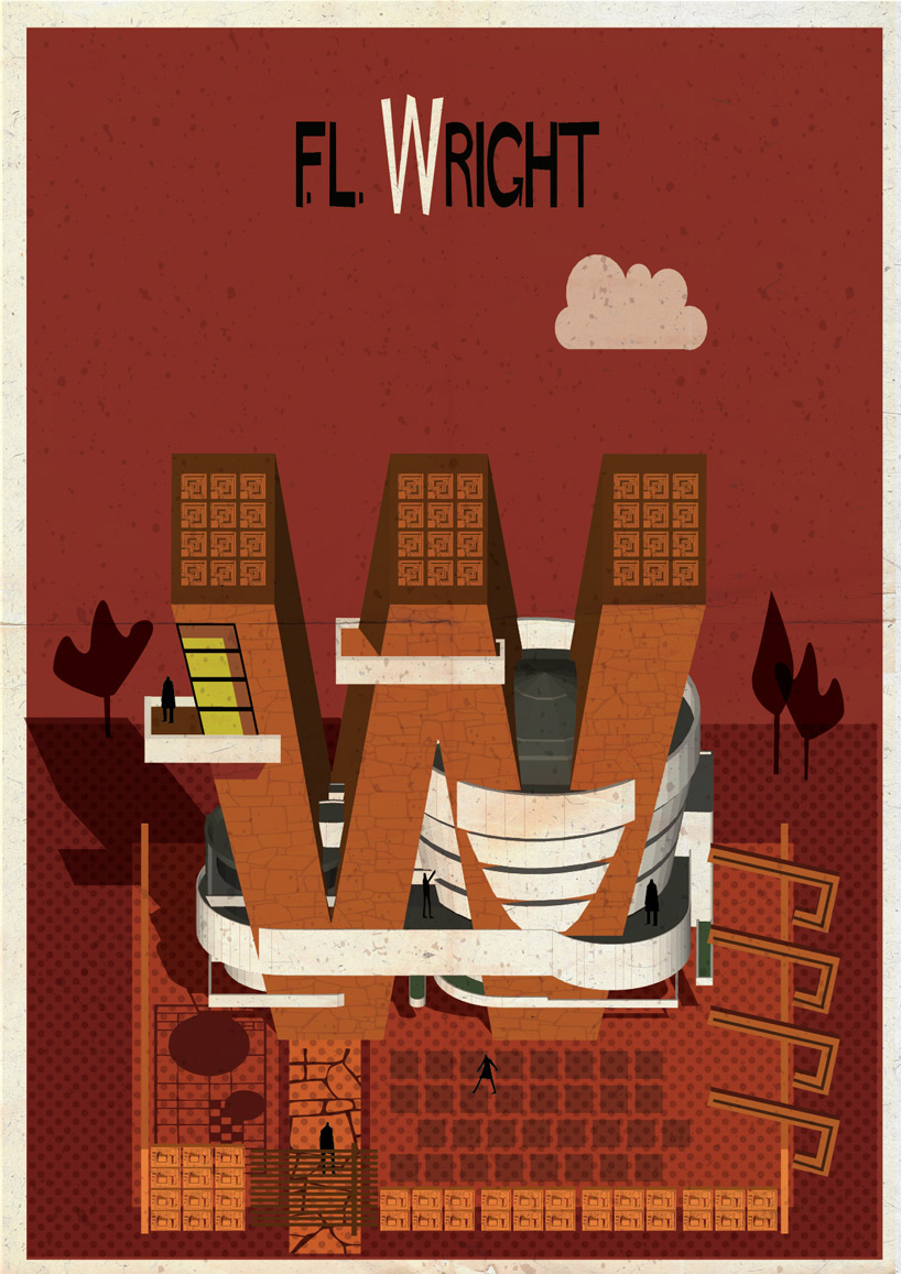
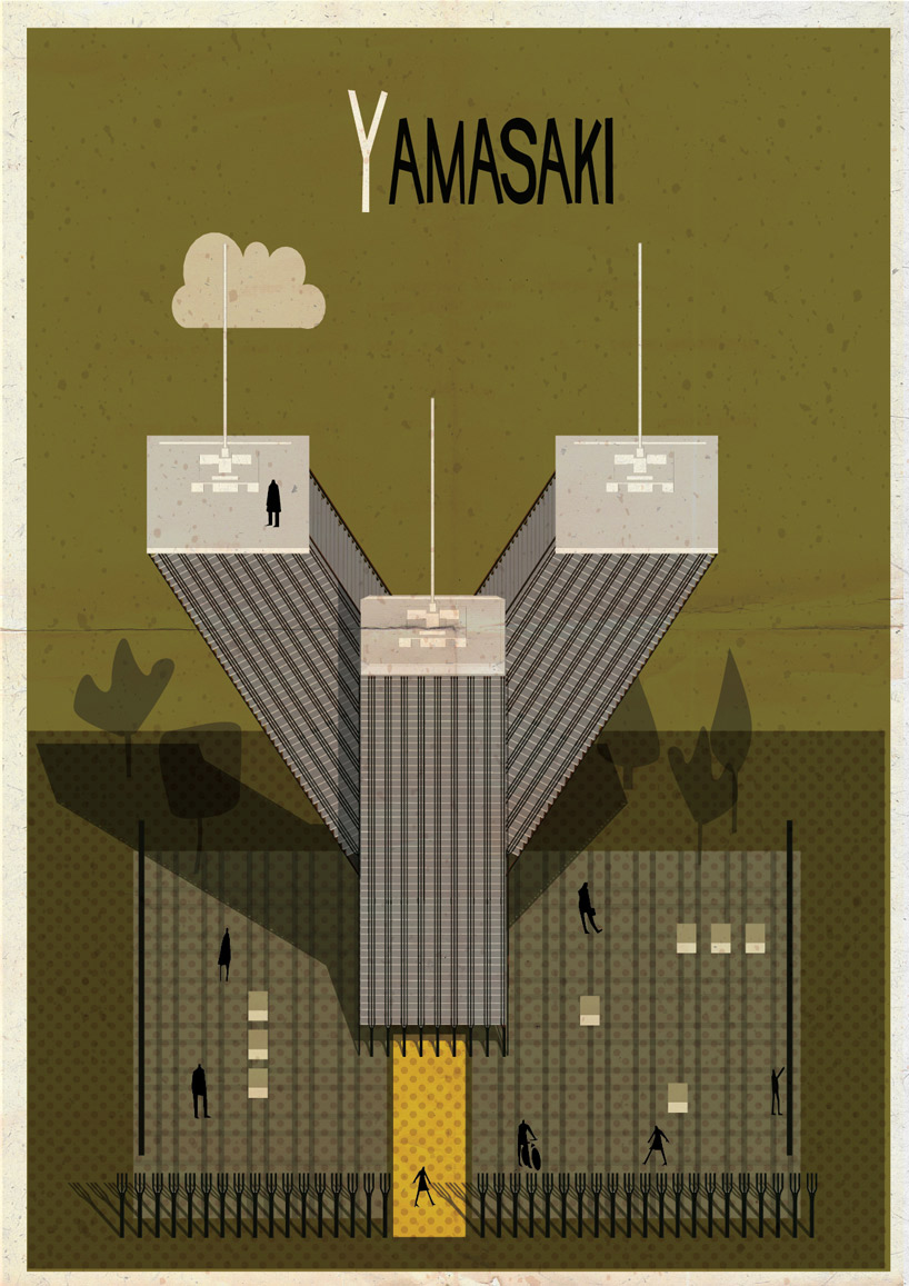
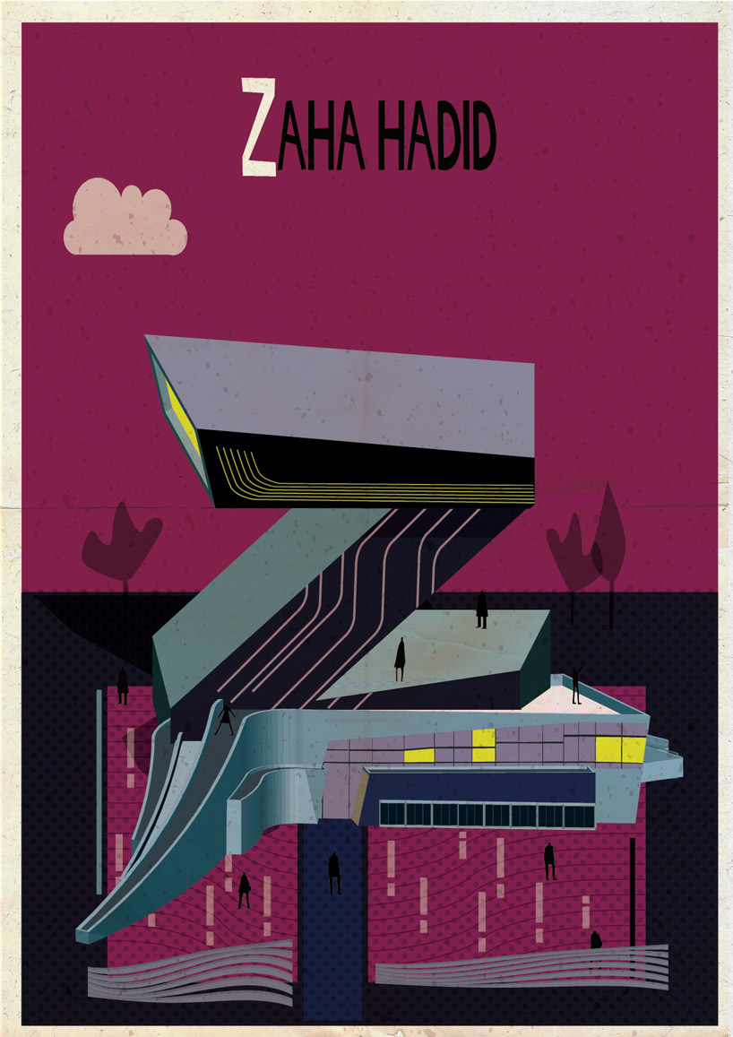
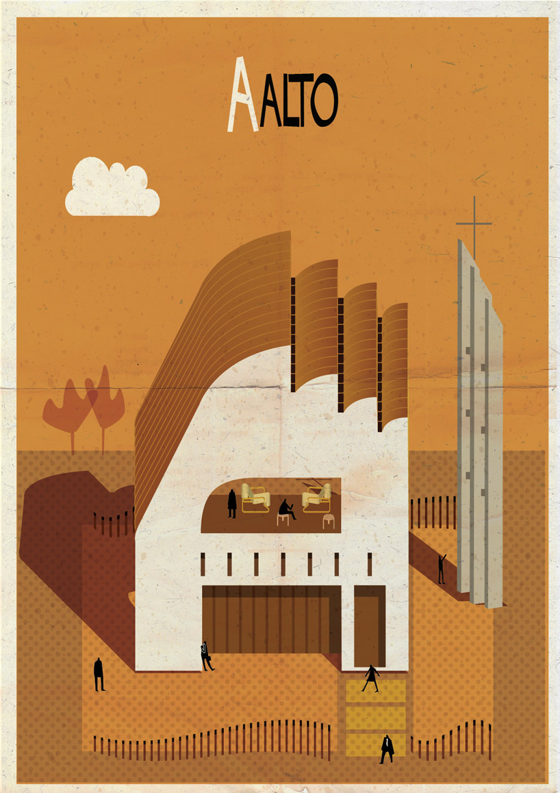
A isn’t for apple but Aalto in Federico Babina’s so-called ‘Archibet.’ Likewise, G signifies Gropius and N stands in for Niemeyer. For his alphabet of architects, Babina embellishes each letter with aesthetic stylings associated with a corresponding designer, so that the C in Le Corbusier is contorted into the platonic, square geometry of a Purist villa. The K for Kahn is imagined in monolithic concrete patterned with concrete tie rod holes, while a Pompidou-esque structure imprisons the errant ‘P’ in Piano. And on and on through Z (as in Zaha, of course).
“Each letter is a small surrealist architecture,” Babina says of his architectural abecedarian. The letters are treated more or less like scaffolding on which to hang an architectural veneer, be it Bauhaus or High-Tech. When combined, these semi-autonomous units form a kind of “imaginary city.” The shapes and styles may differ from letter to letter—or block to block, as it were—but they all “speak the same language of architecture.”
For Babina, an architect and graphic designer, the most challenging aspect of the project was selecting which architects to include in his alphabet. “The choice was often guided by an inspiration rather than the importance of the architect,” he says. The guidelines, he adds, were quite flexible and open to liberal interpretation. When faced with the choice between Meier and Mies, for example, Babina loosened the rule of his system to accommodate both. (Strangely, Mies is cast as the letter V.) Similarly, Roberto Burles Marx, barred from occupying the B or M slots, is represented by a giant X that stands on a swatch of the Copacabana boardwalk.
Is it problemmatic to reduce the history of contemporary architecture to the rarified works of few famous practitioners? Surely. But Babina’s project isn’t definitive, nor does it strive to be. Koolhaas and Gehry are the glaring omissions, of course, while one imagines how a Rossi or Graves building might have benefited from the graphic treatment.
See the complete Archibet here.
All images courtesy Federico Babina
