January 31, 2020
Nordstrom’s Manhattan Flagship Unites Historic Landmarks and Contemporary Forms
James Carpenter Design Associates and CallisonRTKL integrate a progressive new build and waveform facade within two landmarked buildings in Nordstrom’s Manhattan flagship.
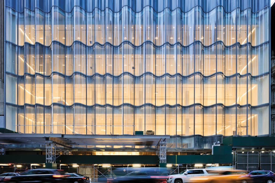
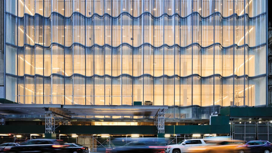
There are many puzzle pieces to building in New York City, where contemporary businesses often occupy the architectural shells of previous eras. But in the case of Nordstrom New York’s new flagship store, the seams are so well-disguised it’s easy to forget what used to be. Distributed across a cluster of buildings along Broadway and West 57th Street, the store boasts a daring exterior—primarily on 57th, but also carrying over to the rear on 58th—that hides a deceptively effortless interior.
Nordstrom New York is made up of two sections, bisected by Broadway. On the west side, the Men’s store is set within a prewar building that was reclad in glass in 2008. On the east side, the Women’s store inhabits a space that combines four buildings—two landmarks at 1790 and 1780 Broadway, the corner building at 1776 Broadway, and a seven-floor contemporary new build at the foot of Central Park Tower.
That is many puzzle pieces indeed, and the fact that Nordstrom New York is the fruit of not one but three design players—Nordstrom’s very own Dawn Clark, the senior vice president of store design, architecture and construction; James Carpenter Design Associates (JCDA); and CallisonRTKL—adds yet another wrinkle to an already complex project.
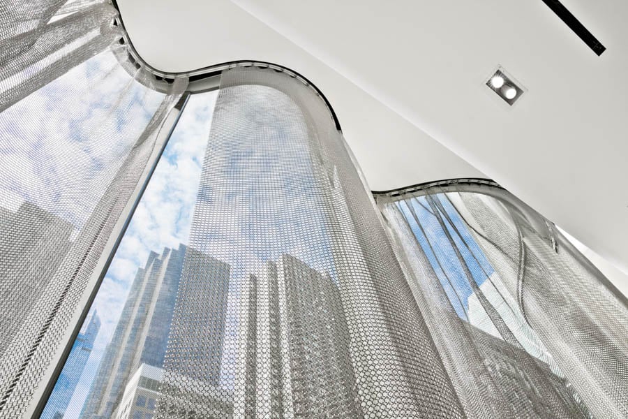
The star of Nordstrom New York is the curvilinear glass facade fronting the new build, courtesy of JCDA. From street level, the rippling glass recalls a lavish stage curtain ready to reveal a dazzling set. From within, the experience is just as theatrical, but a lot more intimate. “The opportunity deployed within the waveform facade creates spaces that people can step into, be within, and be surrounded by light,” says James Carpenter.
The waveform is made of bent annealed glass panels that form an insulated unit. Each glass unit fits into a stretch-formed aluminum frame that nests into the units around it. The concrete floors at each level support the weight of the bent glass, while steel plates lock the units together inconspicuously. On the inside, the waveform is complemented by a chain-mail veil that gently hugs the glass curves and falls to the floor like a diva’s gown, reinforcing the theatrical allusion. The mesh, says Carpenter, “with its very flowing and almost liquidlike character, seemed to have a symbiotic relationship with the curves of the glass.
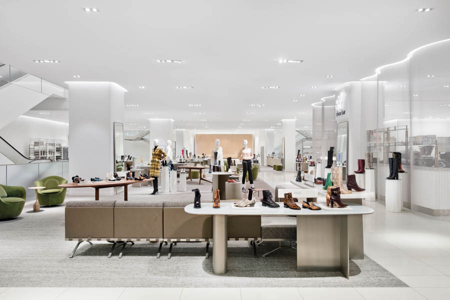
Speaking of curves, the interior has them in heaps. The smooth-edged columns are crowned with a soft halo reveal; railings swoop around corners to lead the eye through the store; and a custom terra-cotta wall near the elevators features a scaled down expression of the waveform’s curve pattern. As for the mesh, it also takes on the role of fluid partitioning to subtly separate the different brands on display.
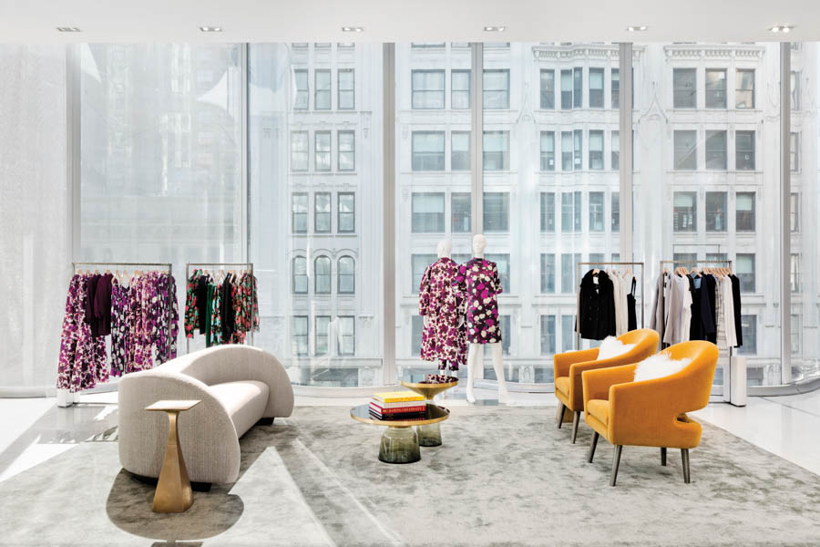
“Over the years, we have been peeling back the boxes and embracing daylight,” says Clark, whose goal for hyper-flexibility is a testament to the fluidity of retail and its constantly changing merchandise. In fact, the Nordstrom model seems to bank on diversity. “Pop-in” shops, seasonal displays, and glamorous center-stage stores brush shoulders with denim alteration and shoe-repair stations—providing a cohesive, uninterrupted shopping experience. There’s even a Nike store on the ground floor of 1776 Broadway, and a pop-up store above it, occupied by Burberry last fall. “Our customers use the store and shopping online symbiotically,” says Clark.
Drawing from the site’s historical value, CallisonRTKL and Nordstrom’s design team first used archived drawings to restore the historical facades of 1776 and those of two landmarked buildings: a 1909 redbrick and limestone middle-block building; and the Flatiron-like 1790 Broadway—a distinctive classical structure by the same architects as the New York Public Library.
Then they moved inside, where they encountered a whole different set of challenges—“floor plates that didn’t align with the main building, low ceilings, existing infrastructure in key areas that couldn’t be relocated,” says Jessica Eaton, associate vice president of Nordstrom Retail Studio at Callison RTKL.
Some transitions couldn’t be seamless, like the Stylist Lounge, which is set a step down and across a metal plate that bridges 1776 Broadway and the glass new build. “We tried to minimize those transitions by making compressed spaces feel intimate and purposeful,” explains Eaton, referencing a series of ancillary spaces that were eventually filled with vendor shops, a restaurant, and the Broadway Bar.
Designed by Rafael de Cárdenas/Architecture at Large and tucked into the facade of 1780 Broadway, the Broadway Bar stretches across the third floor’s end cap and the mezzanine level above it. “The design language was born from assessing this very interesting, somewhat adirectional, atrium-like space,” says de Cárdenas, who realized that the space’s best asset was the void between floors.
With six other food and beverage offerings, including a buzzing Shoe Bar where customers can try on a pair of heels and toast their purchase with a drink, Nordstrom New York presents itself as a kind of porous space where shoppers can roam free, a glass of wine in hand. A theater at intermission, where everything happens to be for sale.
You may also enjoy “David Chipperfield Designs a Stark, Minimalist Store for SSENSE in Montreal.”
Would you like to comment on this article? Send your thoughts to: [email protected]
Recent Projects
Projects
A New Era of Senior Living


