February 4, 2014
These Maps Show How Subway Maps Twist Urban Reality
A new project reveals how wrong subway maps really are.
It’s not a secret that our subway maps distort the geographies of the metropoles they claim to represent. When we traverse a city everyday with an MTA (Metropolitan Transportation Authority NY) or WMATA map (Washington Metropolitan Area Transit Authority), our conception of the city—its boundaries, expanses—easily becomes scrambled. For instance, both Washington’s dense inner core and its spread-out outskirts are all shown on the same scale. In a grid city like Manhattan there might be some semblance of similarity, but in most other cities, reality on the ground is completely different.
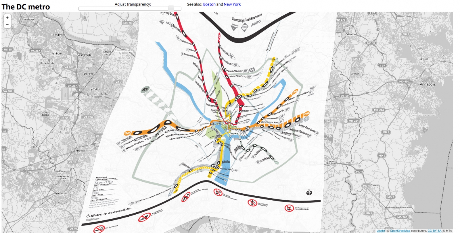
A new project developed at Northeastern University tackles these problems head on. Benjamin M. Schmidt, a professor of history, has designed interactive digital maps of Boston, New York and Washington that superimpose each city’s respective subway route map onto a geographically accurate map made to scale. One can adjust the opacity or transparency between the geographic maps and the overlaid subway routes, and can zoom in and out as well.
With research that joins the fields of cultural history and digital humanities, Schmidt’s maps feed into the larger project at Northeastern University’s history department, which uses maps to investigate the urban and social changes in the city. The new maps are rectified, annotated, and aligned with historical maps to track the changes over time. Schmidt’s maps were designed to help explain the concept of “geo-rectification” to his students. “I made these because I was interested in the collision of two different views we have of our cities: the Google maps version that we use more and more, and the subway maps, which are just as important in making us think about the layout of our cities but have a totally different perspective,” explains Schmidt.

The London Underground Map, 1908. See how the map more or less accurately plots the subway lines according to their geographical placement.
Courtesy London Transport Museum
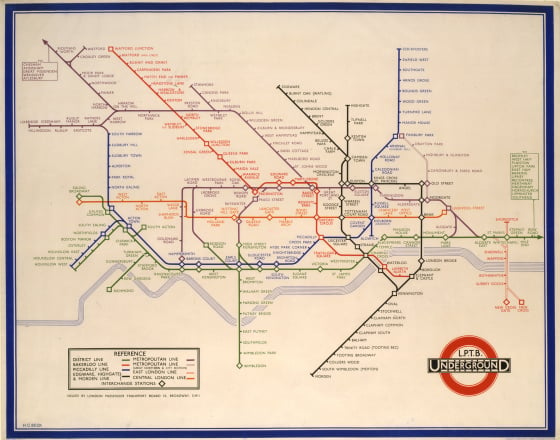
This “rectification” comes some eighty years after the first subway maps began trading in geographical accuracy for abstract clarity. In 1931, when Harry Beck, an English draftsman, first came up with the design of the London Underground Tube map, it was rejected because it was thought “too revolutionary.” Beck had removed all semblance of geography from the map and “cleaned it up” into a proportionate, rectilinear diagram with horizontal, vertical, and angular lines for train routes and evenly spaced dots for subway stops. A trial of 500 maps was run and it became hugely popular among commuters. By 1933, Beck’s diagrammatic map was in full print run and has, ever since, been the template of subways, trains and transport maps across the cities of the world.

The London Underground Map by Harry Beck, 1933. Subsequent editions have more or less left Beck’s schematic intact.
Courtesy London Transport Museum
It’s a classic case of choosing coherence over geographic accuracy. Beck, a commuter himself, understood that for the average passenger on the train, the agenda was getting from one station to another with a quick glance over the map. Geographical accuracy didn’t figure into it. By comparison, the maps that existed before have often been referred to “as legible as spaghetti in a bowl.” Beck, who used to work as an engineering draftsman at the London Underground Signals Office, designed his version invariably similar to electric circuit diagrams that he did for his day job. A map for comprehensibility rather than topographic exactitude, Beck was able to solve a universal problem of growing cities with his sound design, which is probably the reason for its longevity.

One of Schmidt’s “geo-rectified” maps that shows how the “real” DC Metro conforms to the city’s geography.
Courtesy Benjamin M. Schmidt
Unlike Beck, Schmidt makes its clear that his maps are not for commuters benefit. “I definitely don’t think think these maps are useful, per se; there’s a place for accurate subway maps, but not these twisted versions. But I thought it would be fun to show how these examples of good design that we all live with become distorted if you try to “fix” them. I definitely wouldn’t want to see them actually changed along these lines,” he says.
While Beck’s classic design persists in its relevance and needs no fixing, the digital medium does offer us a new kind of opportunity. It allows us to see a dimension of reality that we didn’t have access to before. Yet it emerges that the truth is quite twisted, in more ways than one.


