June 20, 2016
Where We Work: Inside the New Offices of Metropolis Magazine
After almost two decades, Metropolis moves to an airy, light-filled office that supports a collaborative model of media production and considers evolving ideas of workplace design.

Photography by Cait Oppermann
A successful move often begins with a period of intense soul-searching. For Metropolis, the process started with a series of interconnected changes—a thorough reworking of the magazine, a thoughtful reconsideration of the team’s approach to work, and a realization that the staff had outgrown their longtime office space in New York’s Flatiron District. “All of this forced us to articulate a new Metropolis,” editorial and brand director Paul Makovsky says.
For one, the redesigned magazine, launched in December 2014, marked a new approach to work, where individual, heads-down activity was replaced by a more collaborative model, as the editorial and art departments began workshopping issues by gathering in a meeting room and working together on shared documents in the cloud. “It was interesting because we were physically in the same space but we were also working all in the same document; in a way the virtual document and the room are both meeting places,” senior editor Avinash Rajagopal says. It was time to find an office that would match this fluid and open process. “We were writing about how the new workplace was evolving, and here we were doing all of this from our nineties cubicles,” Makovsky says. “We realized we needed to practice what we preach.” Prompted by these changes and the impending end of their second 10- year lease, Metropolis president Eugenie Cowan Havemeyer took the opportunity of an early buyout and began looking for a new home base for the magazine.
It wasn’t just the magazine that had evolved since Metropolis’s last move in 1997; the surrounding Flatiron District had been transformed as well, with smaller businesses increasingly being replaced by chain brands like Home Depot and Olive Garden.

TANDUS CENTIVA
INDENT
After Metropolis editors and architect Tom Krizmanic spotted Suzanne Tick’s Indent carpet at the 2015 NeoCon, they did not hesitate setting it as the starting point in the design of the magazine’s new office space. Manufactured by Tandus Centiva, Indent appears monochromatic from afar, but reveals a variety of yarn textures and colors when seen up-close. The carpet helped the team define a general yellow and blue color scheme for the office, while its main stripe acts as a simple wayfinding element.

In close collaboration with Robert Billingsley and Bryan Boisi at the real estate firm Cushman & Wakefield, the team began considering a variety of Manhattan locations before finally deciding on a space across the street from the New York Design Center on Lexington Avenue, where the Murray Hill and Kips Bay neighborhoods meet.
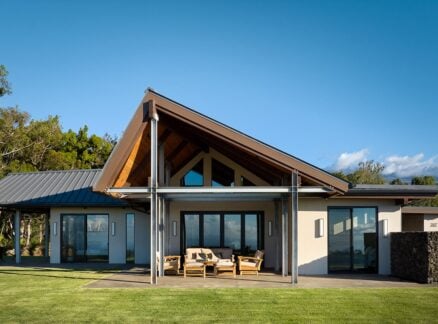
One of the first things that won the team over to the new space was its access to natural light and ample outdoor space. The neighborhood, which has recently welcomed many other design magazines and showrooms, was a bonus. In the old location, despite the generous cast-iron windows up front, light could not reach most cubicles, and although the windows were operable, that was not enough to regulate the climate for the entire office. “Here, the ability to get the sunlight in the morning and a breeze in the afternoon is just incredible,” says editor in chief and publisher Susan S. Szenasy. “At the same time, I can see a big building coming up right down the block; it’s a really interesting thing to watch New York grow around you.”
Having reported on the firm’s work for Bloomberg’s New York headquarters, the Metropolis team was already aware of Krizmanic’s portfolio, but in meeting with the architect, they were also won over by his design process. He refused to take a prescriptive approach, Szenasy says: “He looked at patterns of how people worked and began designing based on the needs that we were talking about.”
At an early meeting, Krizmanic picked up a felt pen and began sketching even as people were discussing what they’d like in the space. “He just kept drawing and saying, ‘These partitions could be movable. How can we do it so we can work this out?’” Havemeyer remembers. “I fell in love right then.”The next step was to turn to the magazine’s architectural network to find a way to meet the challenges of utilizing the existing infrastructure of the new space, including the division of offices around its perimeter. After Havemeyer, Szenasy, and Makovsky interviewed several architects, Tom Krizmanic and his firm, Studios Architecture, stood out.
At 4,700 square feet, the new office is the smallest project Studios has worked on. But Krizmanic lists this among the project’s benefits: “You don’t usually get to hear everyone’s perspective. It was very helpful getting to talk to everyone, seeing what they needed out of a space.” The interview process, aided by a questionnaire developed by Cushman & Wakefield, helped solidify the architect’s idea of what Metropolis is about. The scale of the project also allowed a more intimate connection between the architect and the team, going beyond delivering the finished product—Krizmanic checked in multiple times after the staff moved in this past October, and even dropped in to decide where to put up new art from the Havemeyers’ collection and straighten out picture frames.
The first product chosen for the space was Suzanne Tick’s Indent flooring for Tandus Centiva, which the editors and the architect had spotted at last year’s NeoCon fair. The carpet, which looks like a solid color from afar, reveals a variety of colors and textures up close. The designers chose to lay a yellow strip down the length of the main space (dubbed the office’s “yellow brick road”) to reinforce the connection between different departments and give the space an overall color scheme—matched by the custom yellow legs of the Herman Miller Canvas desks and BuzziSpace’s BuzziBrickBack felt acoustic panels. The team didn’t restrict itself to leaders in workspace manufacturing, but also drew from younger talents such as lighting designers Rich Brilliant Willing, whose fixtures create distinctive moments within the space. “We’ve always been an independent magazine, and this idea of working both with established design companies that have been around forever and ones that are emerging is part of our identity,” Makovsky says.
HERMAN MILLER
ADAPTIVE WORKPLACE DESK
Herman Miller’s adaptive workplace desk, part of its Canvas Office Landscape collection, brings a pop of color to the main workspace. The yellow color of the legs, spotted by architect Tom Krizmanic in a Herman Miller ad, wasn’t part of the company’s standard offerings. “Since it was a custom color Herman Miller developed for one of their showrooms, the process of obtaining it took a little while longer, but it gives more life to the space,” Krizmanic says. “It makes it clear that care was put into every design detail.” Between each set of desks, dividers, also from Herman Miller’s Canvas Office Landscape collection, provide privacy for individual team members.

The most salient feature of the new office is a large pin-up wall that takes up the length of the main space, showcasing the print magazine in development. In the previous location, the display wall seemed like an afterthought, squeezed into a narrow hallway on the way to the bathrooms. “You didn’t have room to actually see the issue in its entirety,” associate editor and web strategist Samuel Medina says. Even worse, other departments in the office, such as sales and marketing, often didn’t have a clear idea of the issue until it had fully taken shape. “It would only get displayed a couple of weeks before it shipped to the printers,” which meant that all the staff couldn’t look over the issue until that point in time, Makovsky explains. “It was like this magic show—let’s unveil the curtain and now you see the work.”
“Our light-filled, flexible, collaborative workspace is a dream come true!” says Eugenie Havemeyer.
Now, as soon as an issue goes to print, the beginnings of a new one take its place. Apart from being the focal point of the office, the pinup wall helped open up the practice of creating the magazine, by bringing other departments, and even guests, into the process. The wall also has a hidden function—it doubles as storage for the magazine’s extensive collection of books and back issues. “We needed storage on the premises without it compromising our workspace,” says office manager Barbara Suarez. “The sliding doors covered the storage up and also activated the office in a striking way.” In developing the layout of the space, Krizmanic retained a few of the enclosed spaces—providing private offices or conference rooms as needed—and opened up the rest, adding to the ease of interaction between departments. Although Harry Allen’s 1997 design of the previous office was successful for its time, it was limited in the options it provided. “It just outlived its usefulness,” Krizmanic says, most noticeably in its cubicles, which, although spacious, didn’t offer any flexibility, as their partitions couldn’t be changed or removed. And while the walls also gave a semblance of privacy, sound actually traveled over the dividers, making work that required deep concentration difficult. “And there was really no natural interaction,” Havemeyer says. “You almost had to make appointments to interact with people, and everyone had to crowd around cubicle doors to hold a conversation.” In the new space, the editors share a large space at the back of the office and can just swivel their chairs around for a brainstorming session.
This sense of improved communication is not restricted to the individual departments. “I like that I can make eye contact with Paul from the other corner of the office,” director of brand strategy Grace Ehlers says. And although there were initial concerns that an open office plan would encourage a newsroom-style atmosphere, full of distracting noise and commotion, the feeling of community doesn’t come at the expense of office courtesy. “The minute the furniture came and people settled in, everybody’s voice dropped. It was the most amazing thing,” Szenasy says. “It was really interesting to see how people adapted to the space and modulated their voices to match other people’s needs, not just their own.”
In addition to the main open space, meeting rooms of various sizes and flexible arrangements, from conference rooms to the dining nook, promote mobility and allow different levels of informality. Perhaps the most unexpected meeting place is a long console divider that stands between the editorial area and the art department. Functionally, the console acts as a storage cabinet, but the surface also becomes a space for the art department to spread out and assess layouts before displaying them on the pinup wall. It is also where the office shares food and spoils from various travels—the Metropolis team comes together as much around its love of food as its love for design. “On the whole, it’s a very choice-rich place,” says Szenasy. “There is this very humane quality to the interior that invites us to engage with a lot of different ways of working and communicating.”
People

Eugenie Cowan Havemeyer is seen in her office, with selections from her archive, including portraits of the magazine’s founder, Horace Havemeyer III. “From the landlord’s early buyout, to a superb team—brokers Cushman & Wakefield, Studios Architecture, and a great new landlord—our lightfilled, flexible, collaborative workspace is a dream come true,” says Havemeyer.
Portrait by Laurel Golio

Grace Ehlers and Susan S. Szenasy meet in one of the office’s three conference rooms. In addition to facilitating meetings, each conference room houses one portion of Metropolis’s extensive library.
Portrait by Laurel Golio

Metropolis New York Design Guide art director Malaya Velasquez Saldaña looks over proofs at the office lunch table.
Open Work Area

The heart of the new Metropolis office is the central desking area. Every month, the entire staff, as well as visitors to the office, sees the magazine take shape on the pinup wall that runs the length of the space. A bold yellow strip in the carpet leads visitors into the office, to the private offices, and conference rooms on the left or the editorial section at the back.

HERMAN MILLER
MERIDIAN STORAGE UNIT
The storage unit acts as a divider and a work surface for the production team, as well as an informal meeting place perfectly suited to tasks like fine-tuning individual elements of the magazine layout. Members of the edit and art teams often gather around Herman Miller’s multipurpose Meridian storage cabinet, with an oak-veneer top, to discuss feature articles. “There’s something about a counter that just makes people gather,” web editor Vanessa Quirk remarks. “It also becomes a place where we share food and spoils from our travels,” senior editor Avinash Rajagopal says. “The food becomes this kind of enticing trap that gets people to come over and share ideas in a very informal way.”

VITRA
ID MESH CHAIRS
The chairs, used throughout the office, were designed by Antonio Citterio with a flow-motion mechanism that intuitively supports sitters as they move through different postures. Although intended to cater to a wide variety of office environments, the ID Mesh chair is particularly well-suited for open layouts, allowing Metropolis editors to create an immediate brainstorming session by easily swiveling their chairs around and taking up whichever position they find most comfortable.

VITRA
JOYN SIDE SCREEN
Part of a larger office platform designed by Ronan & Erwan Bouroullec for Vitra, the Joyn side screen separates individual workspaces with a fabric covered fiberboard. While giving privacy to the individual workstations, the screen also provides pinup space for inspirational imagery, an important idea for the entire office—and particularly the art department—while at the same time helping with desk and work-area organization.

KOROSEAL
WALLTALKERS TAC-WALL
Koroseal’s WallTalkers Tac-Wall wallcovering helped transform a highly necessary, if dull, storage wall into the office centerpiece. Resilient, durable, and washable; the wallcovering provides pinup space for each issue to come to life, giving visual articulation to the development process. “The wall is helpful because it gives me a sense of what’s coming down the pipe and what I can harness for my part of the job,” advertising programs manager Daniel Weisman says. “I also don’t come from the world of design so I’m trying to take everything in like a sponge. Through interfacing with the board I can begin to speak articulately about these topics.”
Editorial

The five-person editorial team shares the back room of Metropolis’s office, with windows overlooking Lexington Avenue and offering views of the Empire State Building. “One of the things that I love now is the way the editorial office is set up,” Havemeyer says. “Everyone faces the computer screen, but then occasionally I go by and everyone is facing inward and they’re having a meeting. All they do is swivel their chairs around.” There are Herman Miller Meridian shelves under the desks (below), as well as three sets of Rakks aluminum shelves on the walls, so that anything the editors might need for a quick, impromptu meeting— reference volumes, press releases, material samples, issues of the magazine—is always within easy reach.


BUZZISPACE
BRICKBACK
Echoes of the office’s main color scheme can be found in the yellow-and-gray striped BuzziBrickBack acoustic panels by Buzzispace. Designed by Sas Adriaenssens, the self-adhesive wall panels (above and below) act as a large pinboard for design inspiration while also regulating office noise. “I don’t see a lot of people using earplugs, which is really great, because that means that they can hear what they want to hear but also have acoustical privacy when they need to,” publisher and editor in chief Susan Szenasy says.

Meeting Spaces

GUNLOCKE
BRIEFING TABLES
For gatherings, both official planning meetings and informal brainstorming sessions, Metropolis staff comes together around Gunlocke briefing tables. The rectangular tables (above) in two of the office conference rooms give the spaces an air of formality, while the round table (below) in the conference room overlooking 32nd Street creates a more egalitarian environment, ripe for spirited discussions on content and layout. The metal bases of the tables provide solidity while the wooden tops give the conference spaces a feeling of warmth.

RICH BRILLIANT WILLING
BRANCH TRIPLE CHANDELIER
Available in a variety of configurations and colors, Rich Brilliant Willing‘s chandelier resembles branches which emanate from a trunk of steel. The perforated metal shells of the branches pick up the yellow color scheme of the rest of the office and cast an even light on the conference table. For Metropolis, the decision to include products by the emerging lighting firm was a conscious one: “Rich Brilliant Willing’s cutting edge lighting matches the independent nature of the magazine,” editorial and brand director Paul Makovsky says. “The quirky nature of the lighting sets the office apart from a typical corporate space.”

RAKKS
L-BRACKET SYSTEM
Over the decades, the Metropolis team has amassed an enviable design and architecture library. When moving to the new office the hundreds of books, magazines, and archival materials were stored and displayed with the help of Rakks aluminum shelves and L-Bracket system. Not only can the shelves be adjusted easily to hold oversize books, they can also be angled to turn into a display system (above). One of these displays holds recent issues of the magazine (below), handy for reference during meetings. The pole-mounted shelves can be adjusted to take numerous configurations, while retaining the strength needed to hold up the significant weight of published material.