April 3, 2020
From the Metropolis Archives: The ABC’s of Mies van der Rohe and IIT
Originally published in 2004 this article takes a look at Rem Koolhaas’s student center at the Illinois Institute of Technology.
“From the Metropolis Archives” republishes old Metropolis print articles not available anywhere else on the web. (See the inaugural post here.) Here we present Christopher Hawthorne’s February 2004 review of Rem Koolhaas’s McCormick Tribune Campus Center at Illinois Institute of Technology. IIT’s original campus was designed by Mies van der Rohe, and Hawthorne posits that the new campus center presents both a tribute and a challenge to the master’s design.
T
TRAIN
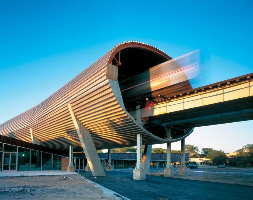
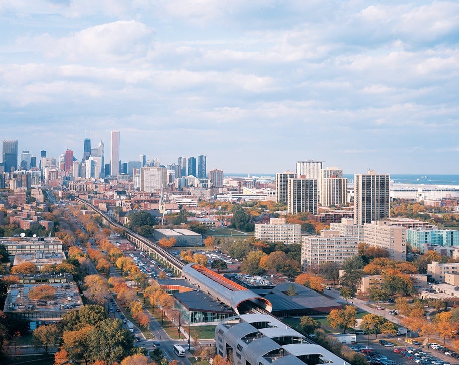
Rem Koolhaas‘s design for The McCormick Tribune Campus Center at Illinois Institute of Technology (IIT) is defined and energized by the presence of the elevated commuter train tracks that run overhead. More than 500 feet long, the tube that Koolhaas devised to carry the train over the roof of the building has already become an icon of Chicago architecture. (It also accounted for nearly a third of the building’s $48.2 million cost.) The enclosure gives people on the train the sensation of riding right through the building. Koolhaas makes the tube plainly visible from inside: its shiny steel-covered underbelly pokes through the ceiling at the north end of the building, looming over the heads of students playing Ping-Pong and video games.
It’s hard to imagine a building site much more awkward, or freighted with symbolism, than the one Koolhaas inherited when he won the competition for a new student center at IIT in 1998. First there was the inconvenient presence of Chicago’s elevated commuter train, which rumbles right over the spot picked for the building. Then there was the fact that the original campus, including the legendary 1956 Crown Hall, is among the best-known work of Modernist legend Ludwig Mies van der Rohe, an architect whose cool perfectionism is a far cry from Koolhaas’s restless, antic style. Those factors would be enough to intimidate any architect, but in typically brash fashion Koolhaas tackled both of them head-on in designing his first freestanding building in the United States. While the other finalists in the high-profile competition, including Peter Eisenman and Zaha Hadid, produced schemes that tried to mitigate the presence of the L train, Koolhaas made it the center of his design. He squeezed a low, broad building directly underneath the tracks, which he wrapped inside a huge sound-insulating concrete tube sheathed in shiny stainless steel and attached to the roof. (A train passes through every six minutes.) The tube makes up the most obvious part of the design’s running commentary on Mies, which veers from reverential to rebellious. The building is shaped like a rectilinear box, but the tube appears to be crushing that classic Miesian shape into deformed submission.
G
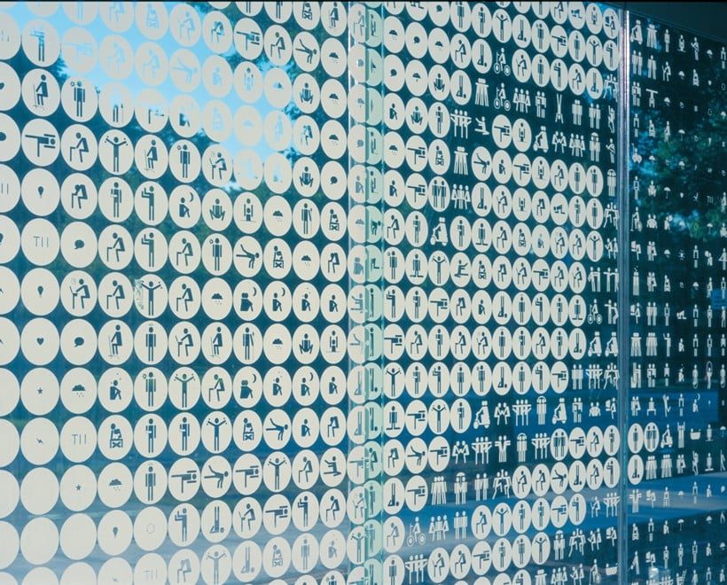
GRAPHICS
Much of the building’s busy flair is derived from the graphic elements that seem to cover every exposed surface. The central element of Rock’s graphic scheme is a stylish, updated stick-figure motif, which he uses throughout the project at both large and small scales. Though Rock’s design looks back to architectural history with a series of homages to Mies (bottom left), it is mostly concerned with engaging a new generation of college students raised on a steady diet of glitzy media imagery. “I think when IIT opened, you could probably assume that everyone would feel very welcome in a highly abstract space such as Crown Hall,” Koolhaas said in a recent interview. “I think that if the current generation [of college students] enters a building like that they would kind of feel a weird absence of information.” There’s no risk of that happening in this building there’s no absence of anything here, except maybe a feeling of quietude.
M
MIES VAN DER ROHE
“I do not respect Mies, Koolhaas,” has written. “I love Mies. Because I do not revere Mies, I’m at odds with his admirers.” That contradictory, even paradoxical, attitude is on full display in the McCormick Center. When visitors enter the building through the main entrance on State Street, they are greeted by two oversize portraits of Mies, both the work of graphic designer Michael Rock and his New York firm 2×4. Other nods to Mies can be seen throughout the building, including a phalanx of uncovered black I-beams. But in the chaotic energy of its interior and its celebration of plain workaday materials, the design suggests that Koolhaas is much less indebted to Mies than to American architects like Frank Gehry and Robert Venturi and Denise Scott Brown. In the battle of Mies’s “Less is more” versus Venturi’s “Less is a bore,” Koolhaas comes down squarely in favor of the latter.
D
DIGITAL CLOCK
Another of Rock’s designs for the McCormick Center is a ten-foot-high digital clock on a wall near the gaming area in the center of the building. Aside from reminding students exactly how late they are for class, it helps dramatize the shifts in scale that are a key aspect of Koolhaas’s scheme. This is a building, after all, that is topped by a gargantuan concrete train tube and dotted with oversized graphics. These elements play against the building’s single-story stature and its ceilings, which appear to press down in several spots. The clock is so big that unless you stand a good distance back from it you don’t even notice it: the closer you get, the more it looks like a lighting element than a way of telling time.
C
COMPUTER LAB
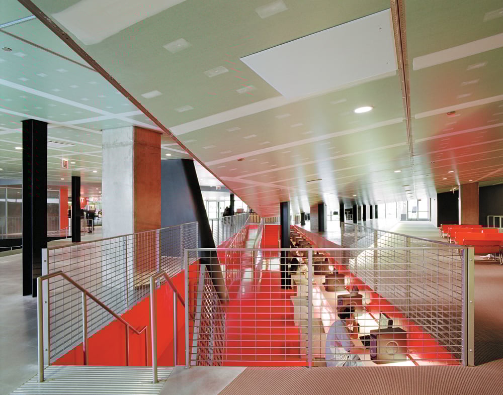
Because the height of the building is limited by the train tracks above, Koolhaas had to carve out a number of areas below grade to provide some spatial variety in the interior. In other words, where in a taller building an architect might produce a dramatic space by giving it a soaring double-height ceiling, Koolhaas did the opposite, pulling the floor out from under students’ feet in several areas of the building. To reach a long, thin row of computers (shown here), students descend a short bank of stairs before checking their e-mail in a space as coolly lit as any Manhattan bar.
O
OUTSIDE
The building was supposed to extend about 30 feet farther to the south (directly to the left in this picture), but that section was scrapped to save money. In its place there is a plot of grass and a sand volleyball pit. When the weather is good, the lounge area will spill outside, underneath an overhang (shown here). From there students will have an up-close look at the Miesian steel support columns that Koolhaas has included along the side of the building. What they won’t be able to see from that spot is one of the student center’s more unpopular features: the black-and-burgundy stenciling that covers the south and north ends of the building. According to the Chicago Sun-Times, it “looks like a retro leopard pattern instead of the wood grain it was supposed to resemble.”
S
SKYLINE
Koolhaas’s student-center building and Gehry’s wildly sculptural new band shell for Grant Park, nearing completion downtown, give the Chicago skyline a new pair of star attractions. In terms of formal chutzpah, the two structures rival anything produced there in a generation. Neither building is vertical, a big shift for a city famous for its downtown core of tightly packed skyscrapers. When IIT first approached a group of high-profile architects to solicit designs for the new student center in a long-neglected central artery of the campus, it asked for a landmark element that would make the building a beacon for the school. They assumed the architects would produce some kind of tower that would be visible for miles around. Koolhaas, never an architect who is comfortable providing what his clients expect, tipped his tower on its side so he could run trains through it.
E
EATING
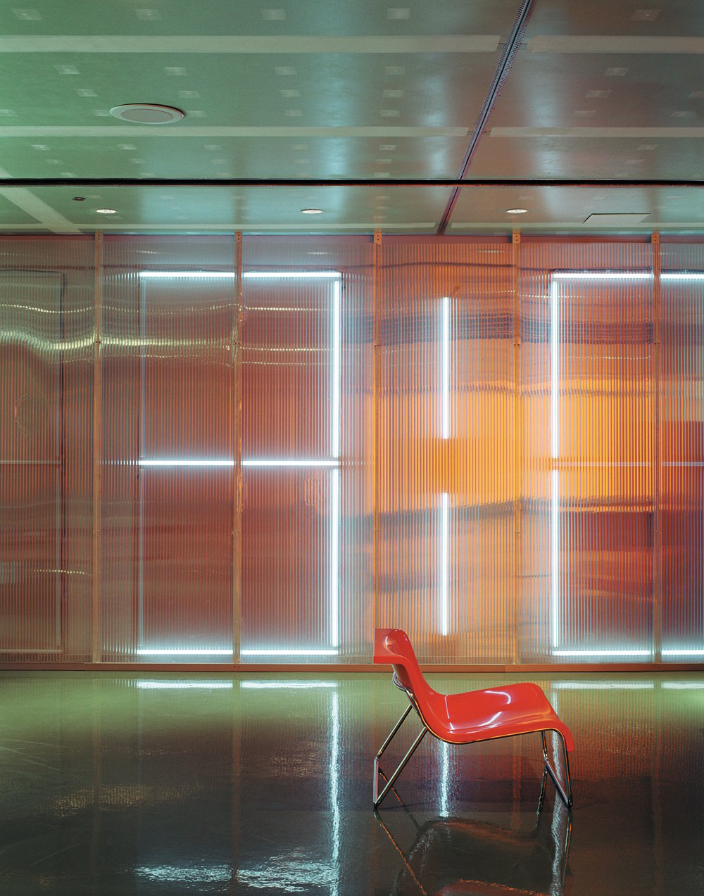
No contemporary student center would be complete without a food court, and Koolhaas has given IIT one of the more dramatic ones on any college campus: a hollowed-out area in the middle of the building that you enter as if stepping down into an amphitheater. (The court was supposed to sit underneath a bowling alley with all-glass walls that sliced across the building. That dramatic gesture was another victim of cost cutting and was replaced by a hanging garden.) The building also includes a more grown-up dining area for faculty (shown here and above), called the University Club. The restaurant is the calmest space in the building. And with its Arne Jacobsen chairs and spare lines, it seems to have been airlifted in from some streamlined midcentury office building. With its floor-to-ceiling glass, it owes a debt to Mies’s Barcelona Pavilion, but the Koolhaas sense of humor still manages to sneak through. For example, the tongue-in-cheek “hearth”, which features a gas fireplace with garishly fake logs plunked down in the middle of a Japanese rock garden.
L
LIGHTING
The lighting, along with the way the building captures and directs natural light, is as inventive as any element of Koolhaas’s design. There is a hallway running along the western edge of the building, for example, that seems to exist just to show off the way the afternoon sun (or the night-time fluorescent lighting) glows through its bright orange walls. And the sunburst made of fluorescent tubes illuminates a short stairway leading to an auditorium, a transitional space that would otherwise be unremarkable, or even banal. Just as with the panels of uncovered green drywall and white spackling that cover the ceiling, Koolhaas is doing his best here to wring some exuberant beauty from the sort of architectural element that usually goes hidden or unnoticed.
You may also enjoy “From the Metropolis Archive: Architects Pollute!”
Would you like to comment on this article? Send your thoughts to: [email protected]


Recent Viewpoints
Viewpoints
3daysofdesign 2026: Vibe Over Spectacle