April 16, 2019
New Color Technologies Are Challenging CMYK’s Hegemony
Color Library: Research into Color Reproduction and Printing shows how new color printing advances are blurring the lines between color reality, representation, and reproduction.
Any graphic designer, and at least some of the general public, can tell you that most printed color we encounter every day uses the four-color CMYK model. From the base inks cyan, magenta, yellow, and key (usually black), the full range of human-perceived pigment can be generated, it is said. While these inks have been the norm of color printing for over a century, trials with different color models and new techniques—especially “spot” printing—have complicated the conventions of printing and reshaped our relationship with color.
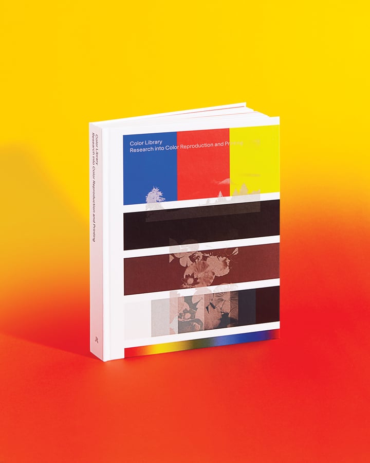
Color Library, an online tool and attendant book (DAP, 2018) on pioneering printing capabilities, is one such effort. It represents a culmination of Workflow, initiated in 2014 by visiting studio Maximage at ECAL/ University of Art and Design Lausanne. “It shows potential users a collection of separate plug-ins, which are simply color profiles for converting colors for printing, arranged for ease of use,” writes Manon Bruet of the web tool in one of the book’s collected essays, contrasting its provisions with those of the default CMYK profiles.
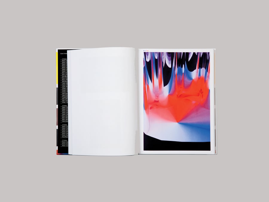
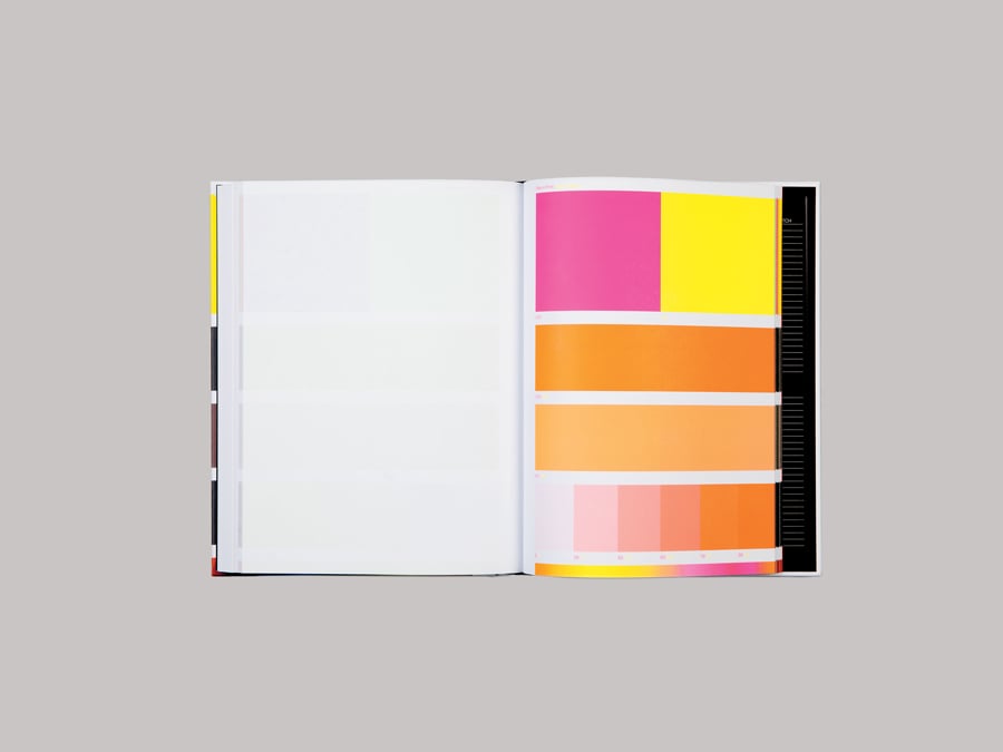
“Color Library profiles are special insofar as they use a calculator to separate an image into a certain number of specific colors,” Bruet continues. “Now there are profiles with between two and five shades, which allow a much wider color spectrum to be reproduced.” Flip through the first half of the Color Library volume and you’ll find conceptual photographs by Zurich-based Shirana Shahbazi printed scores of times, each iteration using a different combination of CMYK and spot color models, plus metallics, neons, and pastels. Images of a mountain view and water lilies are printed in blue, neon green, and red; or in blue pastel, red pastel, silver, and yellow pastel. A more abstracted form is printed in black, cyan, gold, magenta, and yellow.
To what end? While the reign of the four-color offset seems likely to persist because of its affordability and ease of use, its legitimacy—indeed, its hegemony—is under threat from alternatives like Color Library, which promise solutions to problems such as dark-color accuracy and the printing of luminance. “One of the dreams we had was that printing would become a science and industry rather than a craft,” recalls researcher Franz Sigg in another of the book’s essays, in which he reflects on the historical evolution of color reproduction. “But now we have achieved this dream.” Color Library’s price, specificity, and technical demands may render its offerings inaccessible or unimportant to some designers, but if these experiments help challenge our long-held notions of color, it’ll be worth the paper it’s printed on
You may also enjoy “Two North Carolina Exhibitions Bring New Lenses to Familiar Design Conversations.”
Would you like to comment on this article? Send your thoughts to: [email protected]
Recent Viewpoints
Viewpoints
11 Tools Transforming Sustainable Design


