November 20, 2017
This Firm Designed 26 Design Within Reach Stores—Here’s What They’ve Learned
With a book examining his six-year collaboration with Design Within Reach, DFA founder Laith Sayigh talks about building a narrative through design and keeping a local perspective.
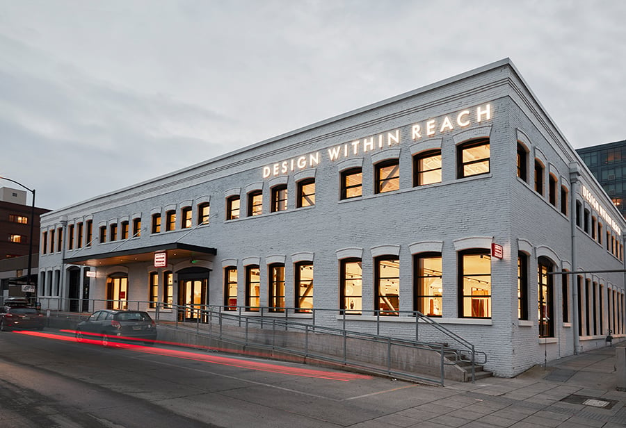
Since its founding in 2013, the multidisciplinary New York firm DFA has explored everything from commercial spaces to prefab residences and imaginative conceptual designs. With its pragmatic, research- and service-oriented approach, the firm has established a long-running relationship with Design Within Reach, creating some two dozen DWR stores across the U.S. By reimagining an architectural mishmash of structures into a coherent brand statement, DFA has shown the power a few carefully chosen design moves can make in a variety of situations. Metropolis talked to DFA founder and principal Laith Sayigh about establishing a narrative through design and the importance of keeping a local perspective.
Your firm’s first book looks at your first six years of working with Design Within Reach. Before we get into that collaboration, what’s different about the way DFA approaches a design problem?
One of the things I really wanted to knock on the head when I started the firm was delivering projects that are realistic, that worked very much within the budget of the client, and also deliver them imaginative, exciting, smart solution to their sequence of issues or requirements. Success in design but success in delivery were two very important factors for us.
How do you make sure you’re designing projects you can deliver?
We try not to do too many moves. One of the issues that comes up, potentially, for a lot of architects is trying to achieve too much out of every single project that they do. We’ve always said ourselves: two great moves—maximum—in any given project and deliver it well and deliver it successfully.
What were the concerns and moves you identified for Design Within Reach?
When we started, one of the big issues for them was there was absolutely no merchandising vision. The stores really fell a little bit like furniture warehouses.
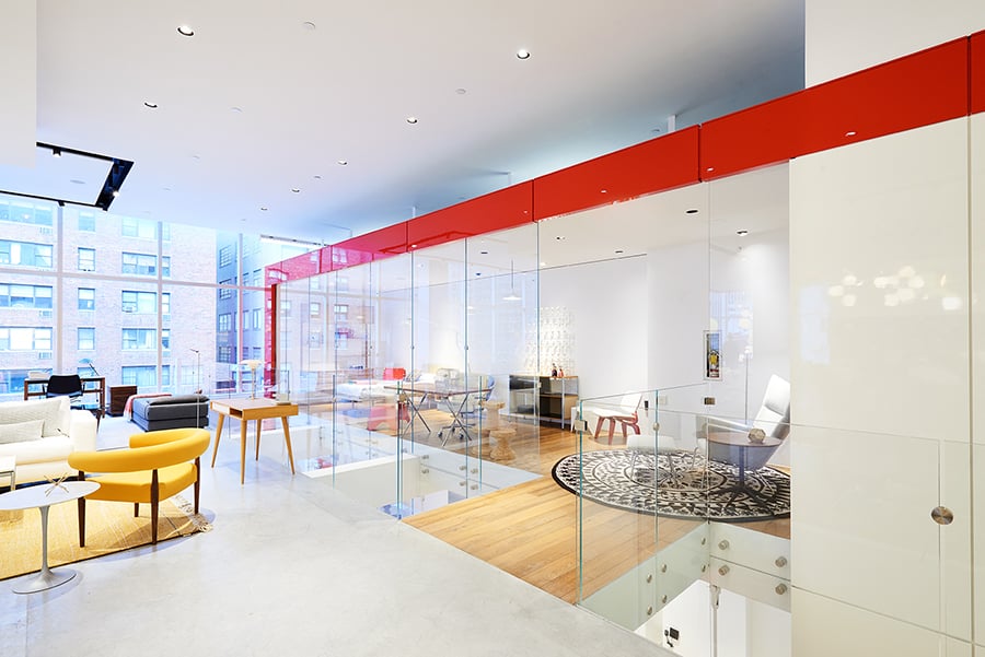
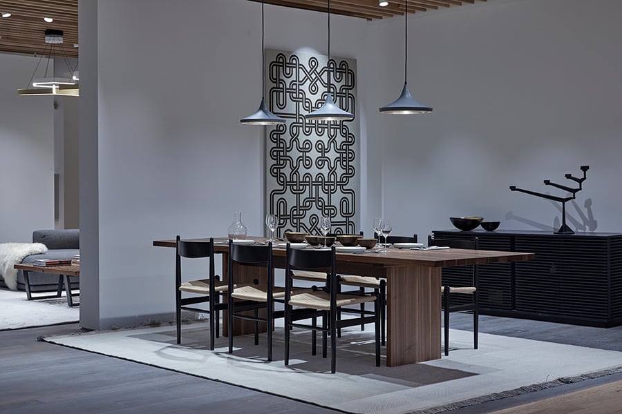
So we came up with this concept of creating “houses” for them. We realized they really needed to start to selling lifestyle, which was, even back then, a pretty common trend that was coming out in retail. A house consisted of a bedroom, a living room, a dining room, and a study. It really helped show the clients how all the product would all be put together in relation to a home.
What architectural moves did you use to create this sense of “home”?
We decided we would create a sequence of dropped ceilings that would have all the lighting in. And they really delineated the space of the house.
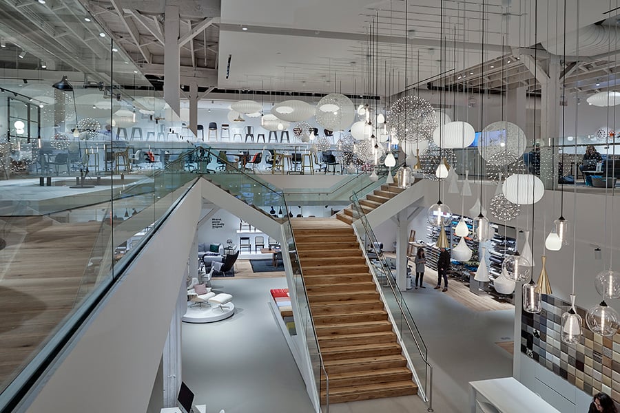
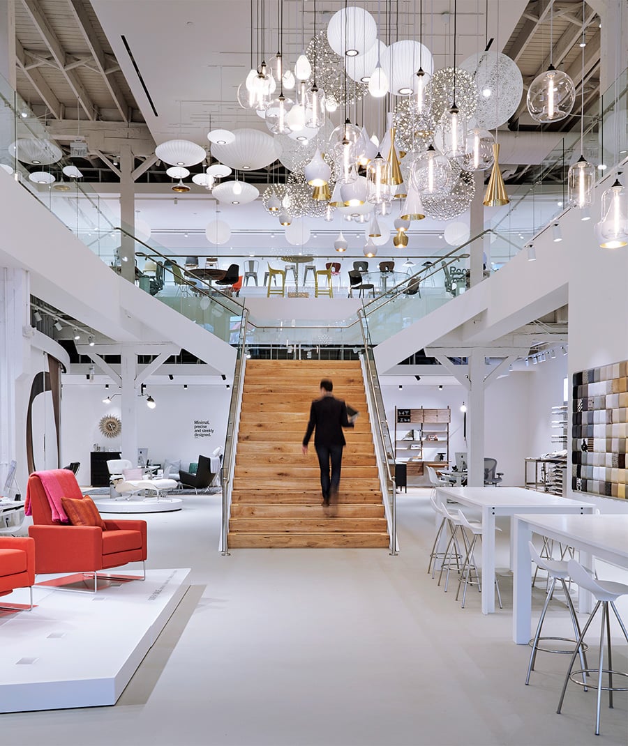
We also created things like a lighting cloud. They sell this incredible selection of pendants. When we were going into their stores they would have one or two lights in there hanging precariously. They felt very lost, the scale of them was just really inappropriate for the size of the stores. Immediately we said, wouldn’t it be terrific if we did these large sequences hanging lights, where you see 100, 150, sometimes 200 lights all in an incredible array—which really sort of gives you that “wow” moment when you go into the store.
So it’s really about highlighting the product?
Correct. We quickly learned that Maharam and Edelman Leather—there’s all these different fabric companies that they represented that any piece of furniture could be upholstered. We really wanted to bring that to the front. That then spawned the idea of the Swatch Wall, which are these beautiful Technicolor walls of swatches when you come into the store. It’s essentially a sequence of upholstered blocks that are removable and you can walk round the store with them—and start to get a real sense of the fact that every single piece of furniture could be done in literally hundreds of different fabrics.
You also brought a local element to each store. How did you achieve that?
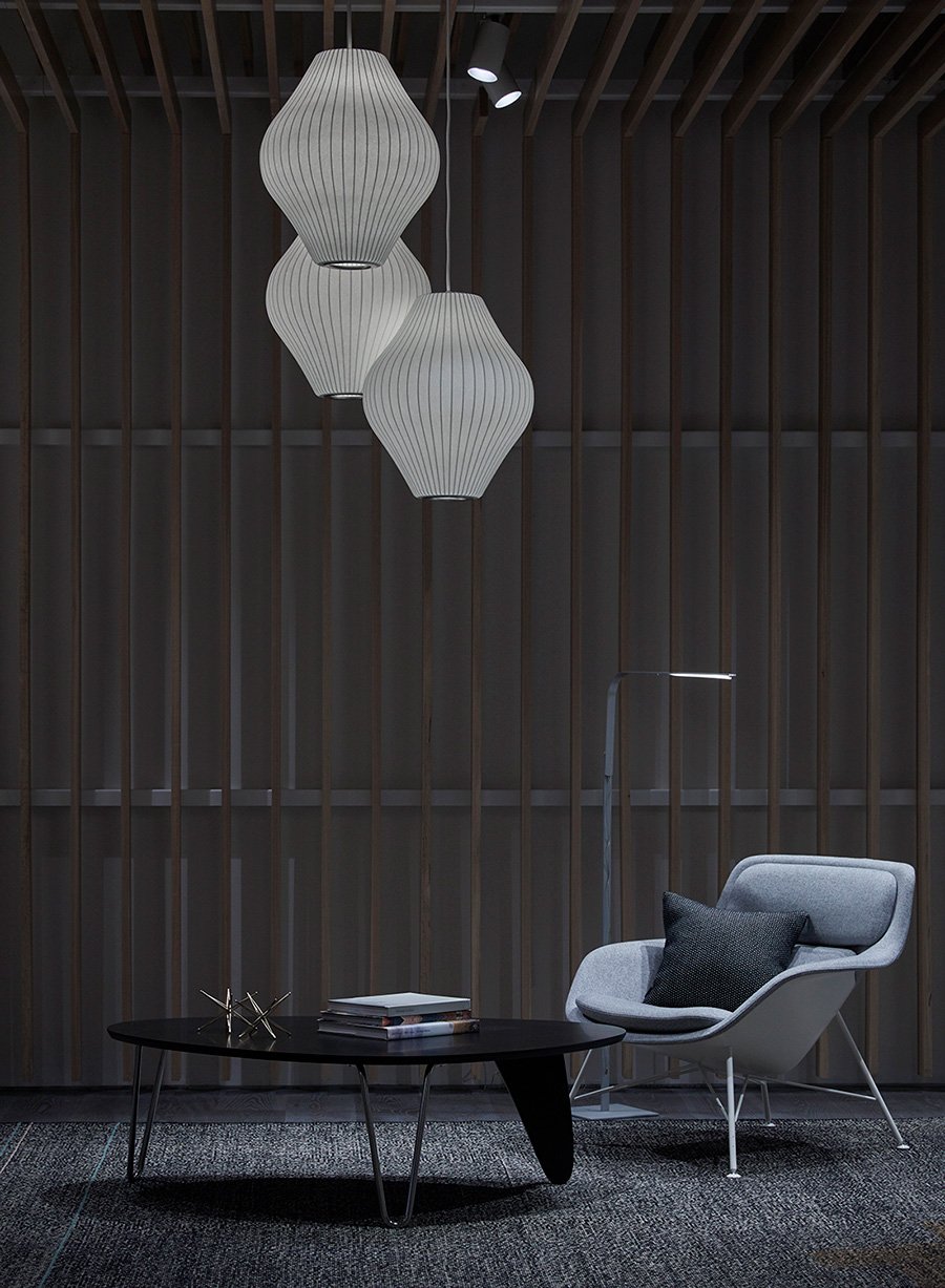
Portland was one of the first locations where we decided to do what we called an elevated house, where we really pulled out all the stops. We did a local white oak slatted ceiling, we found a local pumice stone to put on the floor and made it feel, from a materiality kind of perspective, very local and very part of the Portland fabric, but still contemporary.
What are some recent trends in retail that you’re bringing into your commercial projects?
Recently there had been quite a large trend in the retail and restaurant industry for “more is better,” there was a tremendous amount of work out there that seemed incredibly visually crowded. One of the things that I’m now feeling and now sensing is there’s a shift back to simpler, cleaner, more focused spaces.
What are some takeaways from the collaboration you’ll bring to other projects?
We always look at the narrative in a project: What’s the story we are trying to tell? What are we trying to do, what are we trying to create visually, emotionally?
You’ve recently released conceptual designs for a sustainable tower in Central Park and plans for towers on Manhattan’s West Side. How do these projects at different scales play off of each other?
When you’re designing a house or when you’re designing, you know, one of the towers is 60 stories high on Pier 40, it really all kind of comes down to details and the basic concept. I don’t see a huge difference between designing a 2,000-square-foot house and designing an 86-story building. The basic details and elements of concept for it are not that far apart.
You may also enjoy “Does Apple’s New Chicago Store Have Something to Say About the Future of Cities?“
Recent Viewpoints
Viewpoints
11 Tools Transforming Sustainable Design


