May 28, 2015
Digital Mapping, a Powerful Tool for Analyzing Any Site
Digital mapping can be a powerful tool for analyzing a site’s biophysical and social context.
The Green Team’s last post examined how site history plays out in design. Here we consider landscape diagrams as a tool for analyzing a site’s bio-physical and social context.
The maps created by landscape architects are tools for looking at the big picture. They are diagrams, distilling data to reveal spatial structure and function. Each piece of information is a layer—water, topography, pavement, utility lines—and we turn on layers, either one at a time or overlaying them, to illustrate the built environment.
Ian McHarg is credited with establishing this tradition in the 1970s and 1980s, when he and his students did this work by hand, believing that overlaying various maps full of information would reveal a design strategy. Today, GIS and programs like ArcMap allow us to turn all of these layers on and off with a click of a mouse. Mapping has become a powerful tool for informing us about bio-physical and social landscape factors. Beautifully rendered and interactive examples abound online. One of my favorites is Morphocode’s interactive map Urban Layers, which takes a single layer of information—building date—and color codes Manhattan’s 45,968 structures, revealing historic buildings embedded in the city’s fabric.
Our maps are tailored to learn specific information pertinent to considering a site’s future. We recently employed these techniques in a series of research and analytic studies for our “Vision Plan for the East River Esplanade,” a project completed in 2014 for CIVITAS. The Vision Plan’s study area spanned three and a half miles along the East River, from 60th to 125th streets, one of the oldest portions of the Manhattan Waterfront Greenway. The goal of the study was to assess the area’s aging infrastructure and seawall, as well as identify opportunities and constraints in rebuilding an esplanade that connects people to the riverfront. To do this, we utilized GIS datasets from New York City Open Data and Bytes of the Big Apple, as well as FEMA, USGS and the Mannahatta Project.

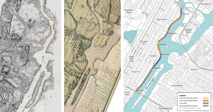
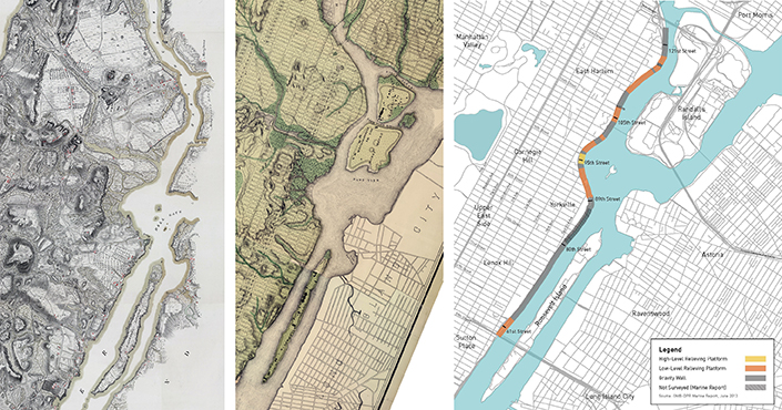
Our firm’s Vision Plan for the East River Esplanade examined the three-and-a-half mile area along the East River from 60th Street to 125th Street and its evolution from the natural river’s edge shown in historic maps to the hardened edge of relieving platforms and gravity walls that it is today.
Credit: Historic Maps, New York Public Library and Esplanade Structure Type Diagram, Mathews Nielsen
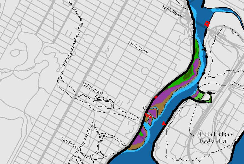
To understand the landscape evolution leading to the esplanade’s present-day hardened edge, we went back to 1609 using data from the Mannahatta Project. Combining historic ecological conditions, the borough’s mean high water line, and the street grid allowed us to create a novel cut and fill diagram. In this map, a black outline surrounds wetland areas that were drained and filled, whereas the areas in color show the vegetated earthen banks and stone outcroppings that had been replaced with seawall (Image 2). We learned about marine life habitats that had been cut back as the shoreline was reconfigured for shipping and industry. In the northern extents of the project area, the map revealed that Pension’s Creek, a significant tributary of the East River, was buried (Image 3).

Historic ecological conditions overlaid on the present-day street grid create a novel cut and fill diagram (right). The black outline represents areas that have been filled in, whereas the remaining areas of color show what has been removed over time.
Credit: Mathews Nielsen

This zoom-in on the project area’s northern extents shows pre-development marshland and coastal forests lost with the reconfiguration of the shoreline. The meandering black line traces the path of Pension’s Creek, an East River tributary that had been buried with the development of the neighborhood.
Mathews Nielsen
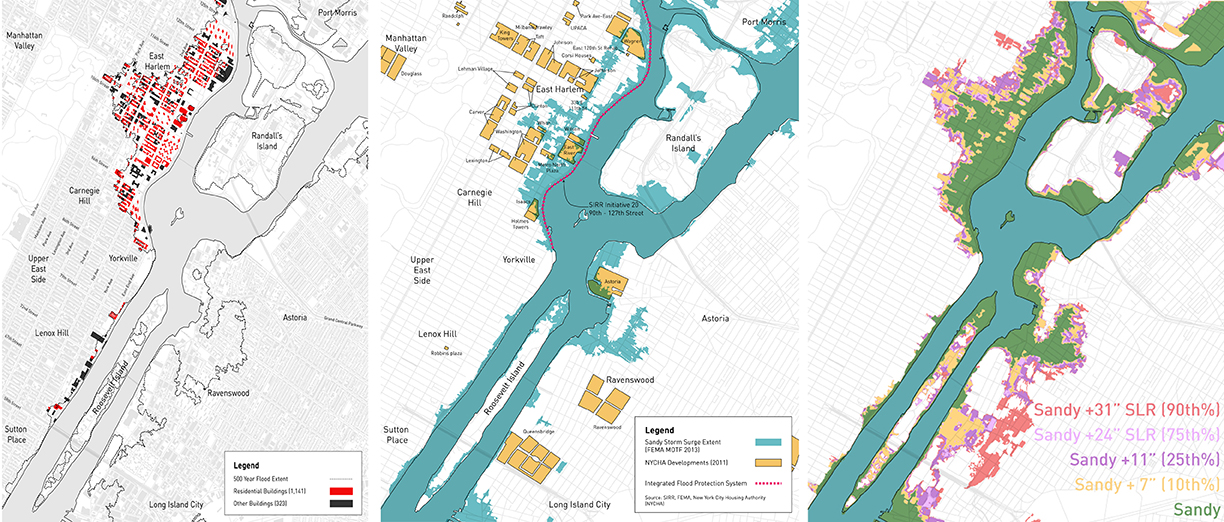
A former marshland adjacent to active tidal straits, East Harlem’s low elevation makes it vulnerable to flooding. The neighborhood was one of the largest contiguously flooded areas in Manhattan during Superstorm Sandy. Seeking to assess flooding risks to structures, we mapped buildings in the 100- and 500-year flood plain. We used the color red to differentiate residences from other structures. It was eye-opening to see the number of people who live in the floodplain. Of these buildings, we isolated NYC Housing Authority properties and showed them with Sandy flood data to highlight the relative vulnerability of these residences (Image 4).The resulting maps led us to prioritize this area in discussions about the esplanade’s future.

Buildings in the 500-year floodplain (left) are categorized by residential (in red) and other. By isolating properties owned by the NYC Housing Authority and overlaying them with Sandy storm surge extents (middle), our firm identified vulnerable parts of the study area. Combining flood data with sea-level-rise projections (right) showed an expanded area of flood liability.
Mathews Nielsen
The diagramming process gave us an understanding of the contextual environment of the esplanade and a way to think about riverfront not as an isolated place but as part of the fabric of New York. Putting the project area on the map with other public spaces, or nodes, like parkland and circulation corridors such as bike lanes, subways, and ferries, revealed the potential for a stronger, more accessible network.
These maps became our tools for learning and a communication. As part of an eight-month outreach process with CIVITAS, we met with community members of the Upper East Side and East Harlem who live along the river’s edge. These meetings were opportunities for us to supplement our research by listening and gaining an understanding of the personal mental maps park-goers develop based on their individual everyday experiences. This combination of data analysis and outreach formed the basis of a comprehensive vision for the East River Esplanade, one that considered both short and long term possibilities for a valued public space.
Katherine Cannella, ASLA, joined Mathews Nielsen in 2014. She is excited to be back in New York City, running over the Brooklyn Bridge and picnicking in Prospect Park, after three years of living in sunny Charlottesville, Virginia, where she received her Master of Landscape Architecture at the University of Virginia.
This is one in a series of Metropolis blogs written by members of Mathews Nielsen Landscape Architects’ Green Team, which focuses on research as the groundswell of effective landscape design and implementation. Addressing the design challenges the Green Team encounters and how it resolves them, the series shares the team’s research in response to project constraints and questions that emerge, revealing their solutions. Along the way, the team also shares its knowledge about plants, geography, stormwater, sustainability, materials, and more.
Follow Mathews Nielsen Landscape Architects on Twitter at @mathewsnielsen and Instagram at mathewsnielsen.
Recent Viewpoints
Viewpoints
The Stories Moving Our Industry Forward


