December 30, 2014
Graves Retrospective Spans Half Century of Failures and Triumphs
A reflection on a half century of architect Michael Graves’s work spans failures and triumphs.

Often Graves’s tableware takes on the proportions of a building. In turn, buildings are often simplified to the level of tableware. Above: Denver Central Library, South Facade (1993).
Courtesy Michael Graves Associates
“It’s been fifty years of more is more,” says Karen Nichols, a principal of Michael Graves & Associates, reiterating an aphorism Graves has taken a liking to in recent years. She is standing in front of an exhibition board in the retrospective, Michael Graves: Past as Prologue, which is currently on show at the Grounds for Sculpture in New Jersey. Nichols joined the firm in 1977, precisely the time when her employer made the fateful and rather lucrative pivot towards Postmodernism. The text on the exhibition wall behind her pinpoints The Big Break to the same year, depicting it with two like-minded projects. The first is the built Plocek House (1977), which originated the hide-the-keystone game Graves has been playing ever since. The other, the unrealized scheme for the Fargo-Moorhead Cultural Center Bridge (1977–1978), intended to enlighten the twin midwestern communities with a dose of the Enlightenment architect Claude Nicolas Ledoux’s architecture parlante.
To hear Nichols (and Graves) tell it now, it’s as if Graves were always more Venturian than Venturi, from his earliest neo-Corbusian villas, up through the pedimented temple he built for Disney in 1988. The truth is, Graves—the Cubist, the classicist, and the caricaturist—has always had a hard time saying “No.”
At times, this kitchen-sink approach has produced felicitous, even lyrical, results, as a scale model of the Humana Building (1983)—a better-proportioned, comelier iteration of the Portland Building (1978–1982), adorned with a Constructivist crown—and accompanying photos illustrate. (Nichols jokes that the Miesian tower that flanks Humana is the box the latter was delivered in.) Less affirming is the hokey synthesis of the Fargo-Moorhead project and the Portland Building’s repressed expressionism, represented in the show by a cookie tin, of all things. And the abominable compositions of the Disney projects cannot be overstated—25 years on, the Walt Disney World Swan Hotel (1988–1989) still finds new ways to offend. Somewhere in the chain, the excesses pile up and the stench sets in, as Graves’s buildings begin incorporating neo-Fascist elevations, complete with rounded columns and shallow arches. The finger can surely be pointed in the direction of Speer-apologist Leon Krier, who helped Graves shake off Le Corbusier.
It proved to be a momentous relationship for Graves, on par with his future collaborations with Michael Eisner, Alberto Alessi (whom we can thank for the bird-whistle tea kettle), and Ron Johnson, who was vice president of merchandising for Target when he met the architect in 1997. At the time, the Target company had underwritten the renovation of the Washington Monument, for which Graves had designed the scaffolding. It easily ranks among his best work, effortlessly subverting the funerary air typically associated with the nation’s First Phallus. It also opened the door to what Target termed the “democratization of design,” a collection of a half dozen Graves-designed household products that ballooned to a list of 2,000 wares by 2012, when the partnership was dissolved.

The Big Dripper, a ceramic drip coffeemaker designed for Swid Powell (1986).
Courtesy Michael Graves Design Group
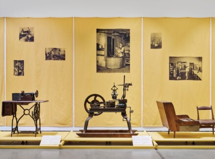
The exhibition devotes nearly an entire wing to this production, almost equal the space given over to the architecture. Racks of neatly lined models—made from the sculpting material RenShape— elevate pots, pans, and cuppery into minor art. Nearby, the actual retailed products are encased in glass, framed for aesthetic contemplation. Never before has a fondue pot been invested with this much weight.
The curation may be bumbling, but it accurately conveys the seriousness and good-naturedness of Graves’s practice. His pursuit for making good (but only occasionally great) design affordable is admirably genuine, so when he says as much—as he did in the old Target TV ads— you believe him. It’s no wonder the buildings ape the tea kettles and coffeemakers. This is, of course, the paradox of Graves’s work and of Postmodernism in general. His architecture, often cheerily dispositioned and slathered with metaphoric content, assigns humanist meaning to places and spaces where there is none. The scale is usually gargantuan, the form leadingly anthropomorphic, but the building entirely ambivalent towards its own occupants. Or with his newer projects, like the casino-city Sentosa in Singapore, the architecture whittles down the complexity of human interaction to a handful of activities, namely consumption and exchange. No number of Graves’s lovely murals, which he often populates his buildings with, could dignify this place.

Graves designed the 500-ton scaffolding for the Washington Monument originally in the late 1990s. The system was repurposed in 2013 amid repairs to the monument’s marble face.
Courtesy Michael Graves & Associates
The product design picks up some of this slack. The proportions and shapes may be exaggerated, but they engage their users in ways the architecture can’t. Graves often recalls an anecdote about how a morose French poet sent him a letter, stating that his typically gloomy mornings are brightened up by the siren song of his Alessi tea kettle. The message? Design can only do so much, but it can provide moments of levity and escape in a seemingly incorrigible world. And maybe that’s enough.
But, for Graves, who has been paralyzed from the waist down since 2003, it clearly isn’t. In the last decade, he has committed a part of his design firm to the hospital and health-care sector. Pairings with the medical-technology firm Stryker have sought to remove the sterile stigma attached to the patient room. Their assertion that thoughtful design can actually have medical results such as reducing infection, as is the claim with the Stryker Prime TC wheelchair, may be spurious. But the designers’ efforts are noble, pointing towards an area where design is very much needed, and can have an effect beyond putting a momentary smile on your face. In the end, it underscores the most poignant of Graves’s themes: We should all have nice things.

A bread-shaped toaster designed for J.C. Penney (2013). Michael Graves Design Group partnered with the retailer after severing ties with Target.
Courtesy Michael Graves Design Group
Recent Viewpoints
Viewpoints
The Stories Moving Our Industry Forward


