October 7, 2020
From the British Melting Pot, “New London Fabulous” Emerges
The slew of recent projects emphasize color’s capacity to bring joy to the public sphere. Just don’t call it a movement.
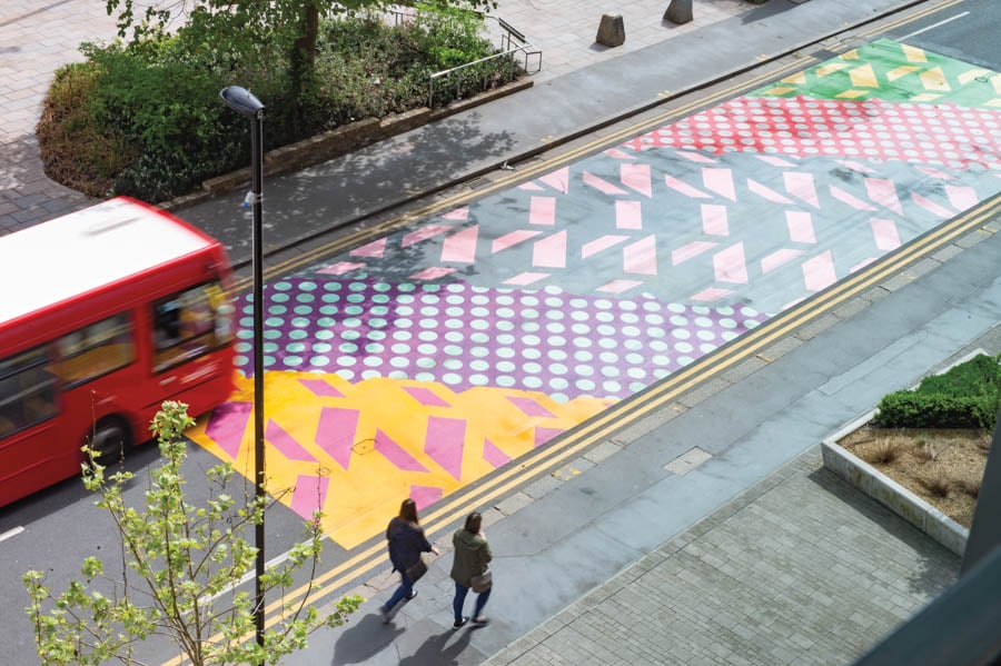
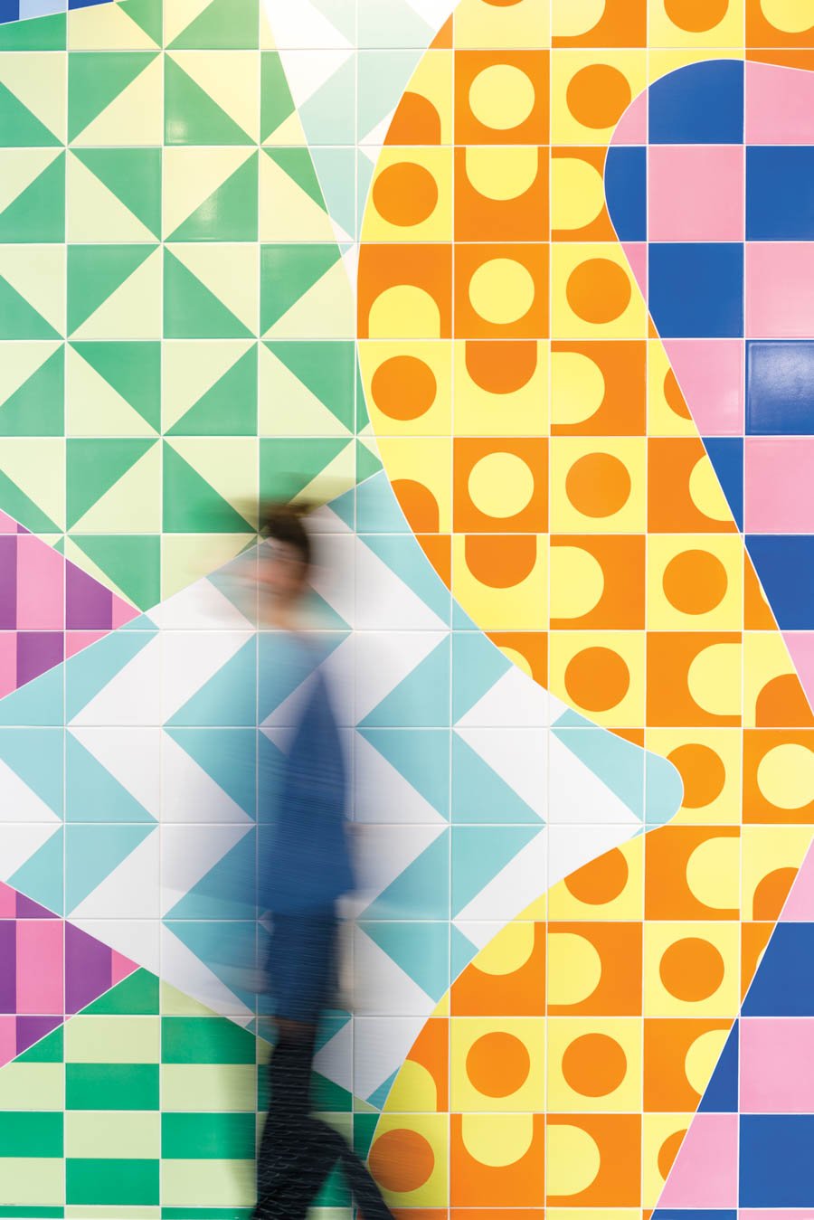
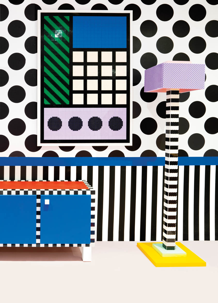
In May, designer Adam Nathaniel Furman participated in a talk in which he lamented the rigidity of design education, arguing that it “brainwashes” students into believing that monochromatic minimalism is the epitome of good taste. He pointed instead to a handful of designers working in London—Yinka Ilori, Camille Walala, and Morag Myerscough among them—who he said reject this attitude, instead embracing color, pattern, and ornamentation. He dubbed the results “New London Fabulous.”
Such work has become increasingly visible in recent years, particularly in the public realm. But speaking to me in July, Furman emphasized that he isn’t labeling this a movement; rather, he is noting an emergence over the past few years of practitioners with a similar approach and career trajectory. “It’s a group that has risen without the support of the usual gatekeepers, that has used social media to reach their audiences and proven they are popular without the need for anointing,” he says. “They’ve often been commissioned by marketing teams of festivals, commercial events, councils, and developers, which critics often sneer at as colorful gentrification-wash.” The critical ire that Furman refers to relates to New London Fabulous’s commercial appeal and mainstream popularity, unlike the stripped-down, muted designs of the most lauded private residential or office interiors.
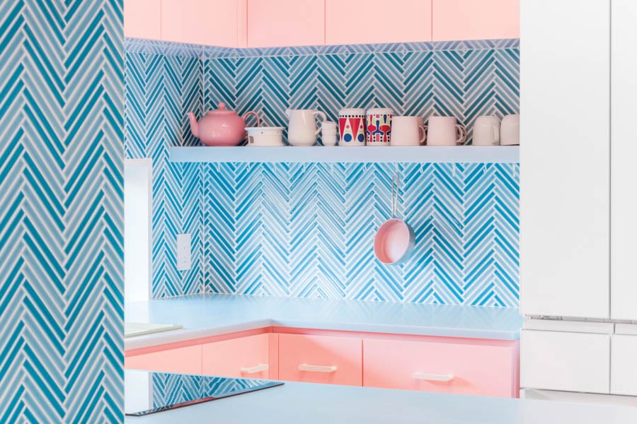
And there is a reason why it has proved popular. Myerscough, who has been carrying this flag the longest, has been arguing for the importance of color in well-being since she set up her studio in 1993, applying it to everything from urban installations to health-care and educational projects. “A lot of people are afraid of color and don’t seem to understand it, but in harsh urban environments, it is plain to see the joy it brings people,” she says.
Furman says there has long been a tendency to dismiss colorful, patterned work as unserious or mere decoration, especially as it has often been associated with women or queer designers. Then there was Postmodernism. The work he calls “New London Fabulous” is often accused of rehashing the aesthetic of the 1970s and ’80s movement without its initial political or theoretical underpinnings and without the wink that indicates you’re in on a joke, he explains.
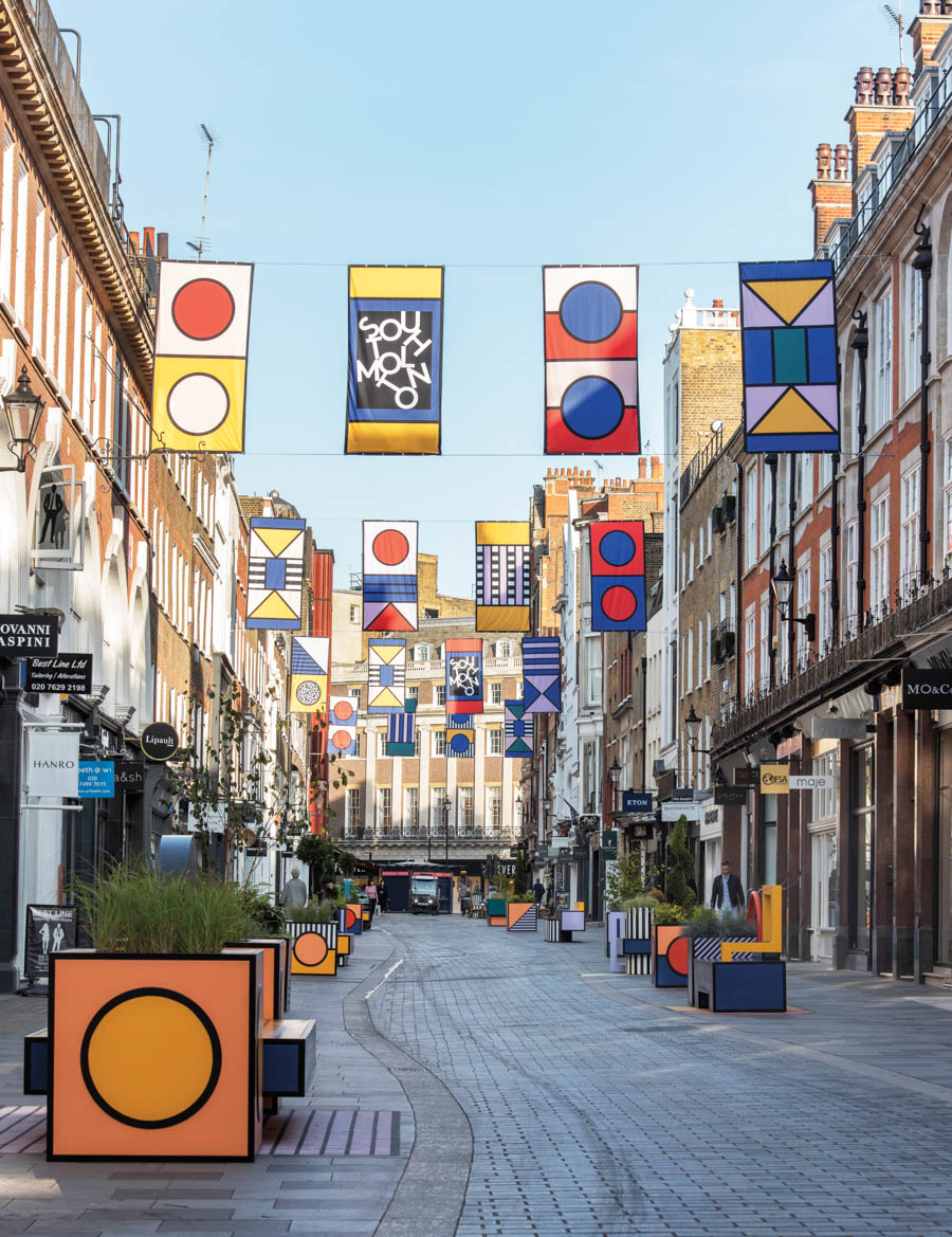
The sincerity of such work often frustrates critics, Furman continues—“They can’t handle the lack of ironic distance”— but disagrees that it lacks political significance. “This shift is partly the result of London being a melting pot. You have incredible European designers who have come here over the past 15 years, as well as second- and third-generation immigrants who are finally entering a design world that was traditionally not welcoming.”

Walala, who was born in France, agrees: “Lots of immigrants coming to London bring excitement and hunger for color. We are all in London but take inspiration from all over the world and lots of different bits of history and architecture.” Her graphic murals and street furniture are unmissable and will soon take on dramatic new form as a crowd-funded mural along the shopfronts of east London’s Leyton High Road, which will be called Walala Parade.
In this narrative about diversity and immigration, though, there’s a looming danger of oversimplification—of equating maximalism and exuberance with specific groups of people, effectively ghettoizing their work and leaving no room for individuality. Furman argues, however, that his very point is to challenge homogeneity and to celebrate a public realm that better reflects London’s diversity. “The domination of the visual language of one tiny portion of the human population has erased everyone else’s visual representation,” he says. “I think there’s an understanding that that is over.”
You may also enjoy “In Defense of Decoration”
Would you like to comment on this article? Send your thoughts to: [email protected]
Register here for Metropolis Webinars
Connect with experts and design leaders on the most important conversations of the day.
Recent Viewpoints
Viewpoints
11 Tools Transforming Sustainable Design


