January 6, 2015
Textile Designers Scholten & Baijings Break Down Their Process
In the course of developing textiles together, Maharam helps Scholten & Baijings articulate the story of their design process.
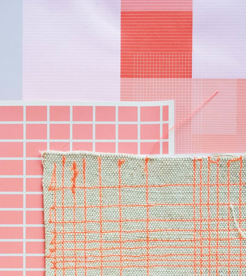
Computer prints and a textile sample for blocks and Grid, from June 2012.
All images courtesy Scheltens & Abbenes
Behind the subtly hued, restrained products designed by the Amsterdam-based duo Scholten & Baijings lies a surprisingly messy process. “We work in the atelier way, the so-called dirty-hands method,” says Carole Baijings, “so we can explore all of the possibilities of the material and technique.” The journey is one of constant refinement, culminating in designs that have given Baijings and her partner, Stefan Scholten, a reputation for both precise production methods and color.
In a recent collaboration with the textile company Maharam, this process was as interesting to the client as the two collections of upholstery fabric—Blocks and Grid—that came out of it. Maharam first created a booklet about the development of its fabrics, then helped expand it into a monograph on the design studio’s career, Reproducing Scholten & Baijings (Phaidon Press Limited), which will be released next month.
“Carole and Stefan stand tall in their own rigorous and modern way,” says Michael Maharam, the CEO of Maharam, in the introduction to the book. “They are clever organizers and excellent makers. Importantly, they bring unexpected and striking color to the mix, and couple it with a studied approach to pattern.”

Reproducing Scholten & Baijings
Courtesy Phaidon Press
Blocks and Grid both represent a new approach to upholstery, each produced in 92 percent wool in lengths of 27.6 feet. The sense of scale and depth is achieved in Blocks by the illusion of transparent layers, and in Grid by the changes in density of an overlaid pattern. Because of the large size of the design, every upholstered piece of furniture will look unique.
The hallmark of a great creative journey, however, is not just the final result, but the ideas generated along the way—a third collection of fabrics for Maharam, Tones, will come out of the samples created for the first two designs. “By having this collaboration with Maharam, we found that our way of working is special,” Baijings says. Reflecting on the process—as she does in the following pages—has been a rewarding experience: “It’s scary because we show everything, but it’s nice for consumers to see what’s behind the process. That’s special.” —Avinash Rajagopal
Scroll down to read Carole Baijings’s explanation of the textile design process.

Individual color proofs for the gray version of the blocks design, from September 2013.
Diving In
It’s important to get one’s hands dirty in the early stages of a project.
“We’ve produced a lot of textiles before this, but they were always products like a cushion or towel, and that’s different. We were first introduced to Michael Maharam by [the interior designer] Ilse Crawford. He asked us to design upholstery fabric using geometric shapes, and color blocking, but he also gave us carte blanche to do what we thought was important. I think that’s every designer’s dream—then you get the best out of yourself, because you have both a good brief and the client’s trust.
We always start with sketches, but then immediately start making our own materials, so a lot of the examples that you see in the images are samples we made. We stitched a grid on Tyvek, fabric, and printed paper. We also looked for good layering, and examined the dimensions of the grid and colorways. Some of the samples had totally different kinds of color scales.
What’s special for us is that at the TextielMuseum in Tilburg, the Netherlands, they have the TextielLab where designers can work. Their [sampling] machine is one that nobody else in the industry has. We made our own samples, then we went to the museum and checked that what we think is nice is, in fact, nice—at least in the first samples.”
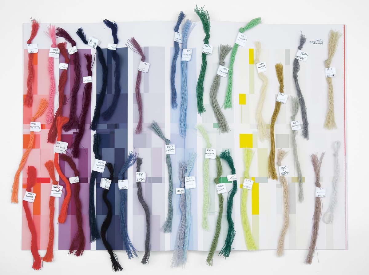
Matching yarns for the blocks color scheme at the mill in January 2013.
Being Picky
Making particular material choices during the production process can pay off in the end.
“Working with color can become very difficult because companies and craftsmen tend to use standard colors and are often not prepared to investigate new ones.
We go back to this special place—it’s an old glass house in the Netherlands— where this guy has thousands of cardboard boxes of yarns from mills that aren’t there anymore. We just go there and find what kinds of colors we like. Of course the textile museum has colors, but we really think in terms of colors, and we already know exactly by heart what we’re looking for. So it’s important to go there to find the yarn that we want. What also makes a difference is that, when we come to the mill, we have this piece of the textile that’s already been made. Then it’s really hard for them to say that it’s not possible.
We were able to work with one of the best mills in the world. It has many more yarns in the machines, of course, so it’s much more refined. Our final textile has a very nice touch, and, at the same time, it’s super strong, because we are able to work with this mill.
The warp was very important. In the beginning, we had the warp in just one color and everything became quite beige. We said, ‘No, that’s not the idea.’ Different colorings of the warp, together with the weft, gave a different result.”
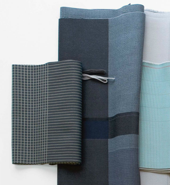
The gray and blue versions of both Grid and Blocks.
Valuing Subtlety
When it comes to color, shifts in brightness and texture can have a profound impact.
“Maharam was one of the best companies to help us get to the next level because it understands the importance of color.
For Blocks, we tried to use colors that were overlapping, almost blending into each other as if they were painted—like when you look at a landscape and see that the colors, the greens and the blues, are all different. But then you have them all in one upholstery fabric.
In Grid, we wanted to create different degrees of transparency. It remains graphic, but you can also apply the fabric to rounded forms because the density of the grid determines how one sees the color. When the grid gets denser, the color almost glows.
We said it’s important in the collection that we create one pattern for Blocks and one pattern for Grid that are each transferred into different colorways.
But, for example, if you make Blocks red, then you need less red to have a nice landscape. In the yellow version, you can have more blocks that are lighter. They are the same patterns, but in every pattern, with each color, we choose how many bright portions we need. We do this so that the same blocks aren’t bright in all the textiles. In that sense, we really ended up making a different design for every color.”

The final prototype for the red version of the blocks fabric, displayed at the Textiel Museum in August 2012. The museum has a lab that allows designers to make early samples of textiles.
Hanging On
A good concept needs to be closely nurtured throughout the journey.
“For both textiles, we wanted to design a nine-meter-size pattern; that’s about the dimension you need to upholster a two-and-a-half- or three-meter sofa. We didn’t want any repeat of pattern in this sofa. In the initial phase, we made a lot of cardboard models to see the fabric on all different kinds of sofas. The models were made before we went to the textile lab, so that we could still make adjustments to see it work on a small scale.
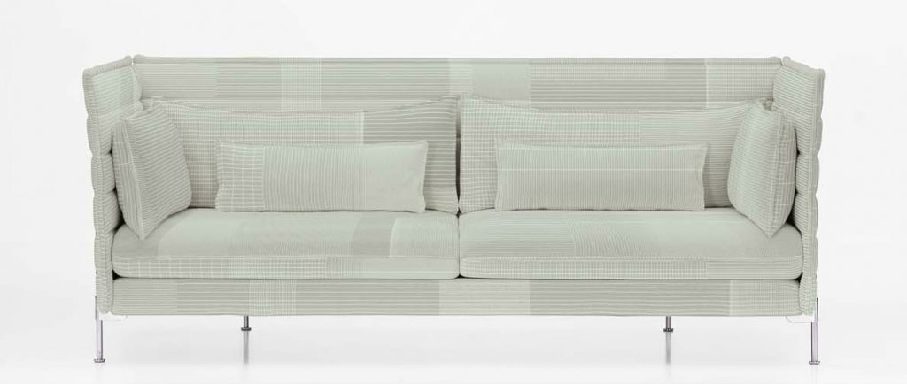
The Alcove sofa, designed by Ronan and Erwan Bouroullec for Vitra, upholstered in the Grid 005 fabric.
The fabric ended up being nine meters long, and, wherever you cut, it’ll always be a nice composition. What’s special about it is that it’s an industrially produced textile, but everyone will have their unique upholstery. And people don’t have to pay anything extra for this difference, but they can say, ‘This is my unique piece.’ That’s the future, the new luxury.”
Recent Viewpoints
Viewpoints
The Stories Moving Our Industry Forward


