October 15, 2019
The Problem with the “Designification” of Health Care
A new wave of clinics is using design to attract patients frustrated with old-guard medical facilities. But is further commodification of health care the answer?

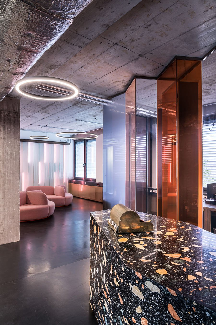
A few years ago I signed up for Oscar health insurance. Cofounded in 2012 by Joshua Kushner and headquartered in New York City, it was the health-care plan most of my similarly freelance friends used. Plus, if you lived in Brooklyn, as I did at the time, you could easily visit its Oscar Center, a primary-care space in a warehouse loft that also boasted the offices of literary magazines. I went in for a checkup, feeling slightly nervous as with any doctor appointment, but was surprised when I opened the door onto a spacious, minimalist, wood-floored, primary-colored office installed with glass walls and snake plants. There was even a yoga room adorned with the decal “Let the Healing Begin.”
It wasn’t like any doctor’s office I had ever seen, but it was similar to other spaces I was very familiar with: coffee shops, coworking hubs, and Airbnbs, all with the shared visual argot of vaguely midcentury aesthetics. The similarity made me wonder whether my monthly insurance premium was paying for fancy packaging rather than medical care. Were such aesthetics actually necessary? And what might the cheery decor conceal?
Oscar is part of a wave of new health-care service providers and clinics that have translated the oversaturated, cartoony flatness of e-commerce brands into physical medical facilities. Beyond their homogenized branding, these companies also have the same architectural vocabulary, whether it’s Tia, marketed toward women; Parsley, with its “whole body” approach; or One Medical, which is “designed around your needs.” Through their digitally derived style, these spaces contextualize medicine not as a systemic social service but as an individualized consumer good, much the same as other companies offering the basic trappings of adult life to beleaguered millennials: Casper mattresses, Away suitcases, Blue Apron meal kits.
The question of whether health care is a customizable product or should be a singular, nationalized solution is one of the key issues of American politics in advance of the 2020 election. The threat that anyone might have to give up health care they like for a universal policy has already been a flash point in one of the Democratic candidates’ debates. Design provides a metaphor for this dilemma.
Like libraries, museums, and train stations, clinics and hospitals can be a part of public urban infrastructure, places that anyone might pass through (more often outside the U.S. than in). They are places that emphasize a civic life, the collective over the individual, rather than inspiring Instagrams. When we enter a medical space, we expect that we will be treated not necessarily as a three-dimensional personality but as the sum of our ailments: a patient. We are subsumed into something larger than ourselves, larger than our personal preferences.
How did the designification of health-care spaces happen? With the passage of the Affordable Care Act in 2010, millions more Americans got coverage and the marketplace for private health insurance expanded as employees were free to choose their own plans. The years following also saw the rise of image-heavy social media platforms like Instagram. So-called direct-to-consumer brands took advantage of social media to build their buyer base rather than sending stock to department stores or staking out brick-and-mortars. The message of such brands was that they could deliver more specifically tailored products to their audiences for less money by cutting out the middlemen of manufacturers and retailers, though in reality unsustainable floods of venture capital were subsidizing their ability to do so.
These new brands all shared a certain generic identity that is now omnipresent on website banner ads and subway placards. The style was pioneered by Gin Lane, a Manhattan creative agency that helped launch start-ups from Harry’s razors and the clothing brand Everlane to the restaurant chain Sweetgreen and the (literally) generic pharmaceuticals provider Hims. All of these companies have softly curved logos in friendly typefaces and a pastel-colored palette, a diaphanous, barely present kind of visual marketing that echoes the perception that the products are arriving unmediated to the buyer, somehow organic, like farm-stand vegetables. Indeed, they’re identified as basic necessities that are easily accessible rather than elite luxuries. You can acquire them with a single click, through website UX strenuously tested to drive you smoothly down the funnel.

Other spheres of life were designified before health care, most often through workspaces, as start-ups felt the need to capture our attention in physical space as well as virtual. Founded in 2010, WeWork, which has collaborated with Bjarke Ingels, expanded into a kind of global “junkspace,” as Rem Koolhaas might describe it. The company molded office buildings around the world into the same banal template.
The Wing, a coworking space and social club founded in 2016 specifically for women, traded WeWork’s deadening interior architecture for airy, open layouts and curvilinear Memphis-lite furniture courtesy of architect Alda Ly (who also led the design of Parsley) and designer Chiara de Rege. What the two coworking companies have in common (besides investors) is how they intensify the link between commercialized architectural space and personal identity, both inside and outside the office, if any difference still exists in the era of freelance labor.
If we don’t have stable jobs, then we can at least rent stable workspaces in the form of these plush facilities. And yet we find little substance, only a saccharine suggestion of uniqueness. When the health-care start-ups emerged, they adopted this premade vocabulary, part online branding effort and part lifestyle space. Yet health care is not a consumer good like a mattress, a rental desk, or organic foodstuffs. It should be a utility, a shared social agreement.
The branding, both graphic and spatial, of Oscar, Tia, Parsley, and their ilk is exactly the problem with the health-care industry as a whole. These companies invest in their unique spaces and their gently hip interiors as a way of differentiating themselves from older medical practices as well as one another (a failed attempt, given their sameness). Would the U.S. health system be more efficient if health-care companies didn’t have to worry about the specific shades of their design, if they didn’t have to invest so much in marketing, advertising, and midcentury Modern furniture? According to a recent study, the healthcare industry spends about $30 billion a year on marketing, twice what it did two decades earlier. It’s a waste that other countries don’t tolerate—until 2008, hospitals in the U.K. weren’t even allowed to advertise.
Health-care architecture could look more like what it should be—a democratic experience available regardless of your employment status or economic class. The care spaces don’t need to be austere, but they also don’t need to resemble fashion boutiques, immaculately in touch with the latest trends. Instead of offering curated displays, the start-up clinics could be elegantly functionalist, like public-library outposts or newly renovated subway stations—these clinics now use the same white ceramic tile, after all. We need to decommodify health care rather than using design to commodify it further. Despite the reforms of Obamacare, 27.5 million people, or 8.5 percent of Americans, are still uninsured.

The appeal of health-care start-up architecture is the individualization that it promises. It assuages our fears that our needs or concerns won’t be recognized in an institutional setting. Health-care spaces of the future could preserve this friendlier approach and retain the aesthetic suggestion of personal care, if not the elaborate design itself. The start-up Tia, for example, emphasizes a diverse user base and an embrace of alternative treatments like yoga—an openness reflected in its bright colors, overlapping patterns, and cartoonish illustrations. This design idiom does create a feeling of age-appropriateness without pandering. I knew I was being manipulated by Oscar’s interior style in Brooklyn, but I paradoxically still felt that the company might understand me better because it knew what style I might like.
Health-care facilities under, say, a Medicare for All–style policy might reflect more accessibility by embracing their local architectural context and taking on the storefront intimacy of the start-ups’ facilities. If it takes less energy to enter a medical space, whether physical or psychological, then it might be better used. My call for patient-driven efficacy is different from the ephemeral demands of Instagram fashion. In other words, we don’t need Philippe Starck Ghost Chairs in our waiting rooms, as one Brooklyn dermatologist I went to presumed. The digital infrastructure of health care could use the same update: We buy a Casper mattress because it’s easy, unlike, say, navigating the relentlessly buggy Obamacare website. Imagine if finding a government-funded doctor were so simple.
There’s a One Medical office just down the block from my new apartment in Washington, D.C. Members pay an annual fee of $199, before insurance, to access the company’s network. The lobby has plush furniture, a concierge stationed behind a wide desk like that in a boutique hotel, and a sculptural art piece mounted on the wall. It’s located in the same condo development as a colorful Philz Coffee, a San Francisco chain that brews its coffee one cup at a time, so you can have it exactly the way you want it. The two businesses aren’t so different. But unlike a $5 pour-over, health care is a human right, one that should be accessible, pleasant, and affordable.
We need a different medical system as a whole. But in the meantime, we might not be so easily seduced by high-design interiors that give the appearance of care but can’t envision a world in which health care is not a private commodity. The branding has a way of coddling us in the illusion of our own individual preferences, which, in turn, hampers us from cultivating the solidarity we need to realize better health care for all. Beyond the clean typography and wobbly graphics is an even simpler but no less attractive message: We can help one another.
You may also enjoy “7 Projects That Signal the Rise of Haute Health Care.”
Would you like to comment on this article? Send your thoughts to: [email protected]
Recent Viewpoints
Viewpoints
The Stories Moving Our Industry Forward


