


March 31, 2022
What’s Next for Color
SPONSORED BY:
Each year, Wadden and her team assemble the Colormix® Forecast, a collection of forecast hues that describe the zeitgeist of color. They scour the design world for inspiration and insight, evaluating research, interviewing architects, designers, and stylists, and traveling to trade shows around the world. They also look beyond paint trends, paying attention to product design, industrial coatings, fashion, flooring, and architecture.
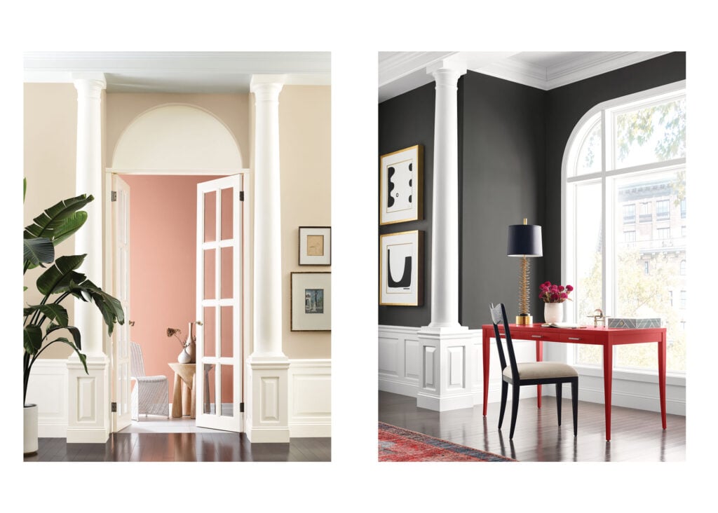
This year, the team saw that the design world is at an inflection point. “Designers and architects are at the forefront of this sea change we are all living through,” Wadden says. With that in mind, her team built a collection of palettes that incorporates of-the-moment design trends and opens space for a discussion of what’s next in design. It’s called MODE, a collection of four unique palettes: Method, Opus, Dreamland, and Ephemera, each signifying a macro trend or aesthetic direction that design will take in the future.


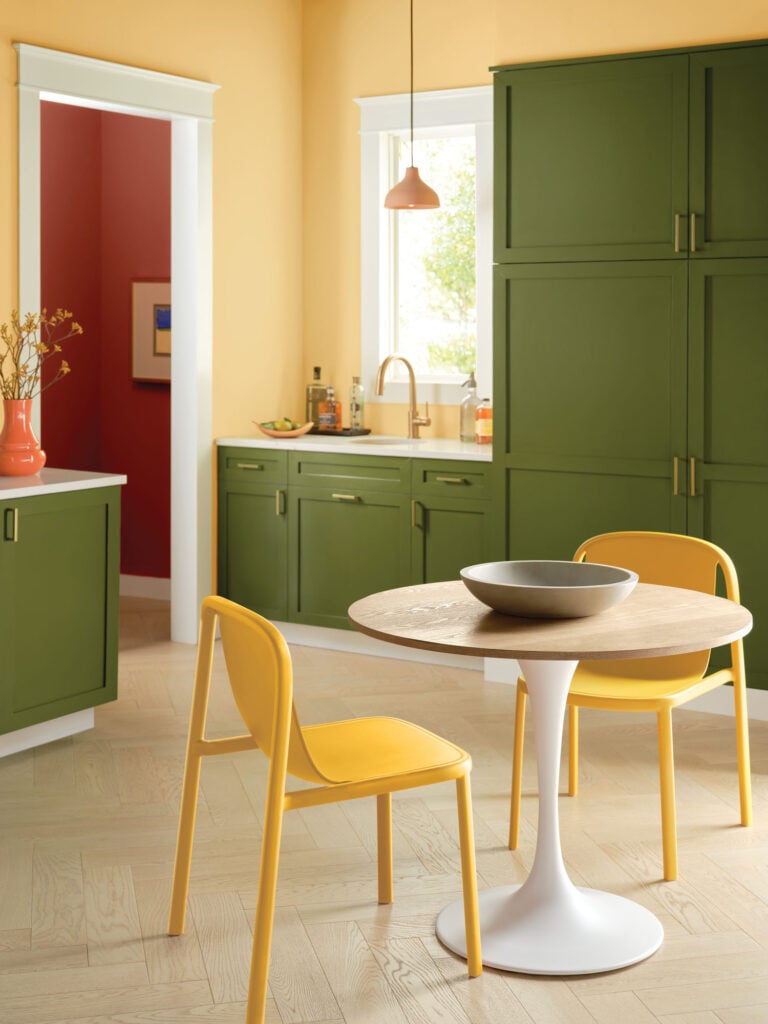
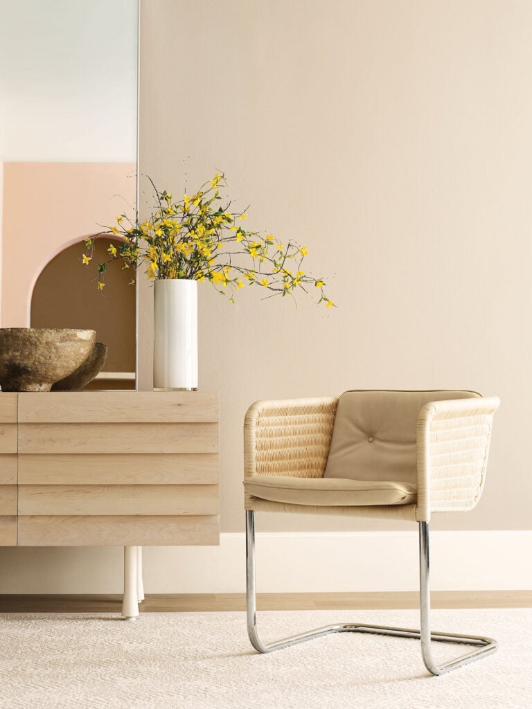
Method presents a selection of natural neutrals and warm hues that represent sustainability and the idea of the natural home. Opus is a maximalist palette with darker hues and dramatic jewel tones. Dreamland represents the digital shift, with some filtered colors and cooler color temperatures. The final palette, Ephemera, captures our nostalgia, taking cues from the sixties, seventies, and eighties, while updating them for a new generation of designers.
Further refining these colors into palettes that professionals can apply to hospitality, new residential, healthcare, education, and multi-family settings is the job of Emily Kantz, fellow forecaster and Sherwin-Williams color marketing manager, who oversees development of the Commercial Colormix® Forecast. “For hotels, we selected deeper moodier shades to capture a more dramatic backdrop for guests to enjoy,” she says, “whereas for offices, we wanted to encourage designers to create workspaces that have that sense of comfort and security while being away from home with a palette full of warm neutrals and rich earth tones.”
Most thought leaders would agree that sustainability, technology, and the residential-commercial convergence are growing movements in design. But how will those translate into the aesthetics of architecture and interior design? That’s what sets the Colormix® Forecast apart—the Sherwin-Williams team invests research, time, and their passion for color into distilling trends, themes, and notions into palettes that inspire. The result is a tool that allows designers not only to stay on top of current trends, but to focus on creating experiences that are relevant, essential, and timeless.
Would you like to comment on this article? Send your thoughts to: [email protected]
Related
Products
Dorothy Cosonas Designs Textiles from the Fiber Up
The creative director carries forward Luum’s legacy of material innovation through close collaboration with mills and an emphasis on fiber-level experimentation.
Viewpoints
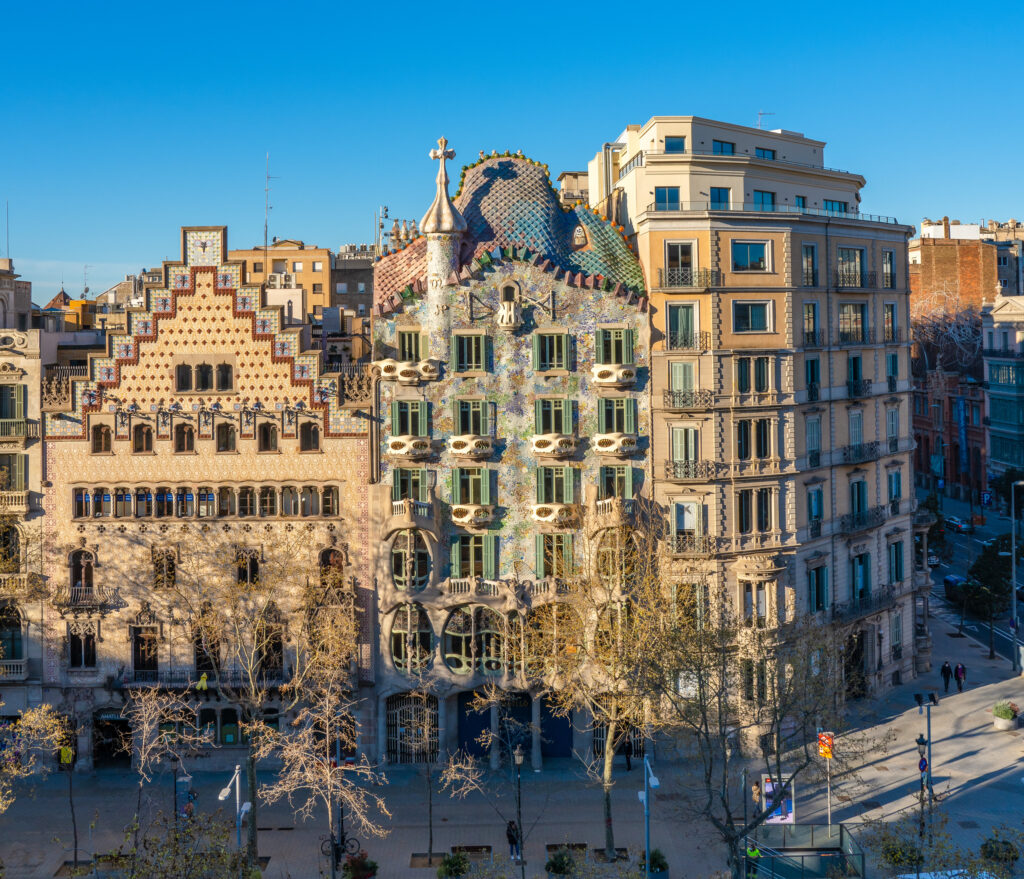
Antoni Gaudí, On the Spectrum
World Heritage Site, Casa Batlló, is “committed to autism.” Can other cultural institutions learn from this ground-breaking neurodiversity initiative?
Projects
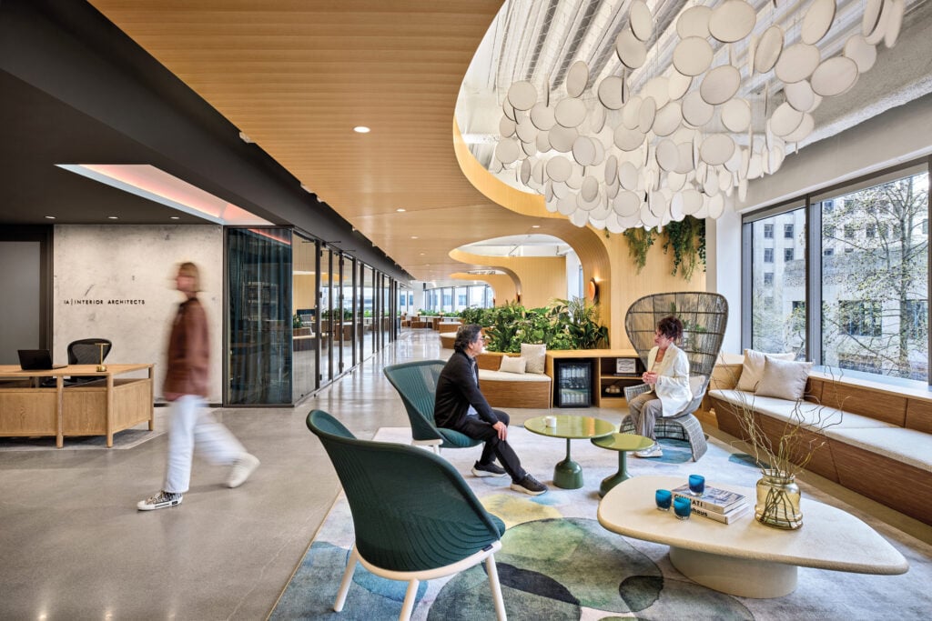
At Its New Seattle Office, IA Aims for Harmony
The workplace project is the testing ground for a new design framework and a one-of-a-kind foray into 3D-printed furniture.