April 1, 2004
Open Table
Familiar design cues from the public realm give a new restaurant the air of accessibility.
You approach a space with a massively proportioned concrete entryway and are greeted with ledger forms and brass mailboxes: a) you’re mailing a package, b) you have a meeting with the IRS, or c) you’re having dinner in one of Manhattan’s newest eateries? Answer: welcome to Public restaurant, which opened in November and is owned and operated by the four partners of design firm AvroKo—architects Adam Farmerie and Greg Bradshaw, and graphic designers William Harris and Kristina O’Neal—with Dan Rafalin, who handles finances and operations.
“We were really keen to apply the same kind of sensibility and attention to detail to something that we owned instead of always watching other people have a nice time with what we produced,” Farmerie says. The idea of designers opting into New York’s cutthroat culinary scene makes more sense once you know that Farmerie also recruited his brother Brad, a chef who has worked under celebrated London restaurateurs Peter Gordon and Anna Hansen since 1996. Aiming to make exotic foods more approachable, the partners needed a name that would convey accessibility. “Public,” with its municipal overtones, fit the bill.
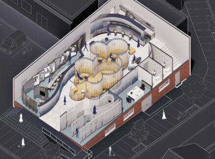
The name refers to the attitude behind the food—heady yet unfussy combinations such as duck breast, battered okra, and fig-walnut chutney—but it also became the conceptual starting point for the spatial design. “From the very first meeting we asked ourselves, What are the basic services you need in any town?” O’Neal says. Thus began an antiquing spree that turned up the mailboxes, a wooden card-catalog file, machine-age hanging lamps, and textured-glass office doors of the kind seen in film noir. “But we didn’t want to make it too themed,” O’Neal says. “It wasn’t supposed to be a carnival.” Salvaged elements are set amid dark wood paneling and weighty concrete slabs, but there are more eclectic elements too—aqueous Chinese glass tiles in the bathrooms and shadowy steel-mesh screens inspired by the paradoxically private glass-block walls of Pierre Chareau’s Maison de Verre. Bradshaw also designed a flexible table system that blends the communal and the private: tabletops can slide along a single rail to create seating for groups of various sizes.
The theme extends to the graphics of the manila guest checks, wine list, and menus—each printed in Courier type, hand-stamped with a unique number, and embossed with the Public logo. In order to be able to change and produce them quickly, Harris devised a perforated page on which two menus are printed at once. “They retain this great perforated edge when they’re torn, which is very governmental,” he says, “like a receipt that’s been torn from a ledger.”


