June 13, 2008
Opposites Attract
Ed Fella and Post Typography go head-to-head
The crowd at last night’s Opposites Attract event.
Last night at the New York Art Directors Club, Brooklyn-based Under Consideration hosted the second in its Opposites Attract series. The premise, as the name implies, is to bring very different styles of graphic designers together to discuss their work and varying trajectories. This evening pitted Baltimore’s Post Typography (Nolen Strals and Bruce Willen) against Los Angeles’ (by way of Detroit) Ed Fella. Under Consideration’s Armin Vit and Bryony Gomez-Palacio moderated the conversation.
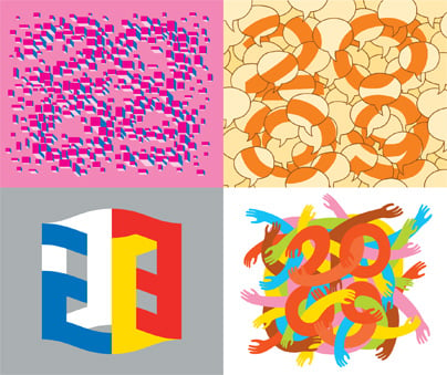
A different approach to numbers: Ed Fella (above) and Post Typography (below)
Fella, now in his 70s, opened the evening earning laughs from the crowd when he called himself an “exit-level designer.”
“I was once called an emerging designer, then I was a mid-career designer,” he said.
“They have a saying in the auto industry in Detroit: ‘Thirty and out,'” he added. “It was so factory workers wouldn’t burn out and you could give a new generation an opportunity. That’s part of being an exit-level designer—knowing when to leave.” (Of course Fella is hardly watching from the sidelines these days.)
Fella spent decades working in advertising in Detroit before returning to school at Cranbrook, moving to L.A., and developing his now iconic design aesthetic. “I’m well known for all this artsy stuff, but I was in advertising for thirty years,” he said. “Things are different now and Post Typography is a good example: You can have a practice with many dimensions.”
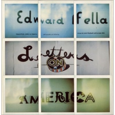
Top: A poster from Alphabet, an exhibition curated by Post Typography. Below: The cover from Fella’s Letters on America book.
Unlike Fella, Strals and Willen have seen their own business rise quickly in their postcollegiate years. The two met as students at the Maryland Institute College of Art and launched Post Typography in 2001 as a part-time endeavor. Their multidisciplinary practice encompasses “graphic design, conceptual typography, and custom lettering/illustration with additional forays into art, apparel, music, curatorial work, design theory, and vandalism,” according to their Web site.
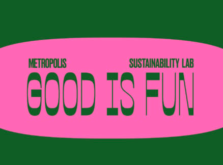
Their projects range from posters for local rock shows to illustrations for the New York Times, from exhibitions and site-specific works (including one for Metropolis), to ad campaigns for the Greenbuild Conference. “We try not to have a style,” Willen said when asked about their breadth of work. “Context is really important to us.”
It quickly became evident that the similarities between the designers on stage last night outweighed their differences. Both Post Typography and Fella produced a tongue-in-cheek manifesto about their work (you can see Post Typography’s on its Web site); each possesses a strong DIY spirit (Fella would offset print his posters on 11-by-17 inch paper from Staples; Post Typography does its own screenprinting). And both thread humor into their work: Fella co-opted the word “hack” back in his advertising days, using it as the name for his company’s baseball team and sneaking it into ads. Strals and Willen have been described as “Wayne and Garth meets Chermayeff & Geismar” and their irreverent, intelligent approach has earned them respect and the ability to make Post Typography their full-time business (with a part-time gig as musicians in their punk band Double Dagger. Songs include “I Don’t Know Which I Hate More, You Or Quark”).
So are they opposites?
“We’re just generationally different,” Fella said.
“He’s the Black Flag to our Minor Threat,” Strals added.
During the Q & A, someone pointed out that all three earned their chops in post-industrial towns. “The best thing I ever did in my life was not go to New York when I was nineteen. I stayed in Detroit,” Fella said.
Willen agreed. He noted all of the attention Baltimore has been getting lately in the press for its arts scene. “People aren’t doing their creative endeavors to become rich and famous [in Baltimore], they are doing it because it’s fun,” he said. “We have more [financial] freedom to take projects that don’t pay as well, but are creative.”
Throughout the conversation, images of the designers’ work flashed on a screen behind them. So it seemed only appropriate that the evening ended with the event sponsor, Veer, drawing business cards out of a bowl for free swag.
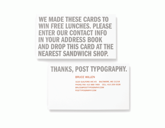
Graphic identity for Post Typography included business cards designed to win the owners free lunches.

They photographed their travels through the restaurants of Baltimore.
And it worked! Bruce Willen (bottom left photo, in the yellow T-shirt) and Nolen Strals (next to him on the right) bite into their free Chipotle lunch.


