July 1, 2003
Walking the Talk
In its new office and showroom in London, Nike makes a bold and branded statement.
In the empire of signs, Nike is the emperor. In Naomi Klein’s No Logo: Taking Aim at the Brand Bullies, Nike’s swoosh is exhibit A. Its history is, she writes, the “definitive story of the nineties transcendent superbrand…It seems fitting that Nike’s branding strategy involves an icon that looks like a check mark. Nike is checking off spaces as it swallows them: Superstores? Check. Hockey? Baseball? Soccer? Check. Check. Check. T-shirts? Check. Hats? Check. Underwear? Check. Schools? Bathrooms? Shaved into brush cuts? Check. Check. Check.”
So it comes as a surprise to find that the one space the mighty swoosh has until now left unchecked is their own corporate environment. The public face of Nike has been meticulously constructed by a series of Niketowns (each one, according to Klein, “a shrine, a place set apart for the faithful, a mausoleum”), but the offices where deals are done and campaigns planned have often been ordinary. “That’s a very good question,” says Rod Connor, Nike’s U.K. marketing director, when I ask him why, and he laughs.
The reason why I am asking Connor is that he has done something about this strange deficiency. Under his direction, Nike’s London headquarters and showrooms have moved from a place in Oxford Street to new premises off Carnaby Street, the district once famous as the retail epicenter of the “swinging sixties.” The old place, to quote the designers of the new one, was “cramped and archaic”; its replacement at last echoes Nike’s ethos of athleticism. “We wanted a place that would reflect what we stand for as a brand,” Connor says, “a place that is creative, pretty useful, and about sport. A lot of athletes come in here—Olympic gold medallists, soccer players, rugby players—and we wanted the place to help them feel proud to be associated with Nike. We bring style leaders and key influencers here, and they have to think it’s cool.” The location in London’s retail heartland is also significant. “We wanted to be in an area close to our consumers, and which they would see as cool and trendy. It’s about understanding the brands that connect with them. It’s about walking the talk.”
With the aid of advice from Nike’s design center in Hilversum, Holland, Connor turned to a two year-old design company, whose very name—the basketball-suggestive Jump Studios Ltd.—would seem to predestine them for the commission. Jump, whose members have variously worked in Ron Arad’s hyperactive London studio and in the high-tech offices of Wilkinson Eyre and Michael Hopkins, say they “want to work across the scales—product design, interiors, packaging, exhibition design.” With these new offices, the firm’s declared aim is to “romance the product.”
The casual visitor would not know this. The showrooms are aimed at the retailers who sell Nike’s products and not at the general public, so there is no external sign of what Jump’s Shaun Fernandes calls “Nike-ness.” The office is in a multitenant building and is reached through a narrow shared hallway and elevators of a kind that in other buildings might lead to a dental practice. One of the best-known brands in the world is notable here for its absence. Only when you cross the threshold into Nike’s space does the brand reveal itself, but when it does you instantly know you’re in the high-energy world of the swoosh.
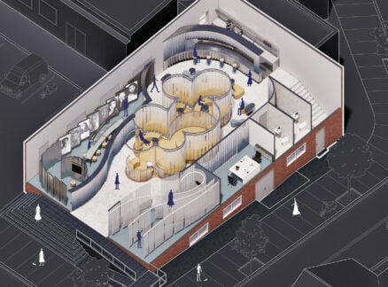
The generic beige of the common areas immediately gives way to a powerful pale blue, and a sloping-walled reception console that, like the swoosh, seems to be leaning into the slipstream created by its own aerodynamic. A plasma screen displays a sports channel (which happens to be talking at the moment about soccer’s less-than-glamorous Scottish League division two—but then, as Nike likes to point out, they’re not only interested in the big names). A tabletop soccer game is visible to the left, for staff energy release. Fit-looking personnel flit past; one has his hand in a sling, due to a sports injury. Such an injury, one imagines, can do his standing no harm in this particular company.
The pale blue turns out to be a consistent theme of the office’s three levels, suffusing floors in resin and sports rubber, and running up walls and built-in furniture. It was chosen for its “freshness” and also because other colors would have had overly specific associations. Red identifies instantly with certain sports teams, orange with other companies, but the blue—the color of sky on a summer morning—manages to impart alertness while avoiding these traps. “Even though they hadn’t used it before,” says Fernandes, a director at Jump, “we knew the blue was a Nike color.” Nike in spirit, he means.
The color defines what Fernandes calls the “series of elements” that are “imbued with Nike-ness, dynamic and very technological.” Starting with the reception console, these elements enclose exceptional spaces: meeting rooms and sales suites; senior management offices; and places designated as “war-rooms,” for the confidential development of new products. The blue elements reconcile a potentially contradictory aspect of the brief: while Nike wanted to be “very democratic and open-plan,” in practice they also need secrecy and privacy. The elements create actual seclusion yet allow the sense of space to flow freely around them. They’re like tents in the desert for what Fernandez calls Nike’s “nomadic” working patterns. Beyond them are looser, more ordinary spaces, where everyday paper-shuffling takes place.
The “elements” are the sites of the most intense activity, and also the places of interaction with Nike’s most valued associates, the sports stars they sponsor and the retailers to whom they sell. With curved corners and shining surfaces, they symbolize energy, and they are charged with Nike iconography. Larger-than-life transparencies of Nike sports stars—Andre Agassi, Tiger Woods, Paula Radcliffe, and some soccer players famous everywhere but the United States—are laid onto glass walls, as are monochrome images from Nike’s history, including Bill Bowman, the Oregon track coach who famously used his wife’s waffle iron to create the first waffle sole. In among the shiny blue surfaces are polished wooden gym floors and steel-doored lockers, more references to Nike’s past. “We started with superfuturistic imagery,” Fernandes says, “but they asked for a bit of the heritage.”
At the entrance to the showrooms you’re confronted with a wall of steel cages containing glittering silver soccer balls, a reference to a TV advertising campaign in which sports stars performed in cages. Status is also imparted by a different kind of stardom: in the most significant spaces the works of iconic furniture designers (Charles and Ray Eames, Antionio Citterio) lend their own authority.
Jump’s design is deeply flattering to Nike. It treats its client’s history and culture as things worthy of the utmost respect, even veneration, to be celebrated with a panoply of techniques. Renaissance architects used to perform similar services for the Catholic Church; recently Rem Koolhaas did it for Prada in the New York store. The Jump approach is, Fernandes says, “instinctive” and not particularly concerned with delivering the “tangibles that marketing people look for.” The famous swoosh is implied rather than emblazoned in the fabric of the interior. “It has to be infinitesimal, as Nike likes the products to carry the brand.”
Jump’s interior is openly dedicated to upholding the power of the brand, and Connors calls the achievement of this interior “a crusade” (the original Crusades were about violently upholding another kind of brand, the Christian cross). Yet these offices do not impart the feeling of inexorable global might that is supposedly the essence of Nike. This is a local initiative by the London office, not part of some grand worldwide strategy, and it ultimately lacks the awesome consistency of a Niketown. Jump’s design is easily embarrassed by the contingent—a misplaced kettle or newspaper, or the potted plants that, despite Jump’s instructions to the contrary, keep finding their way into the space. This is a limitation of the design but also touchingly human.
Given Nike’s assertiveness (and Klein’s ferocious reaction to it), it should be impossible to take the middle ground in response to their branded space. One would think you either buy into their vision of sport and style or you’re repulsed by their desire to appropriate and market human experience. Curiously, however, this particular Nike space ultimately engenders neither effect. It is enjoyable rather than great design, and you can see its marketing aims so clearly that you experience no fear that you’re being insidiously brainwashed. The middle ground is usually fatal territory for a critic, but in this case it’s the only reasonable place to be.


