March 1, 2012
Shigeru Ban Brings a Touch of His Signature Cardboard to Soho
The Japanese architect’s new store for Camper is a crisp reflection of the global brand’s anywhere aesthetic.
All images courtesy Marian Montoro
In 1975, Lorenzo Fluxá repurposed his family’s hundred-year-old shoe factory on the Mediterranean island of Majorca. Out went his grandfather’s stodgy old dress shoes. In came a quirky, slightly hippie replacement: the Camaleon, made of old tires, strips of canvas, and discarded pieces of leather. And a new name: Camper, meaning “peasant” in Catalan. As European tourists poured into Majorca in increasing numbers, the shoes poured out: leather emissaries from a magical, sun-drenched land, packaged in a way that suggested you might find sand beneath the footbed.
In Camper’s famous origin myth lies a big lesson about twenty-first-century design culture. Unlike an L.L.Bean, a Barbour, or even a Levi’s—all brands that began with explicitly functional clothing and spun an image around it—Camper never actually sold Majorcan peasant shoes, only their ideal. As even its corporate history acknowledges, the company was “born to be a brand,” to embody a spirit, “a new lifestyle, a new way of thinking based on freedom but also encompassing comfort and creativity.” Since expanding beyond Spain in 1992, Camper’s global image has been based on the crisp idea of having come from somewhere. It makes for a strange kind of cosmopolitanism—a sense of being comfortable everywhere, but at home almost nowhere.
Given Camper’s 300 boutiques around the world, what does that mean for their architecture? Some stores are assertively low-key, non-designs consisting of shoeboxes stacked up on the showroom floor. Others are the work of high-profile designers like the Campana brothers and Jaime Hayon. Rather than any strict brand identity, the only consistency is inconsistency. “Once we started to become more international and a bit bigger—we’re still more or less a small company—we thought that it would be interesting for us to make all the shops different, and not just one after another,” explains Miguel Fluxá, the son of the company’s founder, and the managing director of creative projects. But that hasn’t meant being contextual in any typical sense. Camper’s shops reflect neither their place of origin nor their immediate surroundings, but attempt to exist in some alternative, free-floating global culture. “With globalization, everything looks the same more or less everywhere,” Fluxá says. “And, of course, we are partly guilty of that, we are part of the system.” To compensate, Camper never repeats a store design more than five times. “The world is big. It’s good to force yourself to try to do new things and look for new solutions.”
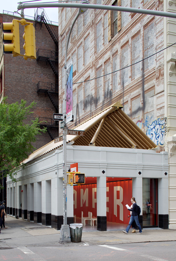
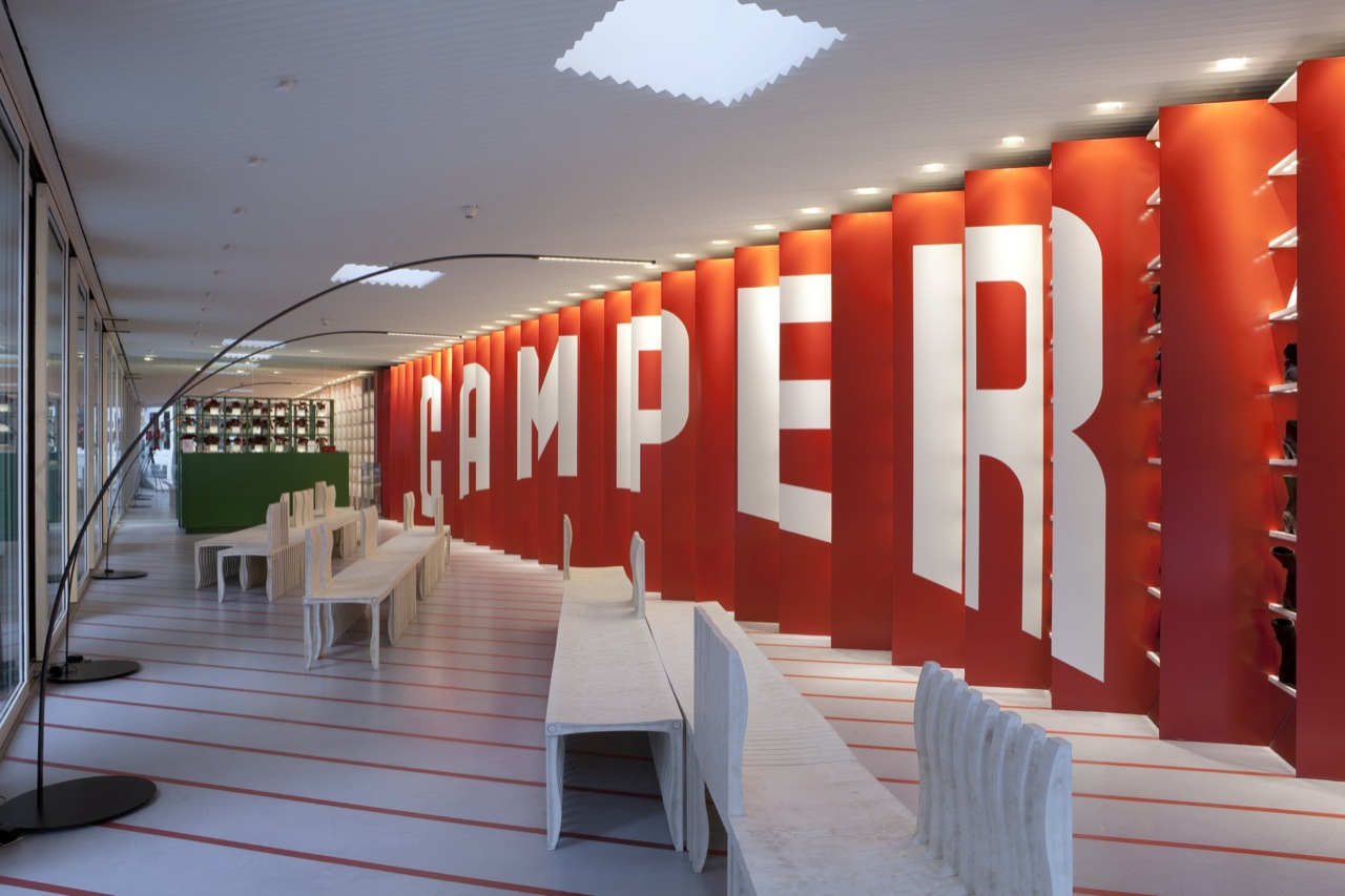
Camper’s newest store, designed by the Japanese architect Shigeru Ban for a prominent corner in Soho, offers a compelling one. As a work of architecture, it’s an unusually muddled New York typology: a single-story, freestanding pavilion of the type sometimes called a “taxpayer”—a placeholder for a future, bigger building. But as an expression of pan-global design, it’s sharp as a tack. Its single idea is easy to explain: a sawtooth-shaped wall looks like a bright red Camper logo from the street, while inside the store, all you see is the product. It’s a super-graphic one-liner, a modernist shoebox filled with actual shoes. But if that’s a joke, Ban isn’t about to make it. “I don’t want to explain my design,” he says. “What you see is what you get. People have to see for themselves, otherwise it’s a failure of design if I couldn’t provide anything that you can feel.” It’s a comment as slippery as Camper’s stance otherwise, revealing an eagerness to not be pinned to anything at all—preferring instead to shrug at the humor of our free-floating global predicament.
If that’s their take, appropriately enough, the collaboration between Ban and Camper began with a traveling pavilion. Ban is best known for his temporary architecture made of paper and cardboard, which is often used to shelter refugees and victims of natural disasters. Camper’s first project with Ban was similar functionally, if completely different philosophically: a store and venue to accompany the brand’s sponsorship of the Volvo Ocean Race, a round-the-world yacht regatta. As the traveling circus lands in four of the planned ports—Alicante, Spain; Sanya, China; Miami; and Lorient, France—Ban’s circular structure emerges from a shipping container to become a store that sells Camper-branded apparel, and it also functions as a bar and activity center. Its cardboard columns are each about 16.5 feet tall, to fit inside the nearly 20-foot-tall shipping container, and they nest inside one another to minimize the shipping volume. In a big step up from the standard wedding tents of the other sponsors, the finished structure is a perfect circle, like Donato Bramante’s famous Renaissance Tempietto in Rome, or a Victorian circus tent (with a Camper flag on the top).

But Ban rejects the comparisons: “Why do you have to connect it with something? That’s the most stable shape for a building. You don’t need to refer to anything but the shape.” It became a refrain—in Camper’s world and Ban’s, everything floats freely. It’s a big cosmopolitan vacation. Through that lens, it makes fine sense that the Camper boat is manned by the Emirates Team New Zealand, who are sponsored by Emirates, the Dubai-based airline. Which is not to mention that Ban himself was born in Japan, educated in New York and Los Angeles, and practices in Tokyo, Paris, and New York.
How does that work out in Soho, a neighborhood that sometimes feels like an airport shopping mall? Where most Soho boutiques occupy the high-ceilinged ground floors of former industrial buildings, which you step up into, Camper’s store sits flush with the sidewalk. Ban takes advantage of that by turning all of the windows into sliding glass doors, so that the store can open all the way to the street. (The height of the structure is something of an accident. Camper originally intended to build a full office building on the site, but was derailed, in part by community outcry over the potential destruction of the artist Richard Haas’s famous trompe l’oeil mural of a cast-iron facade—a remnant of the 1970s, when Soho needed to fake anyone being home.) Inside are furnishings of Ban’s own design: his 10-Unit System chairs for Artek, which are made of recycled paper and plastic, and his carbon-fiber Yumi floor lamp for FontanaArte, which is an explicit update of the Castiglioni brothers’ Arco floor lamp. But predominantly, the space reads as a straight box, dominated by the super-graphic Camper logo—and the shoes. The store itself is a big logo; a sign and the signified. And like its architect, it resists all attempts to be pinned down. In Majorca, Fluxá laughs at the suggestion that the store’s openness might be Mediterranean—or Japanese. “I don’t know if he was thinking about the Mediterranean when he was doing that,” Fluxá says. “But we are an island and Japan is an island.”
In Tokyo, Ban shrugs again. “There are so many windows. I just made the sliding doors to open them all.” What you see is what you get; it’s an enviable concept—the theoretical equivalent of a carefree day at the beach. The question is how it feels when it’s not a single store on a list of 300—or a single project among dozens, on four continents—but a singular place in what was once a neighborhood. It may be a perfect example of a totally global design culture that’s servicing an even more global consumer culture. Which may be what Soho stands for after all.