April 13, 2020
Studio O+A Revamps McDonald’s Chicago-Area Research Compound
Bold graphics impose a fun aesthetic on the lab, where the fast-food giant tests its equipment innovations.
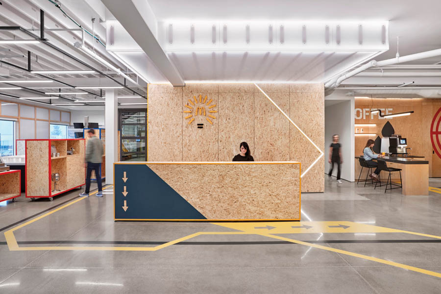
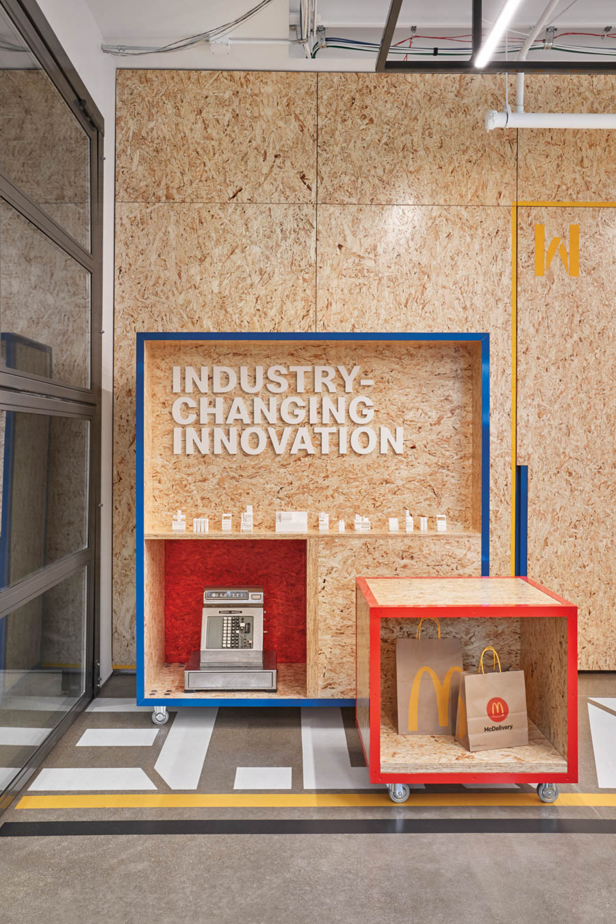
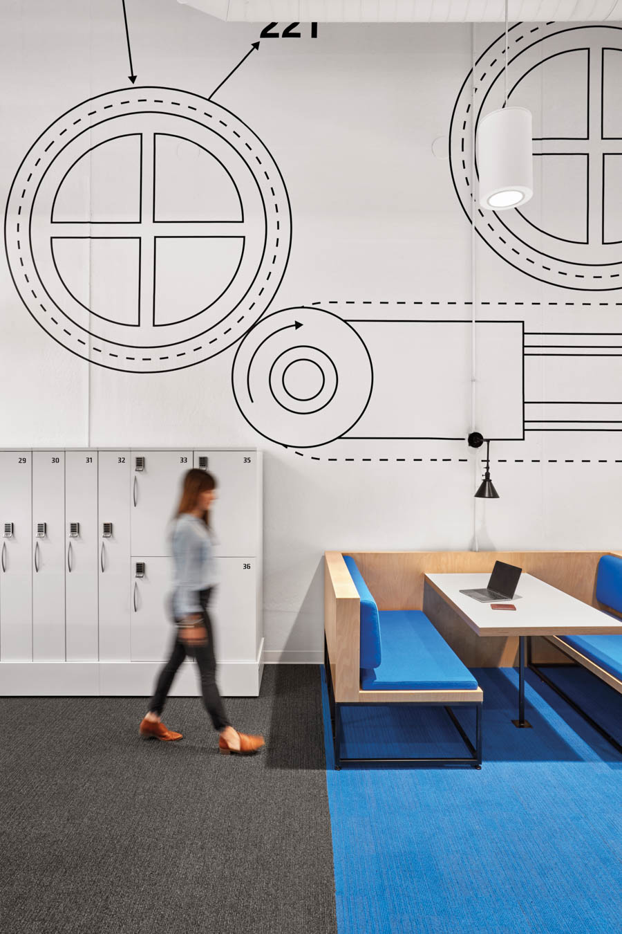
At the newly renovated McDonald’s Innovation Center in Romeoville, Illinois, where the fast-food giant puts experimental food-preparation equipment through its paces, there are supergraphics of industrial bits and bobs on strand-board walls. In places you can make out a burner and bolts. Elsewhere, blenders, mixers, and potato splicers are displayed in custom-designed cases.
More than perfunctory nods to company lore, these moves place emphasis on the humble mechanical innovations that enabled McDonald’s globe-spanning rise. “People have put their life’s work into this equipment, but [it’s] hidden in a machine, or hidden in a drawer,” says Elizabeth Vereker, brand director of Studio O+A, the San Francisco–based design firm behind the office overhaul. (Antunovich Associates was involved as the project architect.) The team’s goal was to maximize “the impact of all of these small components that work together to create this ecosystem of McDonald’s,” Vereker adds.
The supergraphics imbue the nearly 16,500-square-foot center with a “utilitarian optimism,” says O+A graphic designer Paulina McFarland, whose handiwork sets the tone of the place. On the ground level, floor graphics trace circulation patterns from social spaces—including a café, a huddle area, and a gallery—to the self-contained space of the kitchen lab, untouched by O+A. Up on the mezzanine level where engineers work, wood and polypropylene are marshaled into lightweight armatures for breakout sessions.
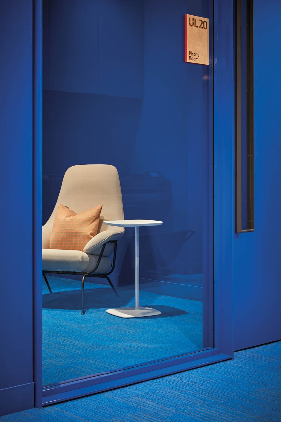
The designers’ first step was to tear out the haphazardly placed partitions that gave the old work areas a warrenlike feeling. They reworked the entry sequence, relocating training rooms to the rear of the floor plate and bringing interactive areas to the fore. A movable feast of McDonald’s innovation, the gallery off the entrance vestibule displays vintage cash registers and models of restaurants in wheeled vitrine boxes inspired by shipping containers. Made of wood and framed in powder-coated metal, they can be moved and reconfigured easily. Seating is abundant across both floors, as are the futuristic modular phone booths, suggesting an itinerant workforce.
More than a suggestion, in fact—McDonald’s operators cycle into the lab from all over the world. Despite assumptions, the purpose of the Innovation Center is not to develop novel menu items but, rather, to test out new equipment and workflow procedures. Studio O+A’s charge was to find ways to make these opaque backstage processes perceivable to the full-time staff of the Romeoville office. Underscoring this theme of transparency, the designers fashioned custom full-height pivot doors to form a porous boundary to the ground-floor conference room, opposite the coffee bar. Similar pivot doors link the so-called “country room,” where the operators gather to run their simulations, to the kitchen lab.
Studio O+A recently designed the McDonald’s corporate headquarters in Chicago’s West Loop neighborhood, and the firm wanted both projects to feel of a piece. “When we came to Romeoville, it was really about bringing in a lot of the methodology and finishes that we had in the headquarters and tailoring them to the space so that it was brought up to the same level of modernity,” notes Vereker. “When you look at them side by side, they look like a cohesive family.”
As at West Loop, in Romeoville Studio O+A opted for a bare-bones aesthetic and a minimal material palette, as well as soft-pedaling McDonald’s iconic brand identity. (A new logo for the Innovation Center sets the golden arches within the rays of a light bulb.) The firm also delivered custom fittings, including light fixtures whose slim bicycle-bar profile echoes the line work of the supergraphics.
About those wall graphics—they turn out to be abstracted patent drawings. “It’s an Easter egg!” says Vereker. “If you work in the building, you know what they are.”
You may also enjoy “Inside Slack’s New San Francisco HQ”
Would you like to comment on this article? Send your thoughts to: [email protected]