June 6, 2019
The Bouroullec’s New Collaboration with Skyline Design Harnesses Generative Design
Debuting at NeoCon this month, the glass panels use custom color analysis software to create an abstract, immersive “stained glass” effect.

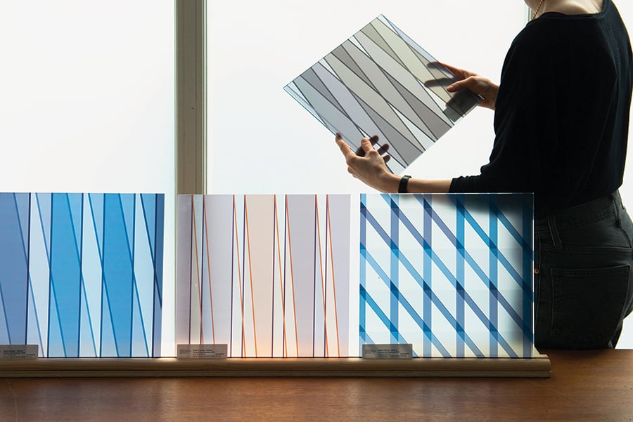
The prolific Parisian design duo Erwan and Ronan Bouroullec are no strangers to the contract industry, having produced successful workplace designs for Vitra, Kvadrat, and other manufacturers. The brothers’ reductive, linear aesthetic and keen sense of color explain the popularity of their designs in offices frequented by the young and creative, and their latest contract offering—a series of interior-exterior architectural glass panels—is no exception. Developed by the Bouroullecs in partnership with Chicago-based Skyline Design and debuting at NeoCon this month, the panels use custom color analysis software to create an abstract, immersive “stained glass” effect. The collection’s two primary designs—the diamondlike pattern Oblique, and Chevron, a zigzag look—are available in multiple colorways and graphic treatments, offering different degrees of scale, color saturation, and opacity.
With a glass panel portfolio including collections from superstars like Patricia Urquiola, Michael Graves, Alexander Girard, and Laurinda Spear, Skyline has long had an artistic bent. The Bouroullecs’ designs first caught the eye of Skyline’s creative director, Deborah Newmark, during a retrospective at the Museum of Contemporary Art in Chicago in 2012. “I found the work intelligent, playful, inventive, and poetic in its elegance,” she recalls. “I was curious how they would approach glass on an architectural scale.”
For the Bouroullecs, the floor-to-ceiling format provided a means to enliven static interior environments with patterns that present a vista onto dynamic landscapes. “Glass is linked to what happens through a window—something which has a nature of movement, of evolution,” says Erwan, describing the brothers’ intention to capture the sensation of seeing color and light shift outside as you walk around indoors.

As we take in our surroundings, our eyes synthesize huge amounts of visual data into a cohesive image. The Bouroullecs have developed Oblique and Chevron to do the opposite, and to sublime decorative effect. Their computer program deconstructs a photograph by distilling the image to its essential components of color and composition, abstracting these elements into each pattern’s lines and shapes to roughly re-create the balance of the picture. “It keeps the color, it keeps a little of the rhythm, but not [by] transferring the picture directly,” Erwan explains. Up close, both panel designs look like incredibly intricate stained-glass tessellations; when they are viewed as a panorama, the distinctions in the patterns become evident. Oblique, for instance, renders the image with the irregular rhythm of a bar code in variegated hues, while Chevron transforms it into an impressionistic gradient reminiscent of a giant Photoshop palette.
Throughout the year-and-a-half-long design process, the Bouroullecs worked with Skyline to refine the software, photographs, and prototypes. They chose source photos that would lend themselves to variety in subtlety and contrast when output as tessellations, opting for images like moody landscapes and tonal nature photos. Specifiers can work with Skyline to select which portion of the photo will be used to generate the design, a process Erwan likens to picking a single passage from a dense tome such as Moby-Dick. “You need to extract a part of this novel—you have to choose the right part,” he explains. “What is the best chapter? What do you feel?” After experimenting with different production methods, Skyline and the brothers used translucent digital printing to achieve the luminosity and depth the panels required.
In the contract industry, where the standard for architectural glass is often clear, Oblique and Chevron introduce a symphony of delicately shifting colors that lend themselves to different sensations, applications, and moods. Installed as a feature wall in a corporate lobby, or along a corridor or facade, the patterns add visual interest and can even enhance wayfinding with their subtle directionality. “It’s not like you are confronted with a single, full layer of color—that would be a little obstructive,” observes Erwan. “It’s more like what you would see when you are outside…. It’s a pattern that has a little life inside, thanks to the software.”
You may also enjoy “The 2019 #MetropolisLikes NeoCon winners are here!”
Would you like to comment on this article? Send your thoughts to: [email protected]


