September 3, 2013
Three Hospitality Designers Who Excel by Listening to the Food
Emerging restaurant designers who understand the connections between menu, price, and place

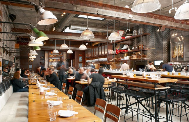
The space for Gusto 101— an Italian bistro in Toronto— was formerly a mechanic’s garage. In transforming it into a restaurant, Munge Leung preserved a good deal of its gritty character.
The word “restaurant” was coined to denote a place that refreshes and restores. Today, where food is as much lifestyle choice as necessity (at least for the fortunate), the ability to refresh and restore depends not only on the cuisine, but on sourcing, service, and—above all—a design and location that somehow frames what’s on the plate. Of course the food is still important. But the space needs to tell the story, whether in exposed beams and cinderblock, neon lights and Japanese comic-book iconography, or polished mahogany and mohair.
The three restaurant designers featured here work in different countries and markets, and for broadly different clientele. One studio specializes in high-end boutique eateries in North America. Another creates dynamic brands for fast-food chains in the U.K. A third applied its expertise in furniture design to create an unlikely comfort-food mecca in Los Angeles. All three work to achieve harmony between menu, price, and place. In cross-media partnerships, they’ve learned how to accent aromas, tastes, and textures in three dimensions. They know how important it is to listen to the food.
For Alessandro Munge, a partner with Sai Leung in the Toronto-based studio Munge Leung, restaurant design is all about pairing plates with place. “When that dish hits the table, your enjoyment of that dish also depends on what you sit on and what the table is made of,” says Munge. “It’s not just about the food.”
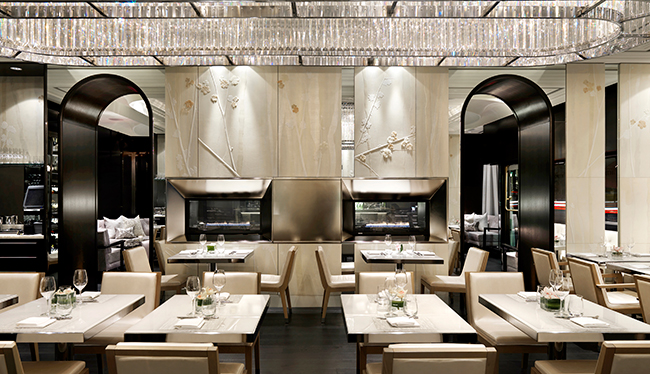
The Hawksworth Restaurant in Vancouver pays tribute to the great outdoors.
Courtesy Martin Tessler/courtesy Munge Leung
Born in Europe and raised in Canada, Munge likes to distill iconic elements to their essence. At Gusto 101, an Italian bistro in Toronto’s revitalized Fashion District neighborhood, rusted license plates and an ivy-draped vintage Goodyear sign atop the former garage space helped create the city’s liveliest rooftop garden. At Weslodge, marble countertops and custom-designed light fixtures hanging from the ceiling evoke the freedom of a turn-of-the- century saloon, while a somewhat secluded second-floor seating area hints at the forbidden pleasures of bygone days. In Hawksworth Restaurant, an elegant four-room eatery set in a 1920s Vancouver landmark building, the wall décor includes handmade acrylic-resin, faux-relief flowers, and a soft tree-like background pattern. “Everybody does trees in Vancouver,” Munge says. “I wanted our homage to the landscape to be more subtle.”
The secret to designing a successful restaurant, Munge says, is grasping a chef’s vision. “When I meet with a chef, I don’t just need to know what kind of food he or she wants to serve. I need to know why he or she wants to serve it here.”
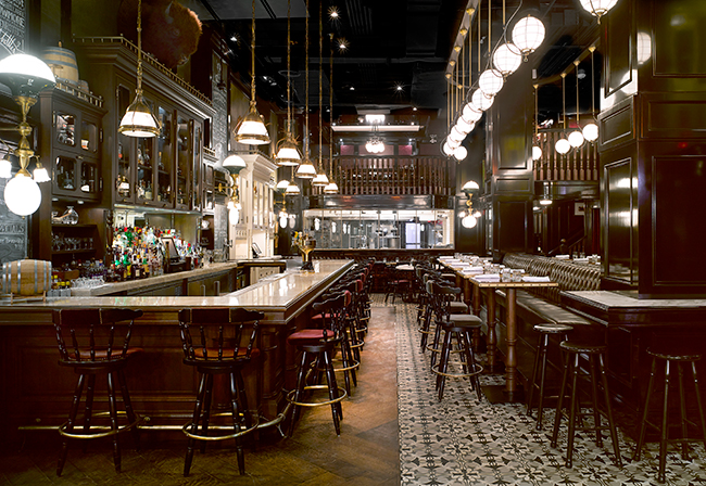
For Toronto’s Weslodge, the architects created a modern Western saloon feel, complete with spittoons on the floor.
Courtesy Eugen Sakhnenko, A Frame Studio Inc/Munge Leung

Krassa relaunched a popular brasserie at its new location at London’s Heathrow Airport. She designed the new space and also refreshed the logo and menu.
Courtesy Sim Canetty-Clarke/Afroditi Krassa
In 2004, British entrepreneur Julian Metcalfe asked Afroditi Krassa to help design a new Asian fast-food chain. “They needed a brand identity,” says Krassa, who’d opened her London studio just two years earlier. “And very soon I understood that identity wasn’t going to be about sushi. It was going to be about lifestyle, about eating light and healthy food.” Krassa’s first foray into restaurant design resulted in itsu, a chain of Asian fast-food restaurants and groceries with nearly 40 locations around London today. With competition between fast-food chains growing more intense, the London-born, Greece-raised designer knew contemplative Kyoto-style minimalism wouldn’t work. “We wanted it to feel like a shop,” says Krassa. “Busy and vibrant, like a London version of Tokyo.”
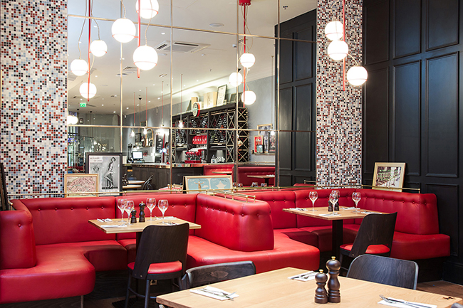
Café Rouge is a chain of French bistros in England. Rather than completely revamp a successful brand, Krassa chose to update the spaces, while keeping the same basic feel.
Courtesy Afroditi Krassa
Since helping to create itsu, Krassa has fashioned or refashioned several fast-food brands, defying stereotypes and exceeding expectations. When Oriel on Sloane Square in London wanted to relaunch its restaurant, Krassa celebrated the art deco movement by using 1930s color palettes, geometric motifs, and train screens as dividers to revive the spirit of an age when travel was truly a luxury. At Café Rouge, an iconic U.K. chain of French bistros, Krassa decided to revitalize the existing identity instead of creating a new one. “There were a lot of good elements,” says Krassa, who’d formerly worked as an industrial designer. “Instead of tossing it all aside, we worked to make them edgier and more interesting.”

Working with a minimal budget, the Thoreen&Ritter opened up the space for this 180-seat restaurant by eliminating several walls.
Courtesy Nicholas J. Reid/Thoreen&Ritter
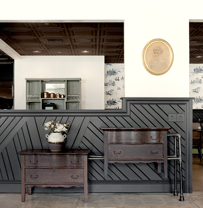
First-time restaurateurs Brendan Collins and Carolos Tomazos took a gamble in choosing to open a restaurant in western Los Angeles’s sleepy Culver City. And they made an even bigger wager in choosing Brian Thoreen and Brant Ritter to design it. But both bets paid off. “This project was about scale for us,” says Ritter, a light-and-space installation artist who met fashion-and-housewares designer Thoreen in 2001 when the pair worked as fabricators for artist James Turrell. Their firm specializes in high-end furniture commissions. “In restaurant design, we pulled back from being overly pre- cious. We knew the space was going to be used and abused. And we wanted it to get better as it aged.”
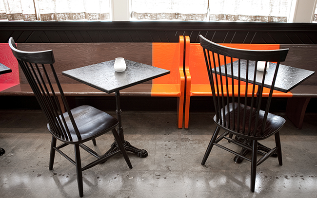
The benches are church pews purchased at a thrift shop.
Courtesy Nicholas J. Reid/Thoreen&Ritter
The fruit of their work is Waterloo & City, a 180-seat restaurant fitted into a 40-year-old diner that has injected new life into the neighborhood below Mar Vista. Thoreen&Ritter preserved much of the former greasy spoon’s layout, but eliminated several walls to make the space feel more open. Responding to Collins’s upscale comfort-food menu, the interior tilts towards homey, keeping much of the original wood and wainscoting, church-pew seating ransomed from a thrift shop, and a solemn black-and-white Shaker sensibility enlivened by occasional flashes of color. “Brendan believes in this type of food,” says Ritter, who works with Thoreen in an old warehouse in L.A.’s Arts District. “We wanted a design that reflected that. Because if you present what you love, the people will find you.”
Courtesy Nicholas J. Reid/Thoreen&Ritter
Recent Projects
Projects
A New Era of Senior Living


