July 14, 2011
Mapping the Cityscape
The Commissioners’ Plan of 1811 was a visionary approach that reshaped New York’s underlying structure, separating Manhattan from the old organic cities, while still defining it today. To acknowledge the success of the grid model made possible by John Randel, Jr., and celebrate its 200th anniversary this year, The Center for Architecture opened an exhibition, Mapping the […]
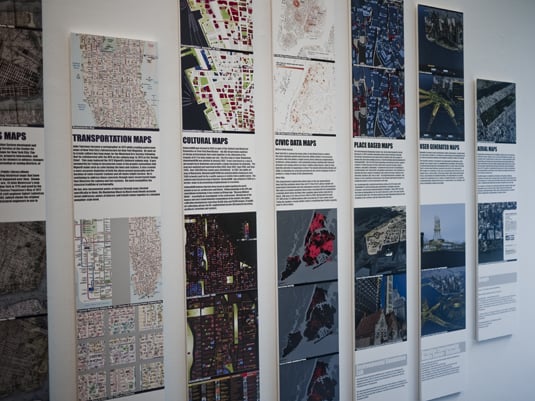
The Commissioners’ Plan of 1811 was a visionary approach that reshaped New York’s underlying structure, separating Manhattan from the old organic cities, while still defining it today. To acknowledge the success of the grid model made possible by John Randel, Jr., and celebrate its 200th anniversary this year, The Center for Architecture opened an exhibition, Mapping the Cityscape, on July 6, exploring the ways in which mapping influences our perception of the environment. The exhibition includes maps ranging from 1609 to present day interpretations, taking into account the technological advances and methodologies that are shaping our urban landscape.
Spanning across the walls at this exhibition are a wide range of cartographic representations, including ecological, cultural, planning, civil data, location-based, user-generated, Google and Tauranac transportation maps. These maps, saturated with different colors, shades, aerial photographs and line drawings, illustrate ways in which the city is used and understood. In the narrow corridor of space that the Center was able to dedicate to the exhibition, one side displays floor to ceiling oversized strips of vinyl prints plastered side by side, while the opposite facing wall is tiled with square croppings of maps and captions mounted onto foam board to mimic the grid pattern. It was difficult to figure out the transition and relationship between each juxtaposition while navigating the corridor, and even harder to compare the maps due to an inconsistent scale. The typography in each caption was too heavy in weight to read comfortably and lacked hierarchy overall, while most of the legends were reduced to minuscule proportions and tacked onto the bottom of each vertical strip below eye level, as though the information was not integral to understanding the maps.
While Mapping the Cityscape was designed to celebrate the grid, the exhibition itself is neither deeply informative nor aesthetically stimulating. Cartography is a complex discipline that combines science, technology and information design, and the works that result from this study need to be curated and displayed in a much more sophisticated manner. Given the small exhibition space and emphasis on contemporary technological advances, an interactive representation or time-based projection showing an overlay of each map, would have been a more appropriate and space-efficient opportunity to compare the varying interpretations of the cityscape.

While Randel’s grid design has proved itself in the last 200 years to be a successful model for urban planning–one that makes Manhattan so easily walkable and inhabitable–the exhibition needs clear, informative graphic design to highlight this effective and strong foundation for the city. The Center for Architecture’s tribute to the grid is merely an overview, an insufficient representation with poor execution. Manhattan’s grid is accessible and easily understood by locals and visitors alike, while the exhibition dedicated to it was anything but. If Mapping the Cityscape aims to encourage design professionals to engage and rethink ways to look at their surrounding urban landscape, it fails, because all it really prompts are thoughts on how to redesign the exhibition for better presentation.
Cheryl Yau is a designer from Hong Kong and currently an MFA candidate in the Design Criticism program at the School of Visual Arts, New York. She considers typesetting to be a therapeutic activity, and will always be a city girl at heart.


