November 2, 2026
UC San Diego Transforms a Facade into a Dynamic Display for Digital Art
In 1975, famed California midcentury Modernist architect A. Quincy Jones completed the University Art Gallery, part of what became known as the Ernest W. Mandeville Center for the Arts at UC San Diego. For the gallery, Jones conceived a two-story plinth of concrete, grounding a row of trunk-like redwood boxes that anchored the north-south pedestrian corridor of the campus. As the student body swelled, the school almost repurposed the building as classrooms in 2016. Instead, its community launched an effort to reassess the importance of the gallery—whose exhibition legacy included early shows of Fluxus, Niki de Saint Phalle, Mike Kelley, and many more—and to rethink its structure.
“The space had not been well utilized,” says Eric Naslund, principal at Studio E Architects, which was brought in to renovate and repurpose the building. “There was no prefunction or lobby; you just kind of walked into the gallery.” There was a sense that this unceremonious entry didn’t sufficiently convey the world-class work within and, perhaps, wasn’t ready for the future. “Another thing the university asked for,” he notes, “was a means to engage contemporary digital art.”
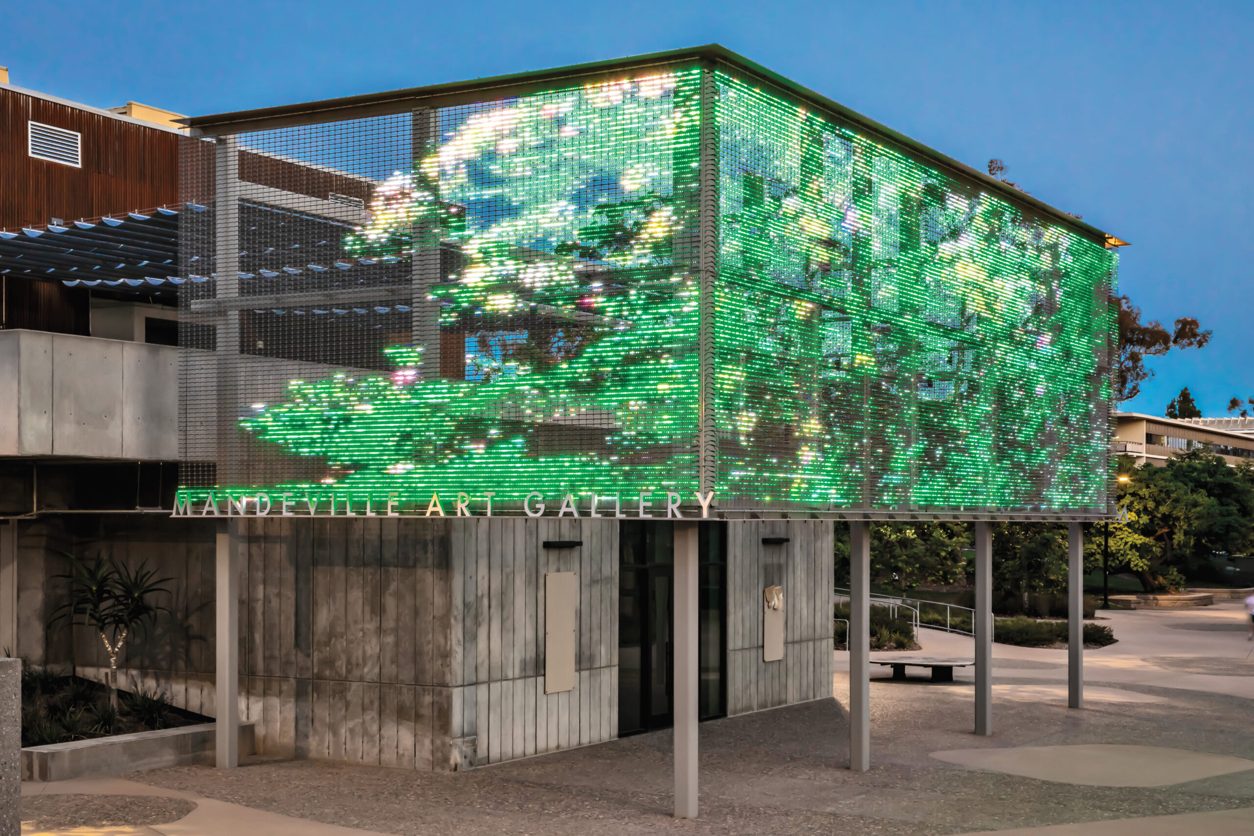
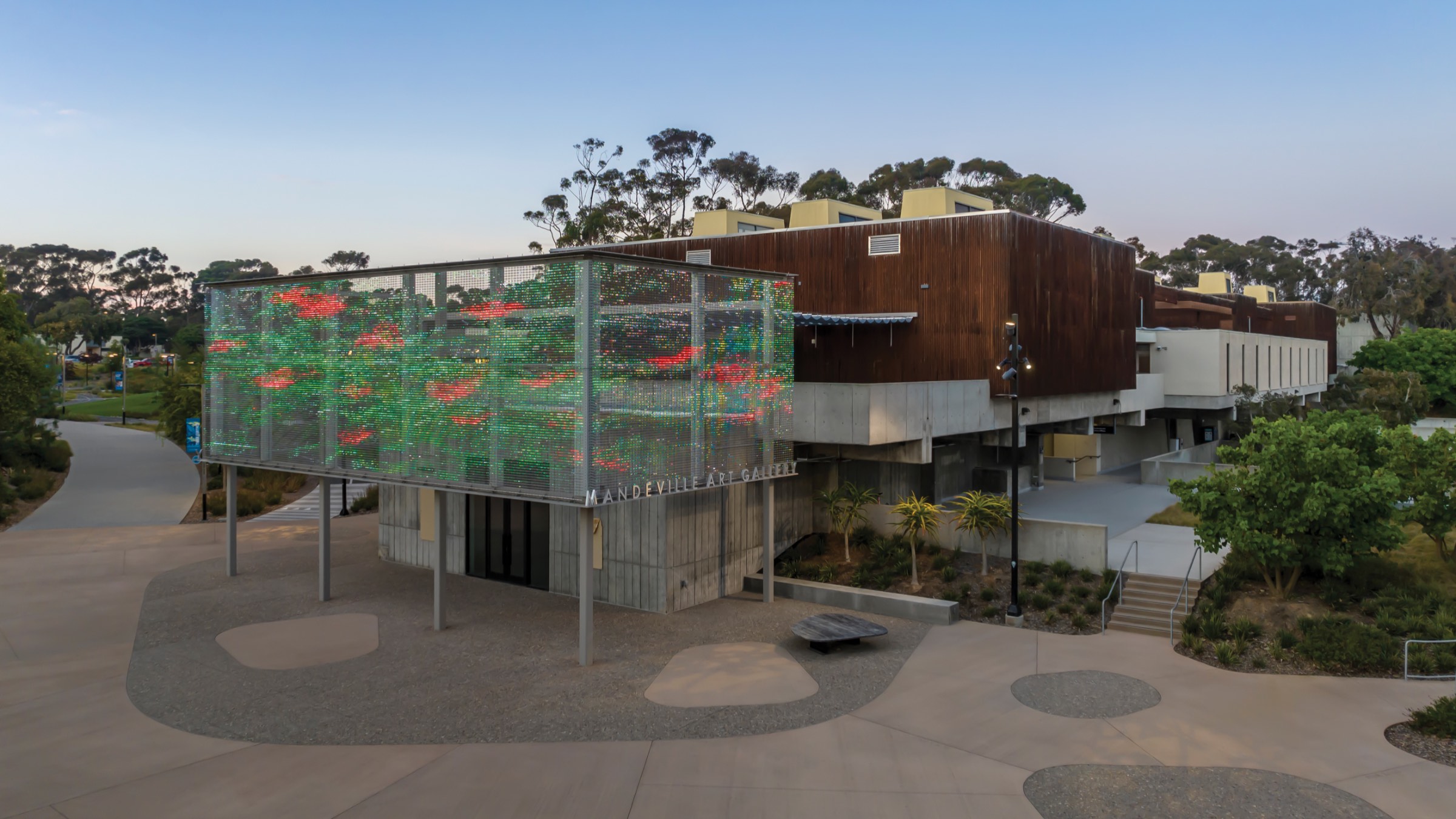
The firm hit upon a way to address both issues at once: a 1,744-square-foot mesh screen that wraps around and announces the 2,360-square-foot gallery inside it. “It’s a kind of porch on the west end of the building that provides a diaphanous, kind of gestalten presence of a space,” he says, “and, as it can be seen from really great distances up and down the campus, it’s a beacon.”
Studio E enlisted Syska Hennessy Group, which had notably helped design the distinctive facade of New York City’s Cooper Union Academic Center and worked with Renzo Piano on the California Academy of Sciences. The team then specified a transparent media facade from GKD. “We weave sleeves into stainless steel mesh, then insert LED tubes of the same width into the mesh,” says GKD USA’s head of engineering, Tom Bialk. Nine panels of the patented Mediamesh wrap around the structure’s three front sides, effectively becoming both a curtain for the gallery and a screen to display digital art exhibitions.
Behind the curtain, tucked into an office at the back of the refreshed main exhibition space, sits the exhibition’s control center. “The tricky part was that thousands of wires have to go out to the freestanding structure,” says Naslund. “This was one of the moments where an opportunity lands in your lap and you think you’re not going to screw this up. We had to float conduits as discreetly as possible.” Otherwise, the tangle of tech would distract from the experience of viewing the art, making the whole project pointless. The answer was its own kind of gestalt. “We made the steel structure itself the conduit, running all the wires inside its frame so there are no visible wires anywhere. And access panels not much bigger than six inches square are integrated in ways that don’t look obvious at all.” The billboard-cum-blank-canvas, he says, “becomes a kind of ghost of Jones’s redwood boxes. It’s a way of being responsive, but also new.”
Would you like to comment on this article? Send your thoughts to: [email protected]
Latest

Viewpoints
A Whole-Systems Approach to Design for Autism
This new ASD Design Matrix can help designers apply new scientific insights while designing spaces that consider autistic people’s experiences.
Profiles
Young Projects Designs for the Unknown
The Brooklyn studio experiments with materials, fabrication, and form to create architecture that puts discovery at the forefront.