


November 16, 2026
Chromatic Architecture Makes a Case for Color
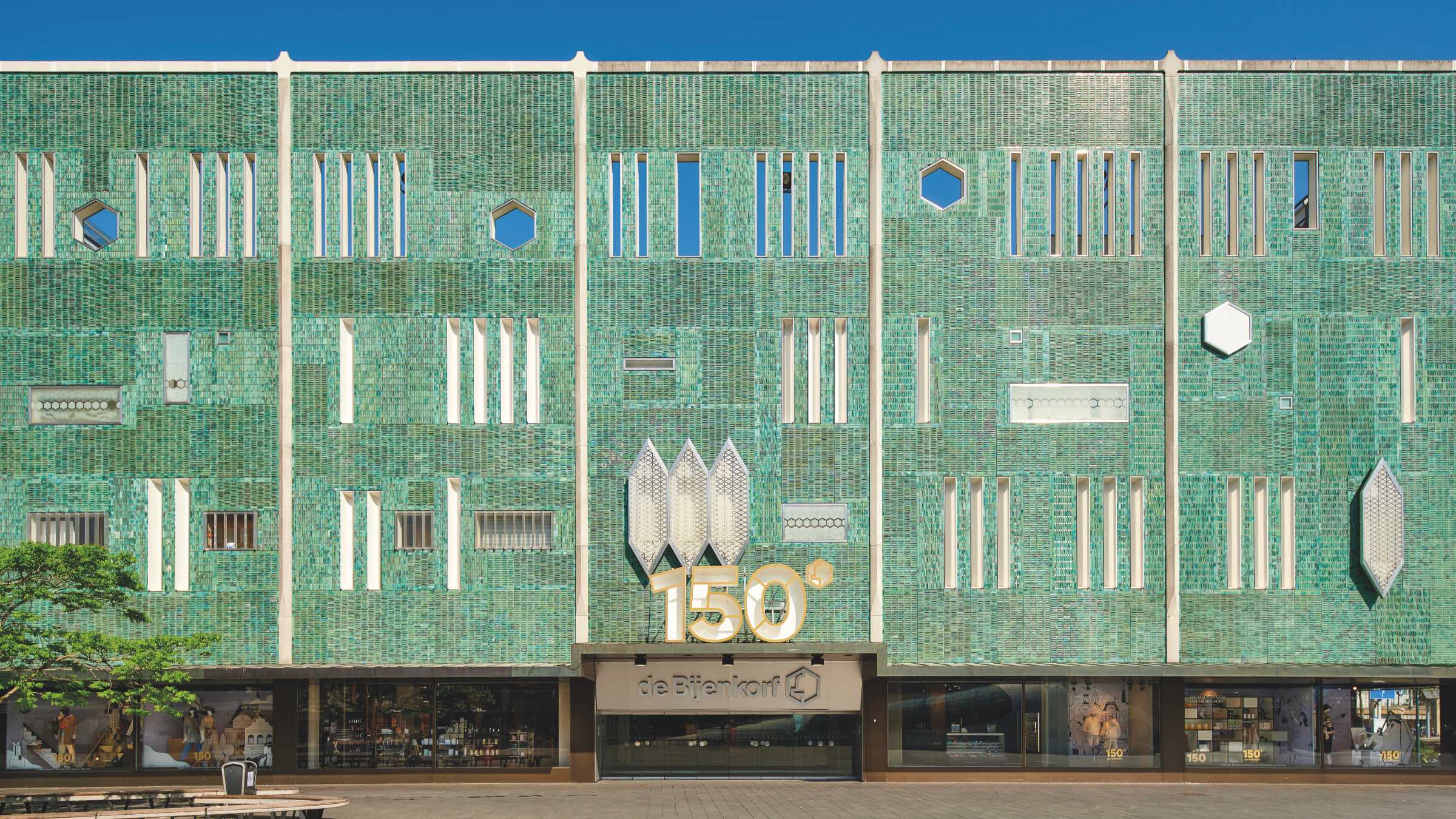
Color is divisive. For decades, the rules of taste have applauded restraint over expressiveness, conformity over individuality—lauding designs in which aesthetics converge with function. What these Modernist conventions ignore is that color has plenty of functions of its own—from conveying meaning, symbolizing identity, and sparking joy to embodying the materiality of a place and telling the stories, aspirations, and ideologies of individuals and communities.
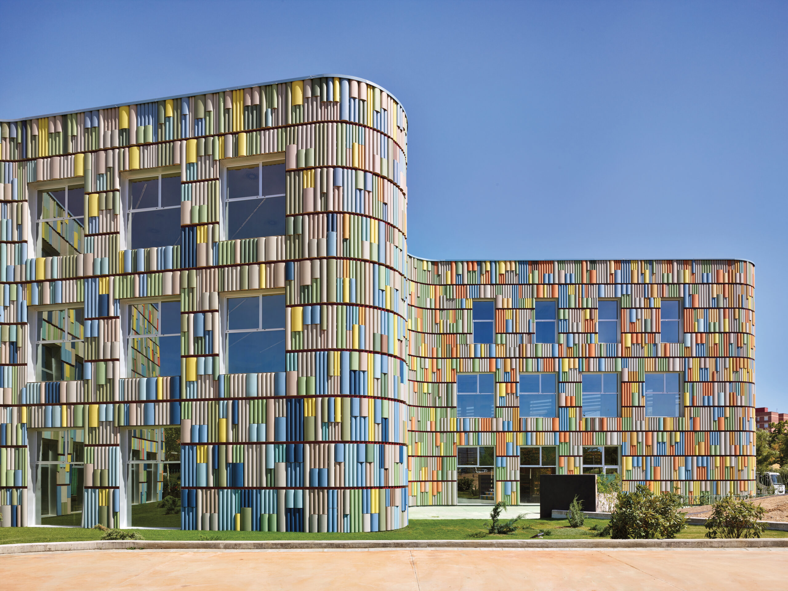
Chromatic Architecture: The Craft of Colour in Design is a collection of 34 case studies that celebrate the diverse ways in which color has shown up in architecture across the world over centuries. The book’s authors—London-based artist and designer Adam Nathaniel Furman, who coedited the book Queer Spaces: An Atlas of LGBTQIA+ Places & Stories (RIBA, 2022), and Texas-based design journalist Kate Mazade, whose writing has appeared in METROPOLIS and numerous other publications—describe color as the “flavor of what we see,” a sensorial metaphor that makes a convincing case that we should not do without it. The projects in the book show how color is inseparable from design. We sat down with Furman and Mazade to learn more.
The opening essay of your book touches on the politics of color—the ways in which it has been dismissed as superfluous or childish over time—but then moves swiftly on to the case studies. How does this respond to and unpack the dynamics you hint at?
ANF: Initially the idea was for a series of essays that would be historical, argumentative, and polemical, deconstructing the prejudices—colonialism, misogyny, queerphobia—that are inherent in aesthetic judgments. People don’t even understand these as judgments because they’re considered to be a form of universal good taste—sophisticated, substantial, and serious. The book ended up different because I find things are more effective when they’re framed in a positive way rather than as an attack. Our approach is to get people to appreciate color without triggering negative reactions from design and architecture professionals or aficionados who are trained to reject anything that uses a lot of it. It’s meant to slip between their defenses—to draw the unwitting architect into the “lair” of color.
KM: Architecture school is an environment where criticism is standard practice—I found there was a mindset that hating something made you cooler. When I went to journalism school, that was turned on its side—it wasn’t so much about criticizing things but about finding stories and figuring out how to represent them. I concluded that you don’t always have to be critical of something to find value in it.
What interests you both about color?
ANF: It’s fundamental to the way I see the world. I grew up in a very international family with a lot of very strong women, who vigorously rejected any codes of taste. At the time, in the late 1990s, color was coded as being against the mainstream dogma of sophistication—it was all about the Prada beige-gray and the minimalism of John Pawson. Queer culture had incorporated color as a reaction against that, and those aesthetics were mixed up with politics—ideas around getting rid of Section 28 [the 1988 UK law banning schools from “promoting homosexuality”] and equalizing the age of consent. After I came out, I ended up in that scene—doing things like helping people design flyers for club nights—so I was completely suffused in color, in environments that reflected us in opposition to the mainstream. When I went to architecture school, I was told all that was stupid—either Postmodernist, fascist, or kitsch—which made color even more intimately tied to my identity.
KM: Color wasn’t something I had been mulling on for a long time, but Adam and I were connected through RIBA Books and ended up having a good partnership. Doing this project allowed me to draw connections between architectural case studies in the book and similar things I had seen through theater, housing, or food reporting—how an idea or a practice by a certain group or culture could influence something in a different discipline, which was a fun way for me to get into this project.
The book has a huge historical span—ranging from Saint Mark’s Basilica in Venice, whose structure was completed between 1063 and 1094, to Suphasidh Architects’ Chonburi Multi-Purpose Building, which I covered for METROPOLIS in 2024.
What did you conclude about how the use of color has evolved over time?
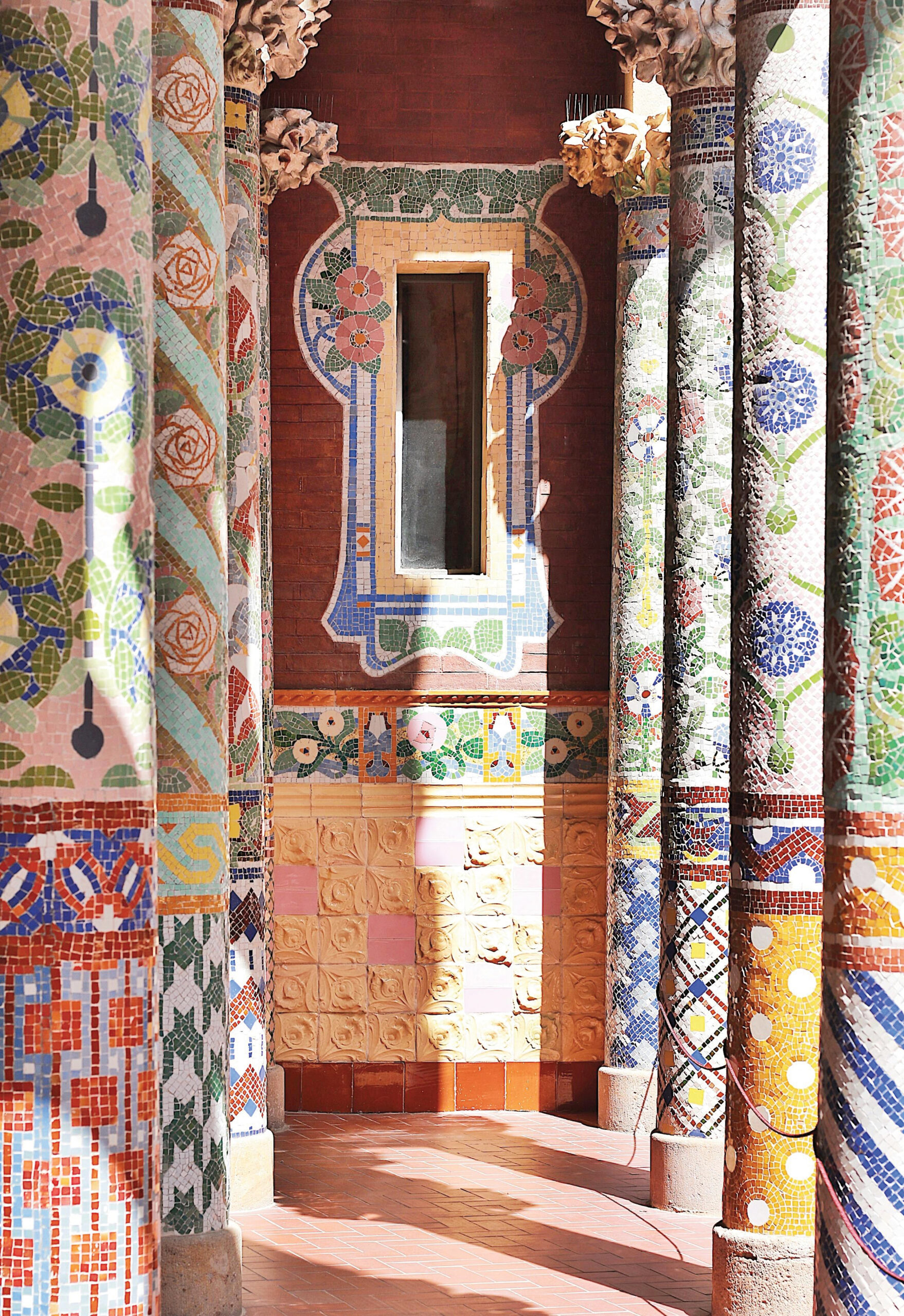
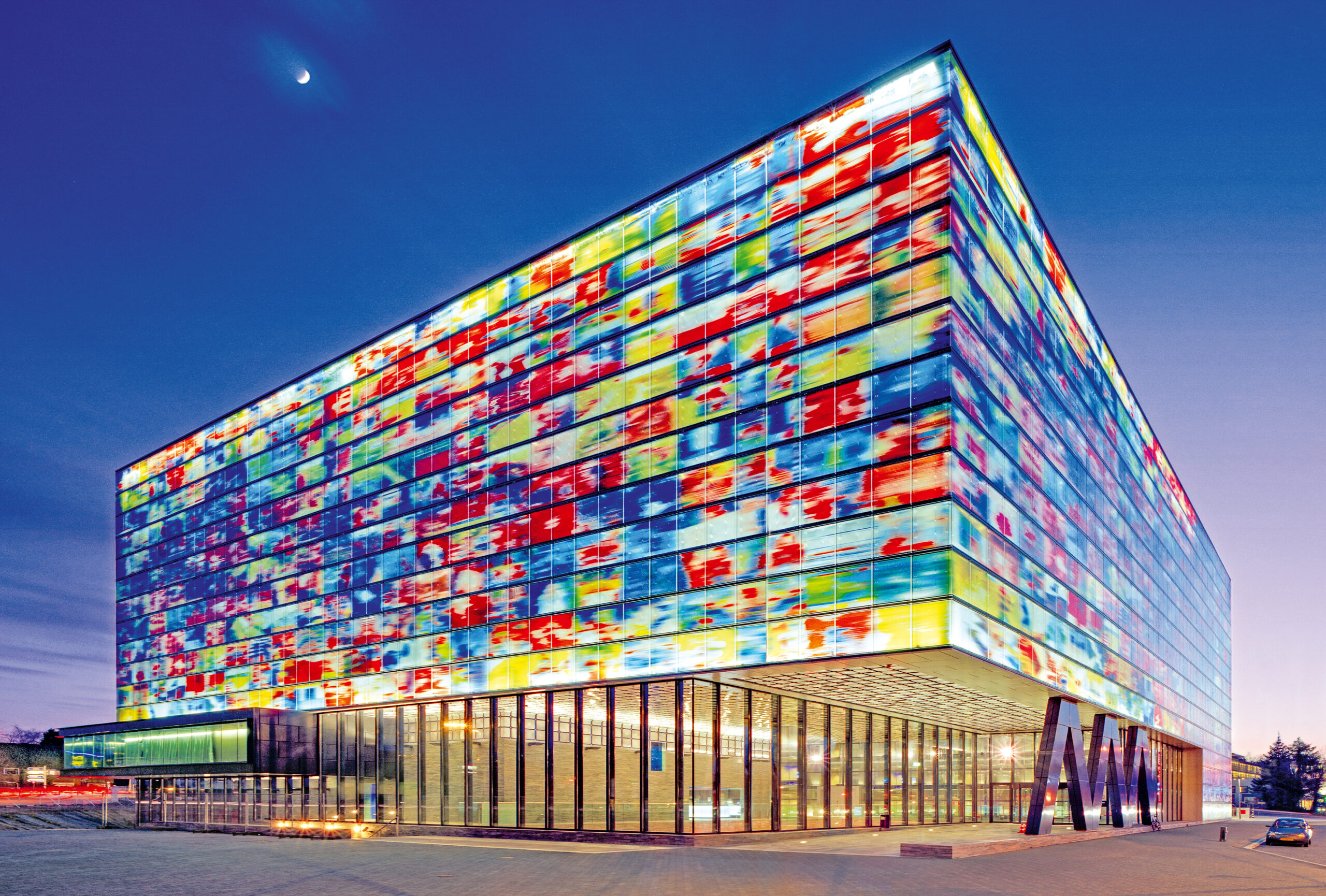
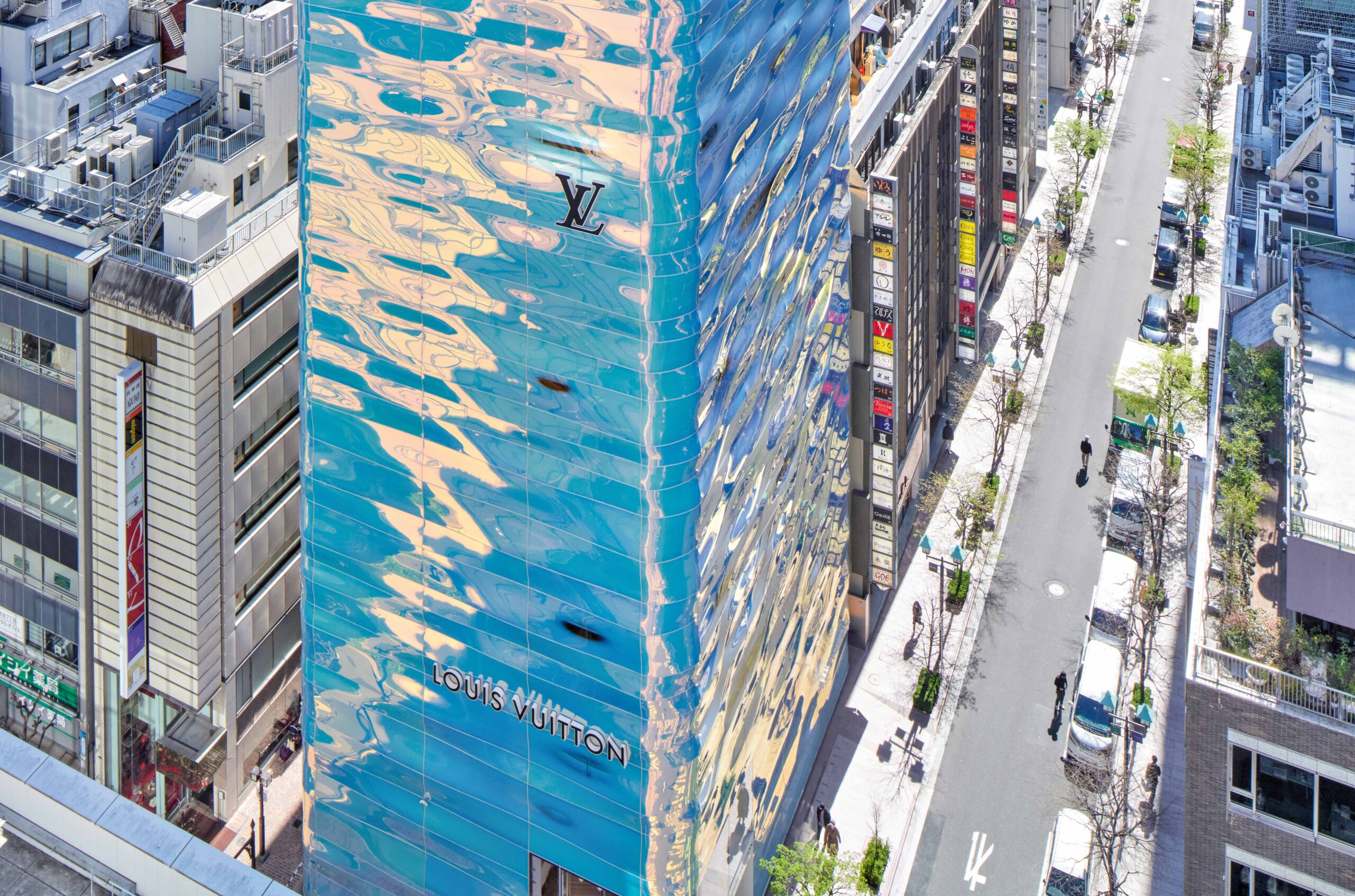
ANF: We live in a rarefied part of the world in a tiny moment that’s highly unusual for not using color effusively, but it has always been integral to the conception of space. Many of the projects in the book encapsulate a political and economic moment through materials and color. For example, Oslo City Hall—with its frescoes, folk art, and murals—came at a time in the mid-20th century when Norway was emerging as a social democracy and wanted to express a sense of unity and civic identity as it progressed into the future. The Palau de la Música in Barcelona [1908] was meant to embody Catalan identity through its local materials and crafts—blown glass, carved stone, and mosaics. For the Palacio de Aguas Corrientes [1894] in Buenos Aires, 170,000 tiles came from London and Leeds, which was hugely expensive, but the building was designed in the Beaux Arts and Victorian style to express the status of the new, cosmopolitan capital of Argentina. Even Louis Vuitton’s 2021 store in Tokyo does that—its undulating pearlescent facade combines spectacular architecture with a more thoughtful Japanese philosophy in response to the hypercommercialization of the luxury market happening at the time.
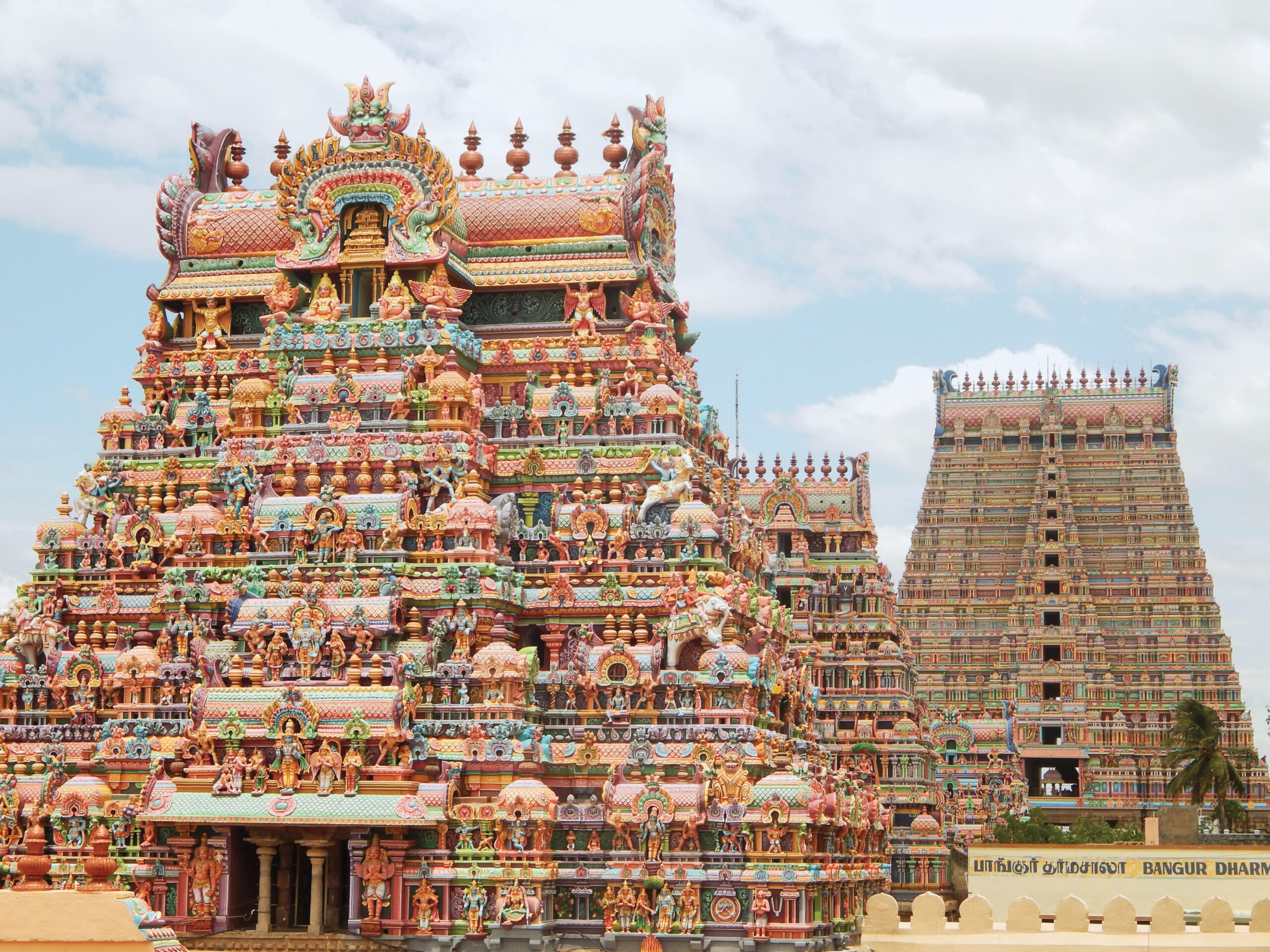
KM: There were moments when color wasn’t the most popular way of designing, particularly in the mid-20th century, but even then, there was always somebody saying, “No, we can still use it”—from Peter Behrens to Gio Ponti. Color reemerged in Postmodernism in a satirical way, but now people are rediscovering it in a way that’s genuine and serious.
Why do you think that’s happening?
ANF: There’s a boiling ferment of people who are looking for ways of belonging that are different from the neoliberal consensus, which has tended to be very monocultural. People are longing to connect with things that are more meaningful, variegated, and granular, and that leads to them discovering alternative taste cultures or the traditions of their own communities, which tend to be less puritanical or filtered. The search for identity naturally segues into color, as it’s one of the most important tools for creating something distinct, with character and personality.
KM: I think there’s a shift in culture that comes with major events: The pandemic was a global moment where everybody was upset and heartbroken, and we are trying to find who we are again. It’s also about the excess of information we have at our fingertips at every moment. Social media audiences are looking for something different from what they have already seen, and designers are looking for a way to rise above the noise.
What narrative or themes stood out as you progressed through the research?
KM: In many projects, the color was a result of the trading patterns of the time or how the materials arrived on-site. The ceramic flower petal motifs on Wat Pho in Bangkok, for example, were created in the late 18th to early 19th century from broken dishes that had been used as ballast on ships traveling between China and Thailand. By using the materials they had available, the designers extended the use of the color on those plates and bowls significantly further through history than if they had been trashed. Architects tend to belittle decoration as much as they belittle color, but it’s not frivolous.
What do you want people to take away from the book?
KM: That throughout history, people built things that represented who they were, the environment they were in, the communities they were in, the economic times they were in, the emotional spirit of that place and time—and we can continue to do that going forward.
Would you like to comment on this article? Send your thoughts to: [email protected]
Latest
Projects
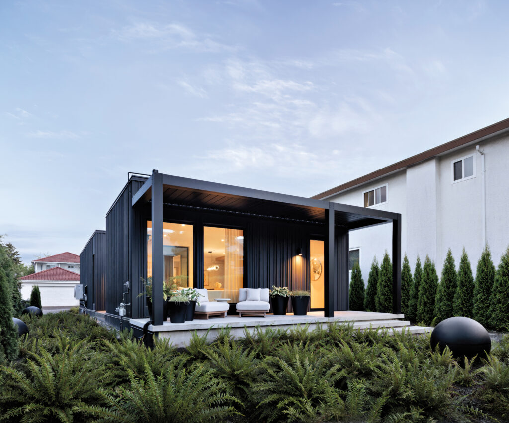
Commonplace Is Making the Case for High-Design Prefab
In Vancouver, McKinley Studios is testing a modular construction system that cuts building time from months to weeks without sacrificing architectural ambition.
Products
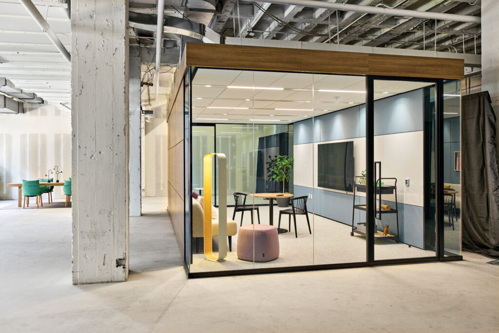
Haworth’s 4Space Rooms Promise to Transform Office Renovations
The inventive new system makes it easy for designers and their clients to put rooms in, move them around, and take them out.