June 27, 2019
Unpacking the Love Affair Between the LGBTQ Community and Design
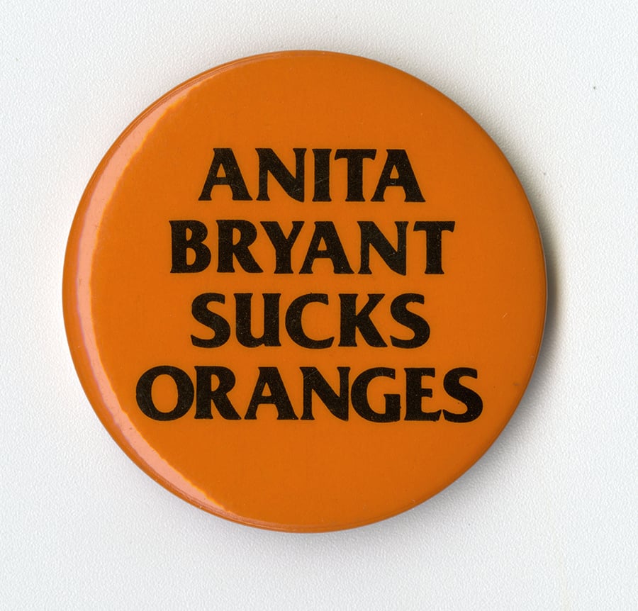
The new survey book Queer x Design, written by Andy Campbell, chronicles the development of queer design, foregrounding politics and activism.
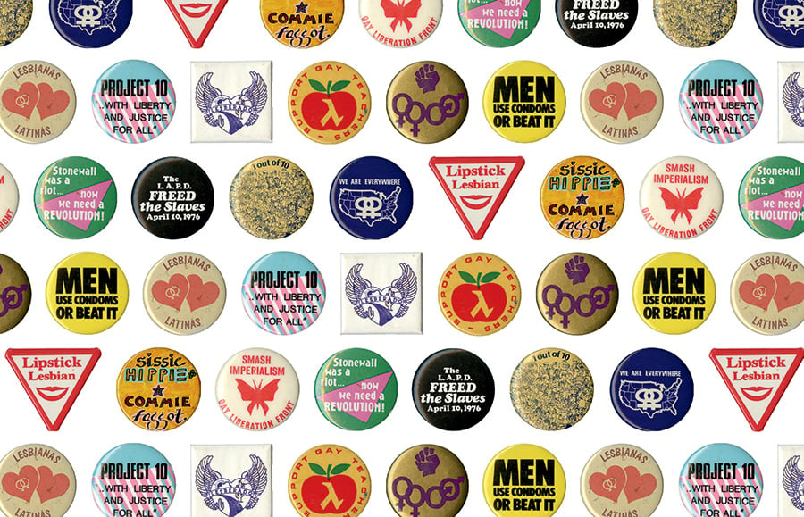
In any major city in the West, it sometimes feels like half the queer people you might meet are designers—and if they aren’t, their exes are. At least since Oscar Wilde’s 1882 tour of rural America, in which he delivered a one-man show of fashion tips and art recommendations, queers have negotiated society via the visual. Maybe we focus on beautifying our exteriors because society has long insisted our souls are ugly. Or maybe our genius for aesthetics is because, as Female Trouble’s Aunt Ida insists, “Queers are just better.” Birds of a feather flock together? We recruit? Who knows.
Art historian and curator Andy Campbell’s new survey Queer x Design: 50 Years of Signs, Symbols, Banners, Logos, and Graphic Art of LGBTQ (Black Dog & Leventhal, 2019) delves into this affinity. From a riotous 1928 illustrated ad for “Ma” Rainey’s “Prove It on Me Blues” single, in which the butch Rainey wears a three-piece-suit and flirts with a femme duo in full view of one truncheon-swinging cop, to the pretty vacancy of the Ellen Show logo, QxD demonstrates that queer design is here and we should be used to it by now.
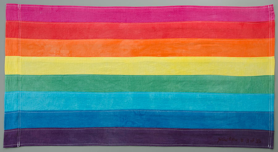
Organized chronologically from the period Campbell terms “pre-liberation” and through the ‘70s, ‘80s, ‘90s, and 21st century, the volume includes all the expected hits, including the Silence=Death poster (rightly and refreshingly credited not to ACT UP but a predecessor, the Silence Equals Death Collective), the AIDS quilt, and the bare-minimum Red Ribbon. A welcome and lengthy dissection of the history various Pride flags, including its more controversial iterations, is the sexiest bit of vexillology imaginable, and a testament to the elasticity of Gilbert Baker’s original.
Campbell doesn’t stop there. A poster for a 1985 PFLAG convention is graceful and even a bit shady. An entry on José Sarria shows off his versatility: as a postwar drag queen, Sarria posed for the cover of his album No Camping as both saucy bride and a brooding young man; a decade or so later, he ran for the San Francisco Board of Supervisors with a campaign ad showing him in male drag with the fierce slogan “Equality!” The word, Campbell notes, is “printed in a type that mimics a cursive handwriting, as though Sarria had signed the poster with the word himself. To certain members of San Francisco’s electorate, the word itself would have been a tacit acknowledgement of the candidate’s homosexuality.” Talk about a John Hancock!
A “key feature in LGBTQ design,” Campbell writes, “is the ambivalent relationship between seeking broad social acceptance and finding innate value in homosexuality’s outlaw history.” The cover of Sylvester’s 1982 album All I Need gets the balance exactly right: part of-its-moment aspirational glamour, part Afro-Futuristic provocation, and queer as fuck. The leggy Pleasure Chest logo is also perfection. When designs err too much on assimilation, like Human Rights Campaign’s IKEA-esque logo, it reveals a bland corporatism. GLAAD’s ever-changing logo reveals a certain…uncertainty of goals.

But exploiting the “innate value” side of the equation has its own set of pitfalls. For every thrilling transgression like the 1970s lesbian S/M organization’s Samois logo, which creates intertwined Venus symbols out of handcuffs and rope, is a Grindr. Campbell unpacks the hookup app’s logo which, weirdly for an app designed to identify the queer people around you, is a mask. Making matters worse, founder Joel Simkhai waxes colonial about its inspiration, saying, “I went back to primitive tribal arts in Africa and Polynesia….It brings us back to basics, primal needs.” Gross.
As the subtitle promises, QxD keeps its gaze mostly on graphic and print design, though the few industrial designs Campbell includes—like the GC2B chest binder and Buck-Off sex toy for trans men—prove a survey of queer products could be fruitful. Campbell does foray into gay semiotics, and not just Hal Fischer’s post-structuralist/faux-Audubon masterpiece by that name, managing to avoid excess jargon. A discussion of the lambda includes an especially powerful image of a flyer for the Association of Black Gays, where the Greek letter rises inside a Black Power Fist. Lesbian feminists used to wield a labrys, the double-headed axe favored by real Minoans and mythical Amazonian giants, across t-shirts and publishing imprints as a kind of women’s will to power. Speaking of fabulous creatures, David Thaxton and Bernard “Bernie” Toale’s 1974 Lavender Rhinoceros mascot once appeared throughout the Boston subway system and should perhaps be revived to trample the city’s upcoming so-called “Straight Pride” parade. The rhinoceros is inexplicable, although there is of course its horn; more design should be so charming, risky, randy, and odd—just like the queer community itself. After all, the battles ahead offer one explanation of the queer love affair with design: when you must constantly assert, defend, and describe your public existence, representation sure does matter.
You may also enjoy “How Humanity Mapped the Moon Over 300 Years.”
Would you like to comment on this article? Send your thoughts to: [email protected]


