March 20, 2020
Two Houses in Germany are United by Their Difference
To unify the houses, which share a tree-dotted complex near Frankfurt, their architects painted them opposite colors.

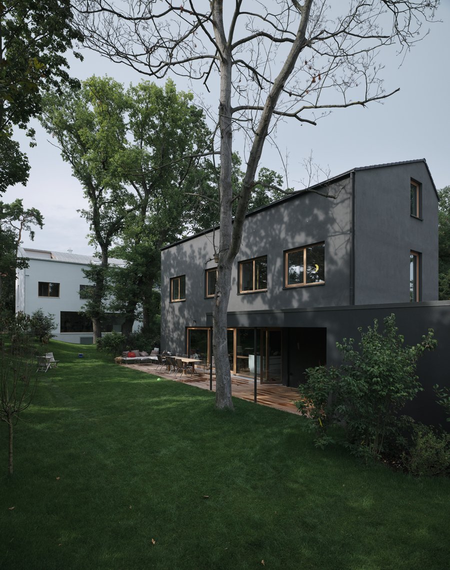
In Mainz, a small city near Frankfurt, Germany, two families were looking for two new homes with lots of green. They wanted a space that could provide both privacy, as well as ample opportunities for socializing, ultimately finding a fitting, 15,069-square-foot site dotted with old oak and pine trees in a neighborhood tellingly called Waldvillenviertel (meaning “forest villas quarter”). Through personal connections, the two families contacted three young local architects—Marc Flick, Henning Grahn, and Christian Stock—who teamed up on the collective effort to design two visually distinct, yet inarguably united houses.
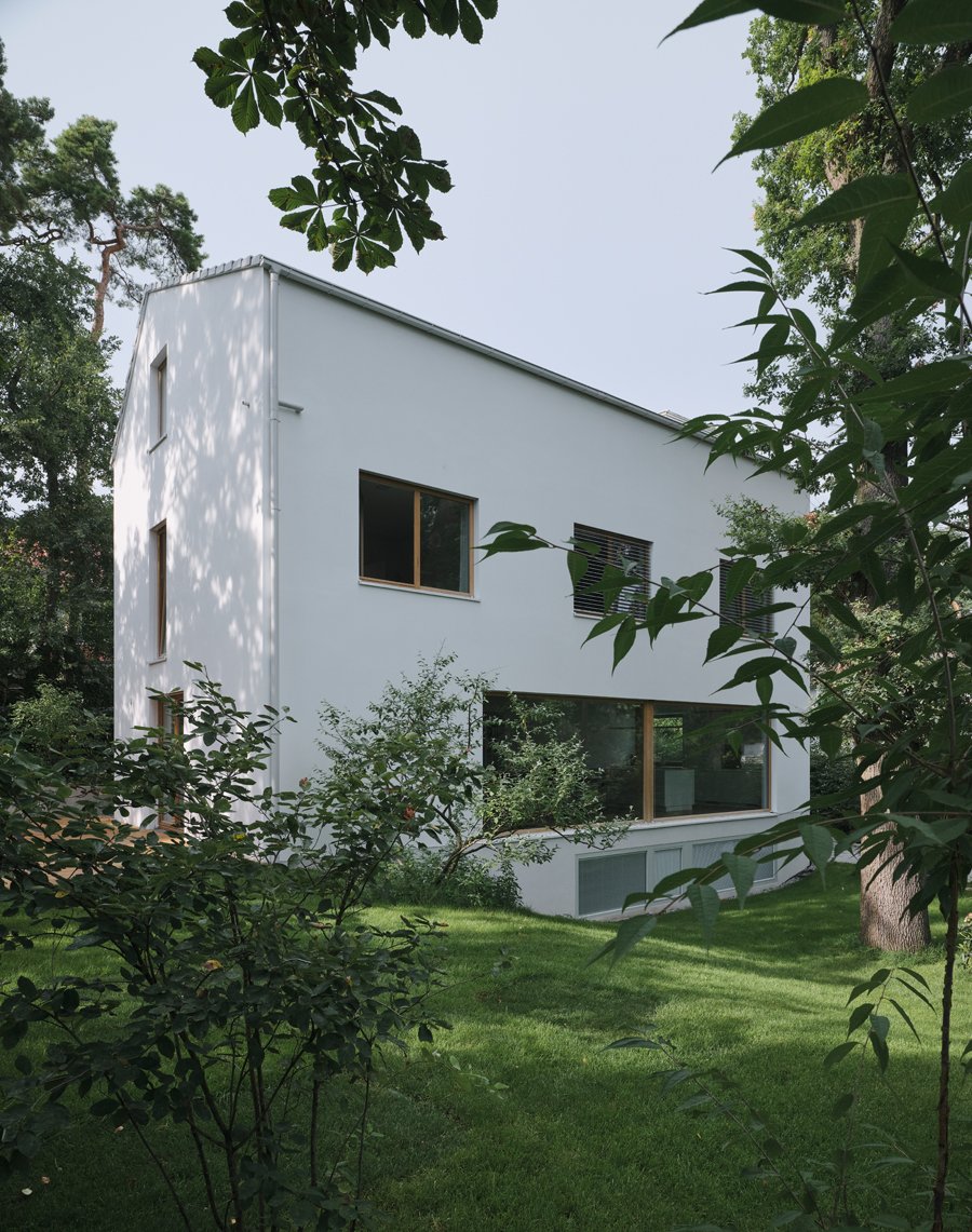
A guiding principle was to preserve as much of the existing greenery as possible. Both homes, therefore, have a very slim silhouette—as if gently laid between the trees. The smaller house of the two stands at the front of the parcel, its slim side fronting the street. A somewhat bulky garage appears as a base for the building, underscores its slimness: only 21.6 by 48.5 feet. A paved path runs along its longer facade and links to the larger house at the farther end of the parcel. In plan, the strewn structures form a wide U-shape, neatly enclosing the shared garden within.

Despite the distance and variations in size that separates the two houses, one feature they share is the complete use of monochrome—a certain unity in difference. The “Black House” fronts the street, while the “White House” shines in the greenery beyond. “The color scheme came from us architects,” says Marc Flick. “It seemed important to us to create a clear unity yet with two different, self-contained houses.”
Besides the striking color scheme, the most eye-catching feature is the asymmetrically positioned ridges. This can be understood as a little wink to local building laws that mandate a pitched roof; by making them asymmetrical, the architects demonstrate that a pitched roof can still look rather modern.

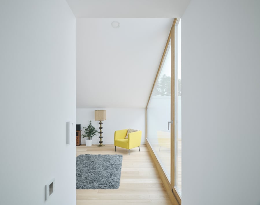
But the rooflines also hint at the stringent interior organization: In each house, they anchor the main wall that stretches from end to end, dividing floors into two zones. One zone is open in plan, with large, spacious rooms facing the shared garden, while the other contains more compact and functional spaces like stairs, bathrooms, and storage.
Within this spatial order, “maximum utilization of space” was key, the architects say. “Sliding doors allow to open some of the rooms toward the corridors, temporarily enlarging the children’s bathroom in the ‘Black House’, for instance.” Those sliding doors, of course, also connect the interiors with the large terraces, where family members can sit and wave to their friends on the terrace across the lawn.
You may also enjoy “This Hillside Gem Is Classic New England With a 21st-Century Twist.”
Would you like to comment on this article? Send your thoughts to: [email protected]


