February 20, 2020
Fort Point in San Francisco’s Mission District Redefines the Brewery Aesthetic
Through bright pops of color, blond wood, and intimate arched niches, the brand hopes to attract a wider clientele.

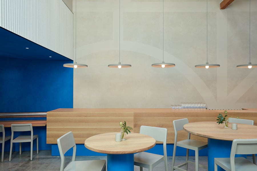
Last October, in San Francisco’s Mission District, the independent craft brewery Fort Point Beer Company opened its third Bay Area location in as many years (with a fourth on its way). But rather than follow the hackneyed template of other beer halls—think heavy wooden furniture and industrial hanging lights—the watering hole took on an organic, jewel-toned identity with a Scandinavian inflection.
It’s an aesthetic well-suited to the company, which hopes to attract a broader range of drinkers into beer’s foamy fold. The night of my visit, for instance, the menu included a tasty pét nat in addition to brewery standards, and the crowd included both Baby Bjorn-wearing parents as well as a murder of millennials donning black clothes, blue hair, and beanies.

Guests process through a compressed streetfront entry into a double-height taproom, which has delicately balanced new build-outs and contemporary furniture with original architectural elements. A blond-wood bar with Charmin-soft radiused edges flanks one side of the room, with sleek, gray pendant lighting strung overhead; across from the bar, a ribbed gray-and-white ribbed wall adds visual and tactile interest. While the walls and fixtures run neutral, bold color serves a programmatic end for two box structures in the space, defining a kitchen (teal) and a seating area for guests (blue). The walls of these two spaces stop short of the ceiling, letting the structure’s original wooden trusses sing. Throughout, the bold blue of Fort Point’s monolithic facade is a recurring element, appearing in the soffitted entrance and on table bases—even in the grout between gray restroom tiles.
By drawing on an identity already both abstract and literal, Dina Dobkin—the creative director for Fort Point and the designer of the taproom—pulled off a true feat of marketing: that is, branding without branding. Dobkin incorporated subtle nods to the Fort Point logo and packaging, weaving the color scheme and line art of the brand’s beer cans into fragments of the bar room. The most recognizable elements are the artisanal neon wall tapestries, which collage together references to locally beloved landmarks: the parrots of Telegraph Hill, Presidio houses, the Fort Point lighthouse. As well, arched niches in the bar echo the brewery’s logo. “The space needed to feel unique, but quiet on the branding front,” says Dobkin, “We wanted to give people a feeling that’s Fort Point.”

In line with the brand’s aspiration to make “good beer for everyone,” Dobkin has worked to welcome a broader spectrum of beer drinkers into the space, which manages to feel variegated in spite of its relatively open plan. The room reads differently looking out from the intimate rear toward the expansively open bar and vice-versa. Dobkin has also accommodated different lounging positions, offering a number of ways to sit or stand or do anything in-between—benches, picnic and cafe tables, chairs and snug two-tops are all on the menu.
The space’s greatest virtue, however, is its mechanisms to trigger interaction: There are circular tables, but no seats along most of the 34-foot wooden bar counter, eliminating any barriers to it. The taps have been lowered to sit flush in the counter, clearing the eye-level view entirely. And with no back bar, bartenders never have to turn away from patrons. There’s also the spoken-word soundtrack in the loos: The night I’m there, it’s David Attenborough, explaining why a certain species of fish changes its color while fighting. The first thing you’ll want to do while washing up at the communal sink? Tell the person next to you all about those crazy fish.
You may also enjoy “This Is Not a Theme Bar.”
Would you like to comment on this article? Send your thoughts to: [email protected]


