October 20, 2012
Preserving The Past & Future of Chinese Letterpress
Typographers, educators, designers, and type enthusiasts from around the world gathered at the annual ATypI conference this past week. Hosted by the Hong Kong Polytechnic University from October 10-14, this year marks ATypI’s first meeting in Asia. The five day conference includes daily presentations and workshops on a variety of topics surrounding typography–with this year’s […]
Typographers, educators, designers, and type enthusiasts from around the world gathered at the annual ATypI conference this past week. Hosted by the Hong Kong Polytechnic University from October 10-14, this year marks ATypI’s first meeting in Asia. The five day conference includes daily presentations and workshops on a variety of topics surrounding typography–with this year’s special interest on multilingual issues. One workshop that was especially popular was the Zi Wut: Chinese-English Blingual Letterpress Demo Workshop.
Zi Wut is a tiny letterpress shop located in an old industrial warehouse in the Kowloon district. Zi, means word, and Wut means alive. If read backwards, Wut Zi translates to moveable type. The founders of Zi Wut have made it their mission to use the newly acquired shop as a “preservation and rejuvenation of letterpress in Hong Kong.” They plan to use the space to promote the dying art form of Chinese letterpress to students and the design community by holding workshops and hosting exhibitions throughout the year. This ATypI event was the first time the shop was open to the public.
The bilingual letterpress workshop, held a week ago from Thursday, shed light on the commonalities and differences between Chinese and Latin letterpressing. Surprisinlgy, there is more in common than one would expect. Below is a snapshot from the workshop.
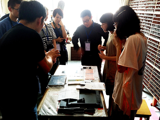
Conference attendees from Chicago, London, New York, New Zealand, Palo Alto, Soeul, and Taiwan–to name a few–gather in this tiny room as founder of Zi Wut, Marsha Lui, describes the history of the shop and how she came upon this complete set of Kai-Shu lead type displayed on the right wall.
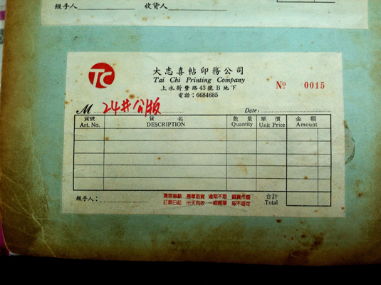
Kai Shu, is a calligraphic typeface commonly used in business cards, invoices, legal forms, and other utilitarian printed pieces. It’s typically not used as body text as the legibility becomes compromised. This invoice is set in Kai Shu by Han-chi Tong for his Tai Chi Printing Company. Mr. Tong sold his lead type collection, along with his printing press, to Zi Wut when he recently retired. The shrinking demand for his craft and high rent forced him to close down his business which began in the early 90’s.
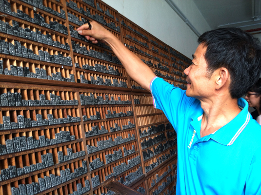
Mr. Tong, pictured here, demonstrates how to set lead type. He has a photographic memory of each character location, allowing him to set type at an impressive speed. The characters are ordered in these cases based on its root component, also known as a radical. Each radical is ordered from most simple to most complex.
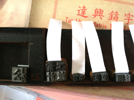
Unlike Latin fonts, Chinese characters are not available in different weights such as light, regular, or bold. The larger characters are simply thicker, and the smaller characters are proportionally thinner. In this case, there are a total of six sizes to the Kai-Shu family.

Mr. Tong uses a wood composing stick and wraps his lead type with rubber bands—a genius idea—until each line is ready to be placed in the chase.

Leads are placed between lines, extra spaces are filled in with various pieces of lead furniture, and tiny gaps are filled with thin pieces of paper. In this case, Mr. Tong cuts up discarded red Chinese money envelopes to fill in his hairline gaps.
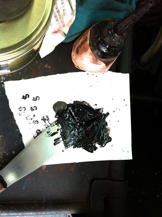
The most commonly used colors for Chinese letterpress is black and red. This oil based ink can last up to several days without drying out.
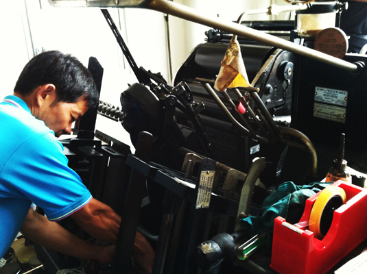
Though the Chinese first discovered handcarved clay moveable type in the 11th century during the Song Dynasty, it wasn’t until missionaries brought over sophisticated machines and printing techniques to Macau did letterpress take off in Hong Kong. This machine, a German made Heidelberg, has been with Mr. Tong since he opened shop. It has never once broken down.
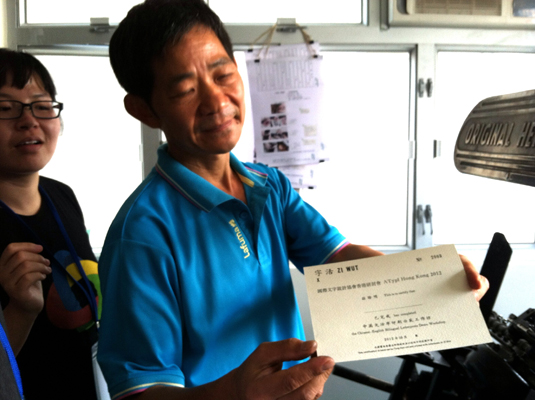
After several test prints and some finessing with the ink pressure, he is satisfied with the quality. Everyone recieves a souvenier print certifying their completion of the workshop.


