October 21, 2020
Supersize Graphics Mark a Design Firm’s Dream HQ in Amsterdam
Unlike the arduous process of its decade-plus development, the thonik building is a light and joyous affair with an ode to amateur-led design.
Surfaces of all kinds are top of mind these days, so we decided to look at all aspects of them, in these articles, from A to Z. Thinking of surfaces less as a product category and more as a framework, we use them as a lens for understanding the designed environment. Surfaces are sites of materials innovation, outlets for technology and science, and embodiments of standards around health and sustainability, as well as a medium for artists and researchers to explore political questions.

It was back in the late aughts that Amsterdam-based graphic design firm thonik realized how few creatives actually own their studios—and as a result, how seldom rental spaces actually fit designers’ needs, or remain affordable in the long term. “Developers make money out of the cultural sector, but aren’t making the best or most beautiful buildings,” say the studio’s founders Thomas Widdershoven and Nikki Gonnissen. Their practice embarked on a journey to build their own six-story HQ, an effort that would draw up a blueprint for how the creative sector might avoid the endless cycle of move-ins, rent hikes, and move-outs. “That was 12 long years ago,” recalls Widdershoven, who designed thonik’s new office in collaboration with Arjan van Ruyven of MMX-Architecten in Amsterdam’s city center. But, says Widdershoven, bureaucratic red tape had to be overcome every step of the way.
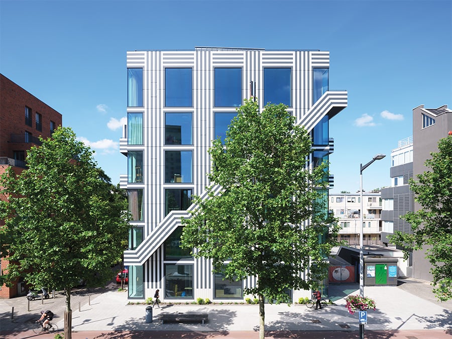
Unlike the arduous process of its decade-plus development, the thonik building itself is a light and joyous affair, confidently filling a constrained site. The high-contrast graphic pattern on its facade is just one of many references to its owners’ profession, and adeptly straddles the line between whimsy and sophistication. An homage to the quasi-psychedelic trilinear typeface that was designed for the 1968 Olympic Games in Mexico City, the graphic pattern is a combination of horizontals, verticals, and diagonals that balance out a multitude of floor-to-ceiling windows and an external staircase. “The graphic skin brings rhythm and balance to the architectural elements,” explains Widdershoven.

The choice of this particular font was not just an aesthetic one, however: “We are big fans of the Mexico ’68 Games because it connected a massive audience to graphic culture,” says Gonnissen. “And the graphic language was applied on a huge scale.” Lance Wyman, the designer of the original Mexico ’68 logo and brand identity, approved the studio’s adapted version of the font, which thonik has used elsewhere at different scales—for instance, in a communications scheme for the Museum Boijmans Van Beuningen in Rotterdam.
Thonik’s past experience with supergraphics, which includes the concept for the facade of the Italian Pavilion at the 2008 Venice Architecture Biennale, led the firm to opt for a rich gray and off-white external color palette over a harsher black-and-white one. And it also informed an unusual material choice for the facade design: The cladding is a recyclable high-pressure laminate called Trespa, made in the southeastern Netherlands. “It is used in outdoor signage, so we were familiar with it as graphic designers,” says Gonnissen.

Inside the building this graphic language continues, most notably on the internal staircase (designed by Dutch collective Envisions), where a dynamic pattern of lines converge on sheets of laminated plywood. Elsewhere, striking carpets featuring thonik’s riff on the ’68 Games font and mementos from other projects it has worked on over the years adorn each room, while more muted floor-to-ceiling curtains (by Dutch brand Vescom) and raw concrete ceilings, floors, and walls frame expansive city views.
Ultimately what this project shows so beguilingly is how sometimes nonexperts pave the way for others. “We’re amateurs in the sense that we are not professional architects,” says Widdershoven, “but we’re also amateurs in the sense that our heart and passion are in this project.” Being an amateur is about a combination of humility and passion, openness to knowledge and collaboration, and an eagerness to learn. “If we want to transform our society and economics, this is the way to go.” Professionals, take note.
You may also enjoy “Designers Are Exploring Ways to Introduce Users to a Mixed Reality”
Would you like to comment on this article? Send your thoughts to: [email protected]
Register here for Metropolis Webinars
Connect with experts and design leaders on the most important conversations of the day.
Recent Projects
Projects
A New Era of Senior Living


