


November 7, 2018
Zesty Chicken Purveyor Nando’s Swaps Cheek for Chic in the U.S.
The international Portuguese-style chicken restaurant is continuing its U.S. expansion by merging bold flavors with bold design.
The moment you walk into the newest U.S. outpost of fast-casual chicken chain Nando’s, it’s clear you are in a different sort of fast-food joint. The South Africa-headquartered restaurant chain, known for its zesty peri-peri Portuguese-style chicken cheeky late night dinners, and friendly environment, has taken a turn towards the high-end in its ongoing expansion across the pond.
The space, set within an existing 3,500-square-foot storefront in North Bethesda, Maryland, just 12 miles outside of D.C., was designed by Brooklyn-based firm CRÉME. Studio founder Jun Aizaki was approached by the chain just over three years ago to work on the design, with just a few qualifiers: “They had a really non-compromising attitude for being creative and fun with the space,” says Aizaki. “They required we use at least some South African artists and artisans in the space, but otherwise emphasized the need for it to be an inclusive, unique, and fun place to be.”
To achieve this goal, the team started first with mood boards, looking at various colors, patterns, and shapes that were prevalent throughout South African design. “We were trying to dig deeper and look into arts and crafts that are rooted in South Africa as well Portuguese elements to try to trace back the history of the brand and find inspiration with that,” said Aizaki.

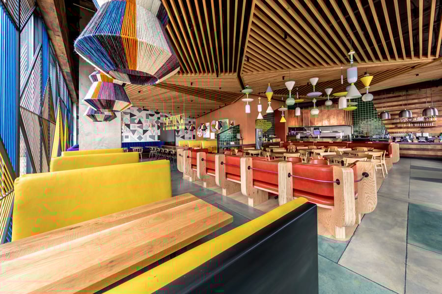
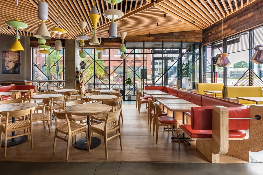
The design team’s exercise translated into a space that is awash with glazed tiles, South African-inspired textiles, and a rhythmic screen woven with industrial chord to shield restaurant guests from the sun blazing through the floor-to-ceiling windows. “The space was almost too bright, it ruined the mood,” explains Aizaki.
To unify the interior and conceal ceiling mechanicals, Aizaki designed a slatted wood canopy that hovers above diners. Its geometries mirror triangular shapes stained into the concrete floor beneath it. These elements, in addition to lending texture to the restaurant’s interior, help out with circulation: “We wanted visitors to be drawn in by the ceiling and towards the delicious food, and then move towards the dining area. It almost guides you without realizing it,” says Aizaki.
Additional features include yarn-wrapped lighting fixtures, custom-designed C-shaped booths made of thick exposed plywood and upholstered with red leather, and a feature wall comprised of grey geometric shapes celebrating South African textile design. The walls are also full of original paintings, all by South African artists.
It goes without saying that the design will allow diners to have their fill of both delicious chicken and beautiful design. “Nando’s has always had fun and colorful restaurants,” says Aizaki,” but now that they’re jumping across the Atlantic, and in a sense starting fresh over here. They need to stake their position as a really vibrant, accessible concept, but at the same time never stop being innovative.”
You might also like, “GamFratesi Designs a Verdant, Greenhouse-Inspired Restaurant in Manila.”


Recent Projects
Projects
SOM Creates a Breathing Building