July 25, 2024
Laura Guido-Clark Wants Designers to Stop Being Afraid of Color
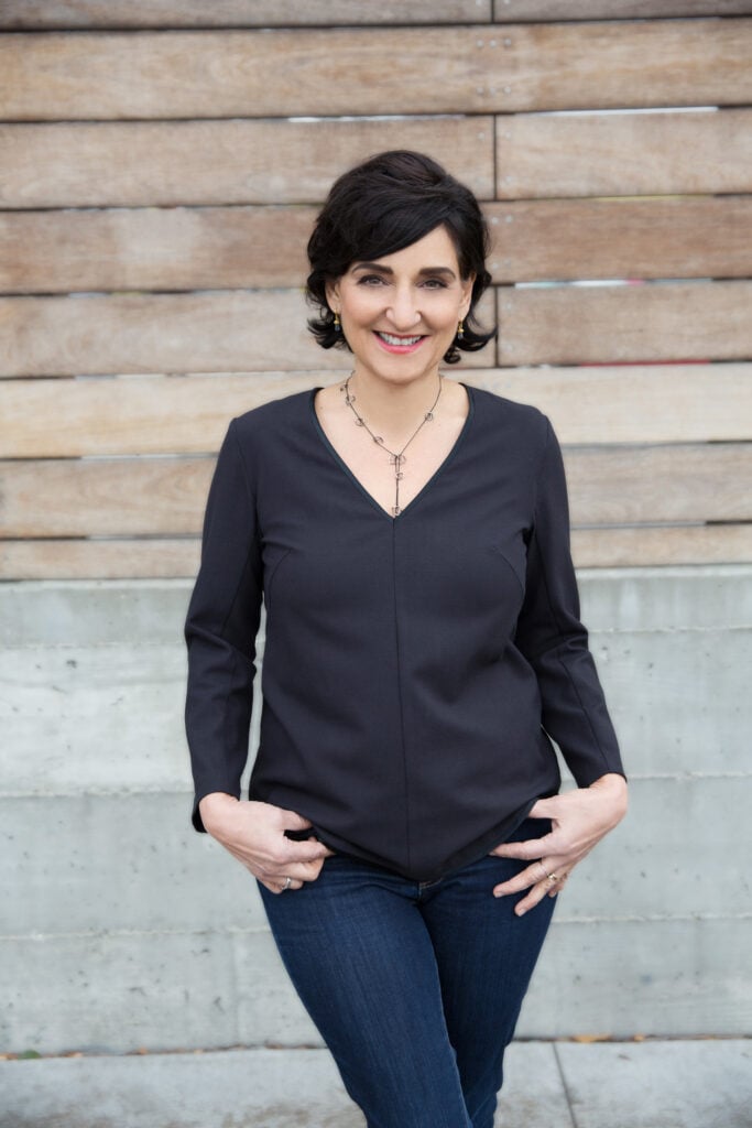
Can you start by telling us a bit about yourself and how you first became interested in color?
My—I’ll call it my color awakening—happened at age 10. I was watching The Wizard of Oz, and found it really profound when Dorothy transitioned from sepia-tone to this technicolor world of Oz. Emotionally, it changed everything to me because I realized just that one thing, that shift in color in the film, just changed the way I felt about [the world] and suddenly everything seemed so hopeful. I realized then that color was super powerful.
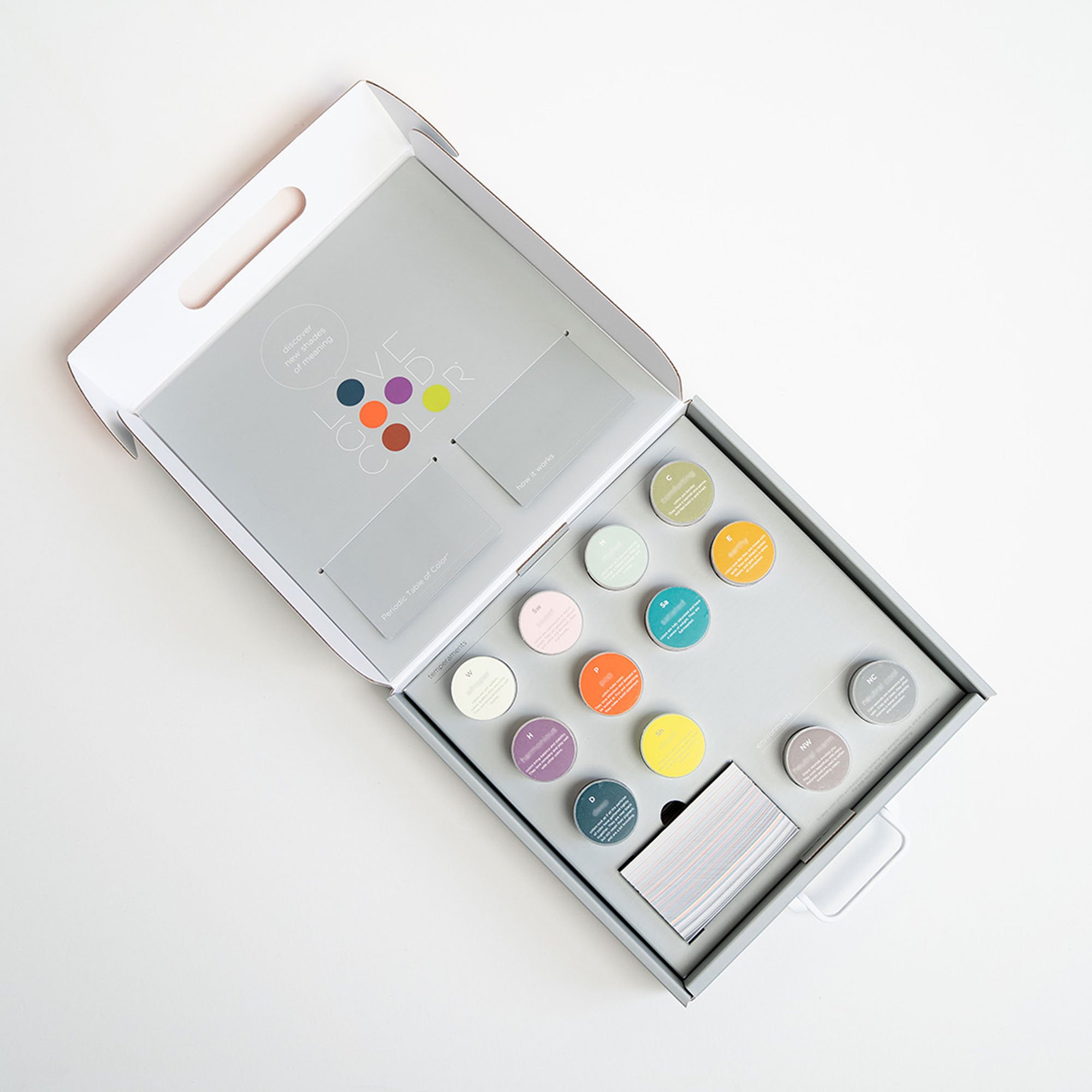
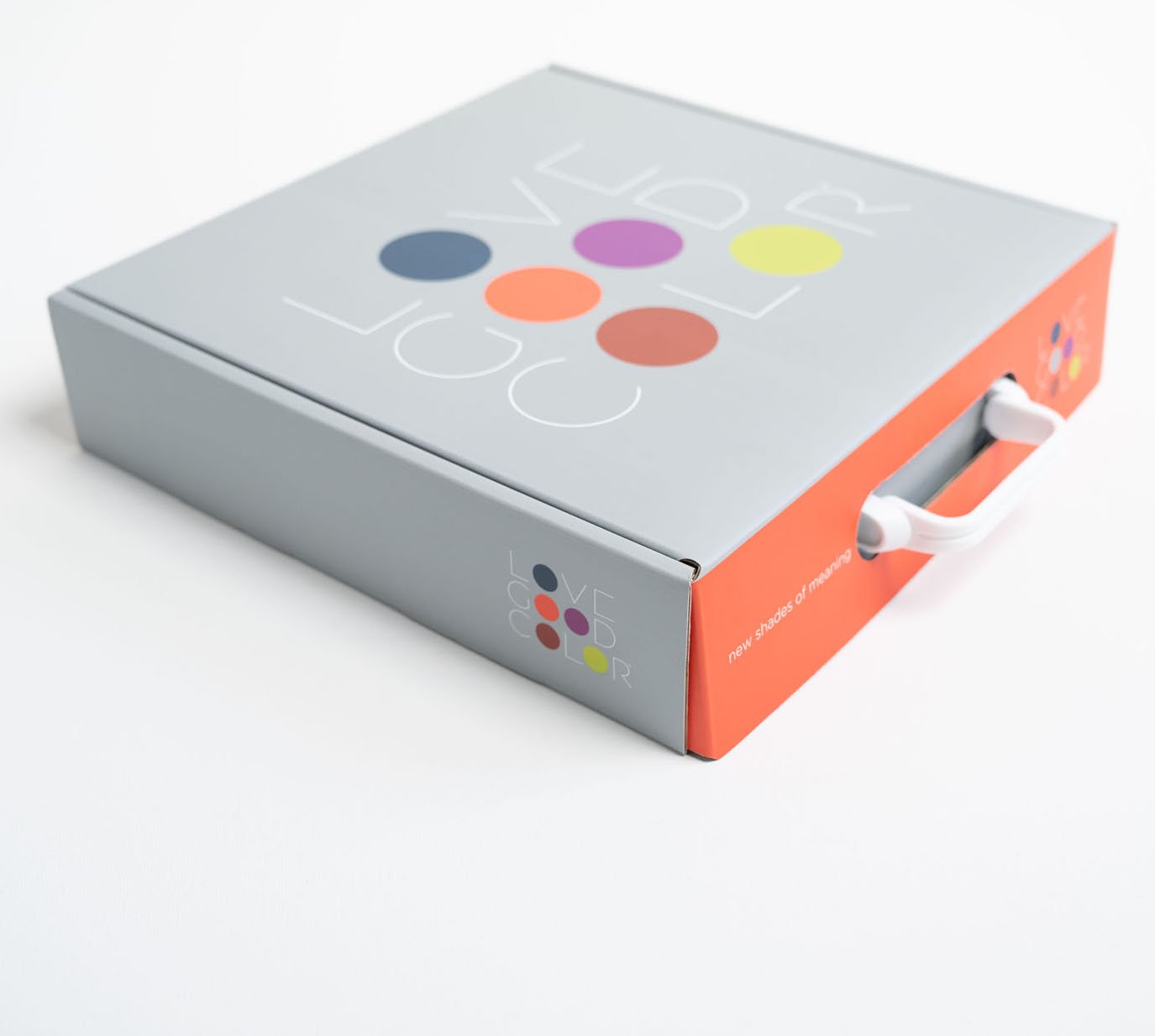
From a design standpoint, I studied interior design but I was also pre-med, so I love science, and it informs all of my choices. And so it made sense to me that I would end up developing my color system, LOVE GOOD COLOR, on color theory and science because I needed to have an understanding that moved beyond aesthetics.
You think about color as a language—How do you do this and why is it beneficial for designers to think about it this way?
The most important thing is to not think about color as a “Band-Aid,” but as an integral part of the design process. When you start to think about color at the beginning of the design process, you can really start to understand how powerful it is. The way I explain it is that while it may be the skin, or on the surface, color represents the heart. This is very critical for our clients to understand.
Color is always speaking before the work. When you enter a space or when you see a product, tge colors have already told you something before words can even express it. For example, if you are in a brightly colored room with many colors popping out at you, it gets your attention, and you can immediately feel that intensity and ask: what is this space trying to say? I think that in that sense, color has a way of telling stories that words can’t quite tell.
And I think this is what makes color so beautifully equalizing because it has this way of saying something without having to say anything at all…which is what I really love.
Tell us more about the work you do with your nonprofit Project Color Corps. How is color tied to issues of equity?
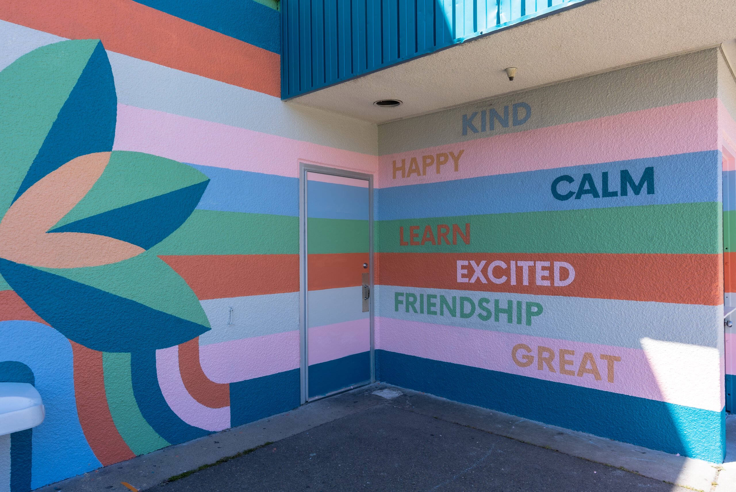
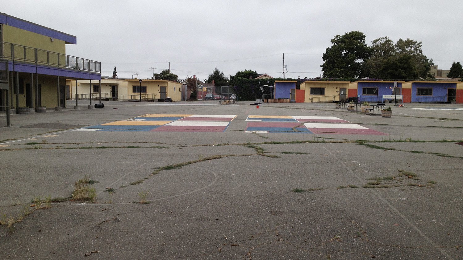
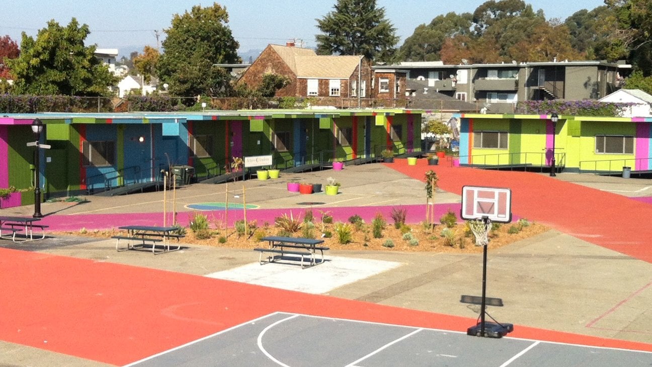
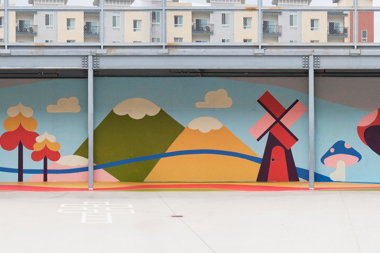
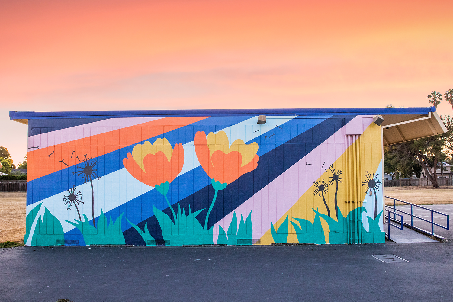
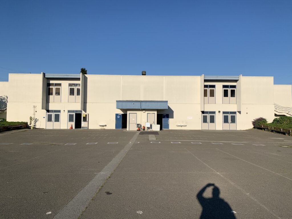
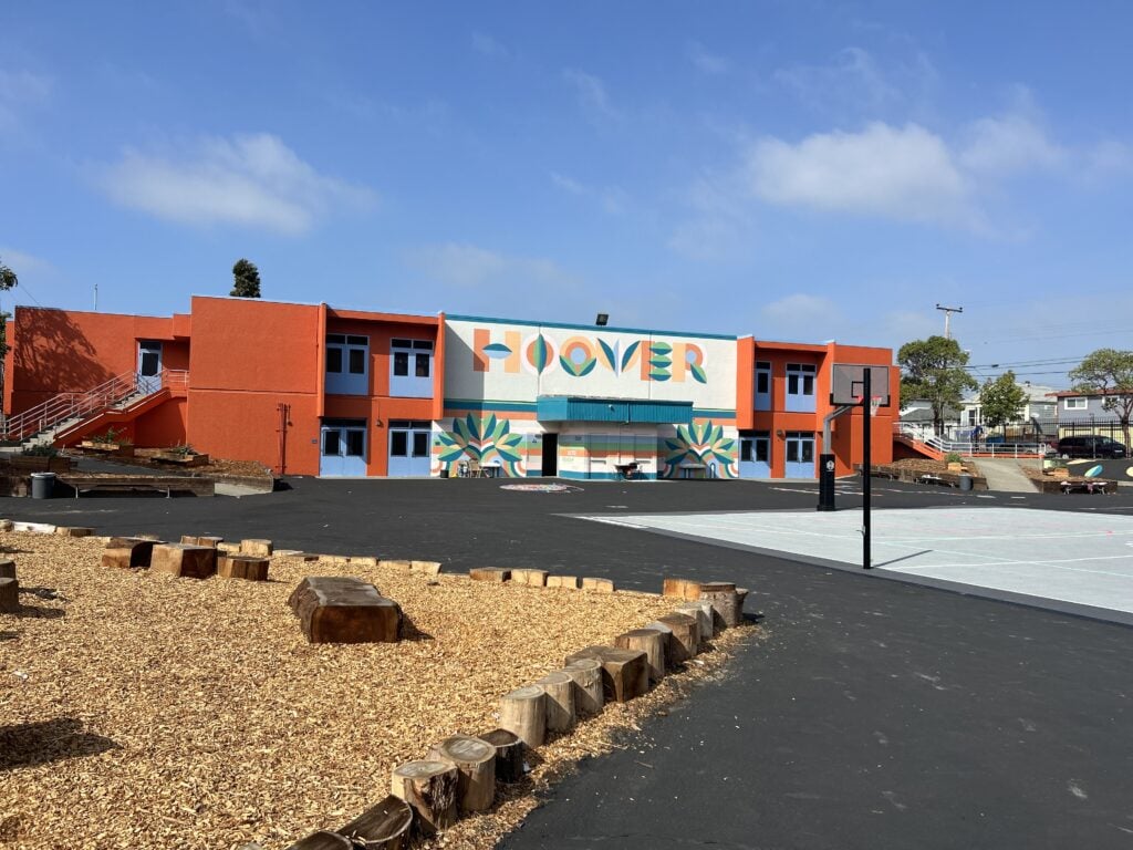
So much of what we’re trying to get do is to advocate for the idea that color isn’t just “nice to have,” it’s essential. The neighborhoods we work in are always visual deserts. And in this way color can function, again, as an equalizer.
Color is representative of the people, of their dreams, of who they are, and what their culture is like. Within the confines of our budget as a scrappy nonprofit organization, we want to know how we can bring equity, joy, and belonging to these neighborhoods. Education is key and we always start by taking surveys with the kids and we ask them what their favorite colors are, but most importantly ask them: How do you want to feel when you come to school?
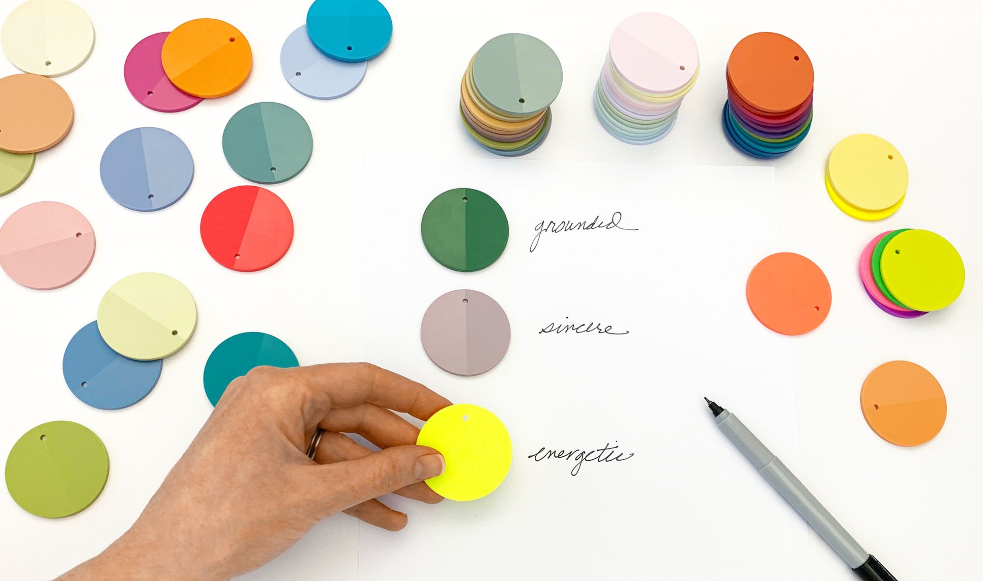
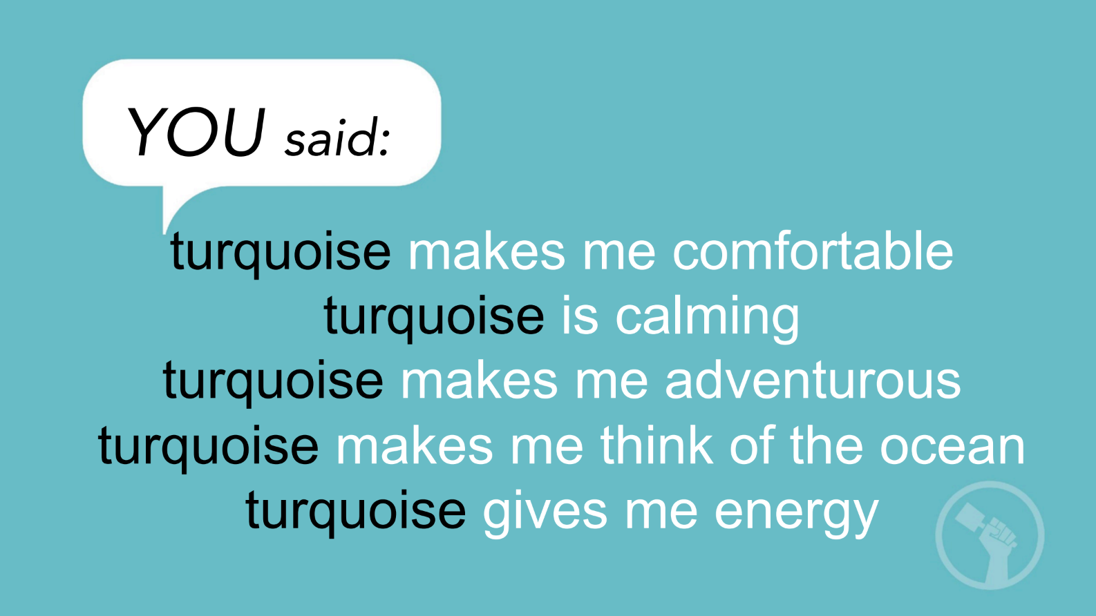
We take all of that data and we go back and we do an educational workshop that teaches them about color, and the feelings associated with colors, so that in the future they can be empowered to change things in their life. We do word clouds for every single color, and when the students read their answers, they stand up and talk about them in these beautiful, poetic ways. And then we do these things where we put the words out on pieces of paper and ask the kids to go through all these colors and find one color and put it on the word that they believe expresses that color the most. We use those to inform our color palettes. So it truly is representative of who they are. It’s not for them but of them. I think that that’s really a critical distinction.
We then meet with the mural artists and designers to bring all this information back to them so that they can create two color palettes based on the words that the kids used. For example, we create two color palettes one is called “Natural Brave” and the other might be “Stellar Fun” and both feel very different but they’re their words. One particular community had a lot of anxiety around issues of immigration, and they wanted to feel a sense of belonging, of being a natural citizen, and of feeling brave.
We then go back to what we call the activation process which is where we bring the kids all their ideas in the form of renderings and then they vote. And voting day is a big day—they are like little lobbyists trying to influence one another about what to vote for. We always hire professional painters, but we also always leave areas that are “paint-by-number” where the kids and their parents can be part of it. It’s about empowerment. It’s for them to feel their strength and their capacity to bring things to fruition and I think that’s so important.

Can you explain to us how designers can use and apply your color methodology?
So we know that the way we typically learn about color is through color theory and we always learn it by color family. And we always learn about a color family being light to dark. Those are the hues of the color families. Those are super important. But what I realized was missing was that we had no way of talking or getting into color in a different way. So for example, when we ask the kids are favorite color and they say blue, that doesn’t help us.
So now imagine a periodic table of color, which is what we developed. So what happens is that all the hues go vertical, but we introduced a whole new way of thinking about color called a “temperament” which is a horizontal. It’s an emotive trait. When you change a color’s value, a soft yellow can feel the same emotionally as a soft blue. And by associating color with feelings, then a designer has a way of getting into color through their client’s emotive needs.
What do you wish more designers understood about color?
Okay, so I really respect designers talent but there are some things that I would encourage them to do. One, I want them to always think about how color can be of service to them. It’s a different way of thinking that is not about color for colors sake but asks the question: How can color be of service?
I want to encourage designers to play with color because when you play with color, you discover new relationships, and it helps you understand that all color is in contextual, and a color’s meaning will be different when you keep adding in other colors. Colors change depending on what relationships they are in, what lighting they are viewed under, and colors are also impacted by an objects materiality and texture.
Lastly, please don’t be afraid to use color.
Would you like to comment on this article? Send your thoughts to: [email protected]
Latest
Projects
This UVA Campus Building Asks Students to Slow Down
At the University of Virginia, Aidlin Darling Design creates the Contemplative Commons, a cross-disciplinary hub where calm, clarity, and connection are embedded in the architecture itself.
Profiles
What Restrooms and Parking Lots Teach Us About Cities
At WXY, a people-first approach is quietly reshaping how New York—and increasingly the country—thinks about public space, sustainability, and civic design.
Viewpoints
We Need a New Approach to Designing for Autism
Architects and designers need to update their strategies for neuroinclusive design. Recent research points the way forward.


