August 7, 2014
Looking Back: Remembering the Early Days of Metropolis
Akiko Busch recalls how Horace Havemeyer III’s innate understanding of architecture informed the early issues of his magazine.

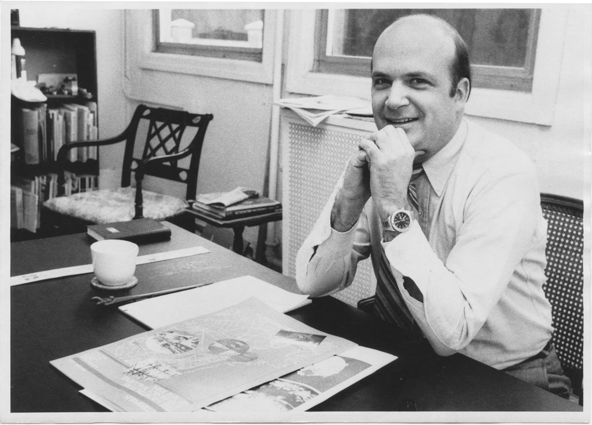
Metropolis founder and publisher Horace Havemeyer III (1941-2014) at the magazine’s first offices, located in the landmarked Hugh O’Neill Building in New York City.
All photos courtesy Eugenie Havemeyer/Metropolis Archive
In the winter of 1981, several months before its first issue was published, Metropolis took up residence in the Hugh O’Neill Building on Sixth Avenue at 21st Street. Once a dry-goods department store that was a landmark of the Ladies’ Mile Historic District, the 1887 Italianate building was in poor order. The dust-like gray of its cast-iron facade was matched indoors by many layers of the real thing. A grand interior staircase needed refinishing and a view over a small courtyard cemetery revealed a tangle of weeds and toppled stones. Although one editor—between girlfriends and apartments—sometimes slept at the office, the amenities of the place were primitive, and we guessed that Steven Holl, whose office was down the hall, probably showered at the McBurney Y. Limelight had not yet taken up residence in the deconsecrated church across the street, which then still housed Odyssey House, a drug-rehab program. All of which is to say it may have been the eighties, but it wasn’t really the eighties yet.
The building might have been in disrepair, but Horace’s interest in architecture included the knowledge that buildings have a hold on their pasts despite generations of varied uses. Something in the history of this one appealed to him, and it likely had to do with the way a once-bustling emporium that sold hats, flowers, perfume, lace, rugs, and clothes became, a century later, a place given to the commerce of ideas. A few desks were moved in, a couple of IBM Selectric typewriters purchased, shelving built, phone lines installed. It was a logical place for a start-up. Maybe it was Horace’s background as a practiced sailor, but he knew something about working with essentials, the economic use of space, the apparatus for tight rigging. In the dot-com days that followed almost a decade and a half later, start-ups—or incubators as they were then quaintly called—took up residence in everything from slaughterhouses to freight terminals, the seeming incongruity of uses all part of the charm. But this was before all that.
If the space was rudimentary, the pages that took shape there were anything but. Horace understood how a page could look. Having spent a decade working in production at Doubleday, he had made full acquaintance with the possibilities of the printed page: its size; the weight, texture, and finish; typography; graphics; layout; photography. He understood how these components could engage human perception and imagination.
And how they might affect the way the words were read, images viewed. With then-editor Sharon Lee Ryder, the story ideas collected—among them sweat equity in urban homesteading, reasonable misuse in product design, teaching city planning, the implications of a solar electric chair, and a proposed community for the swamps of the Meadowlands.
How to decide what went on the page? When I interviewed earlier in 1981 for the job of associate editor, Horace quizzed me on my thoughts on the theoretical disputes between the New York Five, alternatively called the “Whites”—Peter Eisenman, Michael Graves, Charles Gwathmey, John Hejduk, Richard Meier—and their presumed contentions with the “Grays”—Robert Venturi, Robert Stern, Charles Moore, and others. We didn’t stay on that topic long. It was clear even then that he was more interested in the kind of magnanimous ingenuity and human engagement practiced by thinkers such as Bucky Fuller, whom he admired. Fuller’s interest in the organizing principles of nature, his determination to bridge the sciences and humanities, his notion of creating “an operating manual for Spaceship Earth”—all of these were of greater note to Horace than rhetorical stylistic debates about architecture and its club allegiances.
A few months later, the magazine moved to a rooftop space on West 25th Street. The letters on the elevator were PH, but I can’t recall anyone ever thinking of it as a penthouse. The elevator doors opened onto the roof, and you stepped out onto a terrain of blacktop, tar paper, skylights, and a couple of water towers, then walked across to what all these years later has been transformed by memory into a little urban chalet amidst Manhattan’s steel-and-glass Alps. It was 12 floors above street level, a modest height that, in retrospect, seems about right—the small cabin had a sense of elevation and slight remove, but it was still of the city, a good place to take in a broad view of the metropolitan landscape, which that year included the colonization of Tribeca, Philip Johnson’s proposal for a Chippendale pediment on the former AT&T building, Richard Serra’s tilted arc in Federal Plaza, and St. Bartholomew’s Church proposal to cash in on the air rights to its garden and community house.
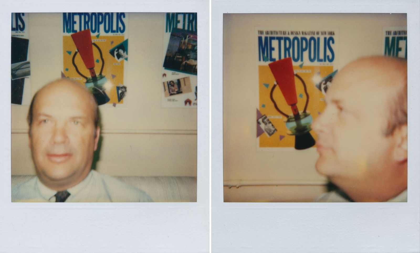
Candid snaps taken in the early 1980s
During this time, I found myself doing stories on how water-lot grants were essential to seventeenth-century Manhattan real estate, an antique prediction of the air-rights battles to come; how a church built in the Greek Revival style could be retrofitted to condominiums; and how Memphis Design, just about to catch on, exploited the confluence of classicism and absurdity, along with the pleasure of tactility in the things we live with. There was a story on portability too—wearable chairs, stackable stools, modular shelf units. Lightweight, minimal, flexible, they were all precursors to the easy adaptability in the furniture and furnishings in the years to come. Most of all, though, I remember it as a period of unexpected and energetic cross-pollinations of interests and disciplines. Among such convergences were architects designing teapots, jewelers designing furniture, and Milton Glaser reconfiguring the interior environment of Grand Union supermarkets.
But the convergence that was most interesting to me was that of design and the social sciences. Patricia Moore began as an industrial designer but brought gerontology into her work. In an interview about her empathetic role-playing of an elderly woman, she told me how the urban streetscape could be threatening to an aging population; it was an early lesson in gerontology that has grown in value exponentially 32 years later, as 75-million-plus baby boomers become senior citizens. I edited a story about environmental autobiographies and about how our adult values about home and environment can be shaped by the spaces significant to us as children—a grandmother’s kitchen, a sunny porch, a bedroom shared with siblings. Three decades later when I was writing about a similar theme, I was astonished to find it nearly impossible to locate any practicing environmental psychologists; this particular convergence of architecture and social science flourished less in following years. But in the interdisciplinary cross-exchanges of the eighties, it thrived and influenced the way I think about design today.
In a publisher’s note marking the magazine’s first year, Horace compared its role to that of “the well-informed anecdotal expert leading a walking tour in a city, lived and worked in, but seldom really seen.” What the tour tried to see especially clearly was design as an endeavor that includes aesthetic, commercial, social, political, economic, and human concerns. We wanted to inhabit the city in every way, representing and reflecting it from all perspectives. If we succeeded, it could be in ways we hadn’t expected. Sometime near the end of that first year, the rooftop office was broken into. When I arrived at the office the next morning, I found shattered glass on the floor and desks, and a spectacle that would be memorable for any young writer—the keys of a typewriter spattered with blood. None of us could quite believe the break-in, but it was hard to deny that being mugged conferred on the tour guide a slightly tougher, more resilient and authentic urban identity.
Many years later I found myself on West 25th Street, and, on a whim, tried to revisit that rooftop aerie. The building now had a doorman who wouldn’t let me get anywhere near the elevator to the roof, even after I had explained I once worked there. The space was now occupied by the Calder Foundation and was, the doorman solemnly told me, “full of very expensive art.” I left with a sense of disappointment, but it was quickly replaced by some mixture of amusement and certainty that the built world sometimes observes its own sense of logic. Because when I think now of all those stories we put together up there, it is easy to imagine them simply floating and drifting overhead like the pieces in one of the famed artist’s mobiles, their bright, amorphous shapes hovering in the space around each other, searching out a kind of kinetic balance and sense.
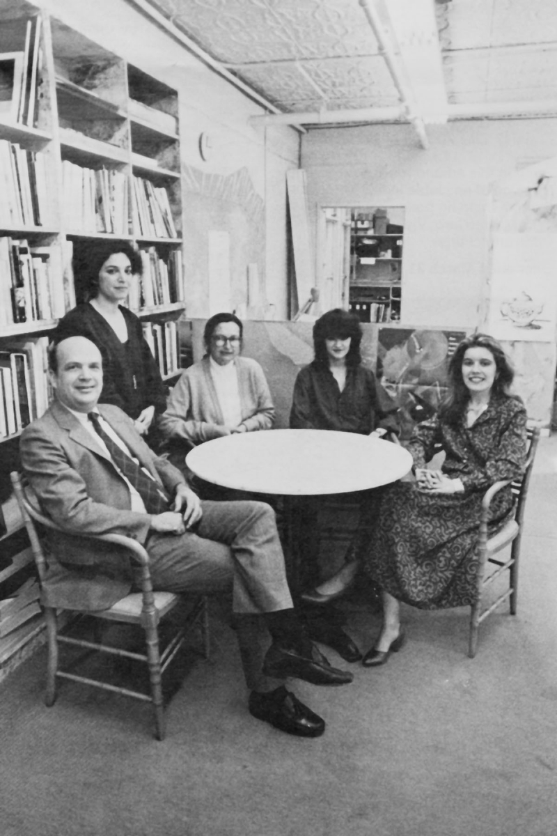
In the Metropolis library at the East 87th Street office, Havemeyer and the editors, left to right: Claude Lubroth, Susan S. Szenasy, Gini Sikes, Victoria Geibel. The 1985 photo was taken shortly after Szenasy was named editor in chief.
I left the magazine staff in the spring of 1982, and that summer Metropolis moved to the Upper East Side. In a year and a half, the magazine moved from ruin to rooftop to respectability. But those two early homes were exactly right. And as befit the publisher of a magazine about design, Horace recognized something about the meaning of place and the value of matching a building to the enterprise it housed. He understood from the outset that a building’s facade, its interior space, its rooms, its walls, its dimensions, its light, and its views of the city could all have bearing on what occurred within. It was an innate knowledge about how the physical shape of things and the ideas they generate are inextricable. Call it a basic appreciation of design. It was a good beginning.
Recent Viewpoints
Viewpoints
The Stories Moving Our Industry Forward


