September 29, 2008
Radical Cartography
Mapping techniques that provide a new way to look at your surroundings
Most of us have a general sense of the geography of our planet through the maps and globes we’ve seen since we were little. But how often do we step back and think about where those images come from and what they mean? There’s an air of certitude to the contours of the Earth, but the outlines of its graphic representation have cultural and political biases any way you slice it. In today’s world of connectivity and data access the capacity to map has become an increasingly democratic enterprise with real power for change.
As part of the Conflux Festival, New York’s Center for Architecture hosted the panel discussion “Cartography of Protest and Social Change.” Panelists included Lize Mogel, co-editor with Alexis Bhagat of An Atlas of Radical Cartography; contributors John Emerson and Brooke Singer; and moderator Régine Debatty of we-make-money-not-art.com.
The panel focused on cartography and how other visual information mapping has a major impact on our impressions of the world. Take for example the “south focused map” (as seen in the book’s logo, pictured above) which appears to be flipped upside down. From any angle the Earth’s geography is identical, but in this example the center of focus has changed. To the viewer’s eye (at least one that naturally reads from left to right), the prominence of continents is altered when they see Africa first instead of North America.
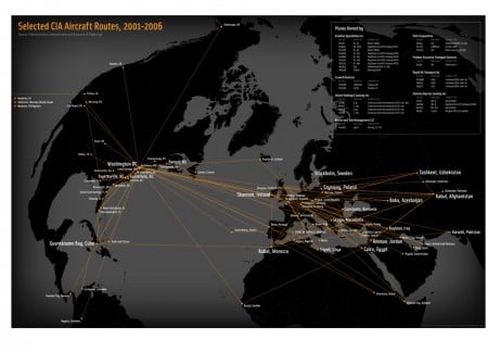
Rendition Flights 2001-2006
Credit: Trevor Paglen & John Emerson
Several maps stood out as particularly interesting examples of visual data that creates change. These focused more on data points rather than the cartography. John Emerson showed a map of CIA aircraft routes representing secret rendition flights. Data for this map– which he collaborated on with Trevor Paglen–was gleaned from various sources including news reports and amateur flight watchers. Activists have used the data to lobby their governments against these types of flights. The European Parliament was pushed to conduct a study on rendition flights which implicated Poland and Romania who have denied involvement.
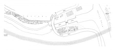
Chetla Lock Gate, Marginal Land Settlement in Calcutta, 1984
To create the Unnayan map, researchers mapped “unintended” settlements of “unauthorized settlers” in Calcutta. By going door to door they created a visual testament to throngs of people who had previously not been accounted for on any map. Bringing their existence to visual light ultimately resulted in the community receiving municipal benefits like water and postal delivery
Brooke Singer’s Superfund 365 is another mapping project that is centered on visualization of data and offers a poignant portrait of the extent of toxic sites in the United States. Singer and her team plotted an online map of Superfund sites with regional data and photographs. The recently completed interactive project is galling in its magnitude.
If the panel sought to detail the cartography of protests and social changes the thesis was muddled somewhat by the blurring together of geographic cartography and more general data visualization. But the power of graphic design to open our intellects to a broader point of view about the relationship of individuals, society, and geography was strongly articulated through these and numerous other examples.
Accompanying the book is a series of exhibitions, currently at the University of North Carolina until 10/18, and moving on to the Art Gallery of the College of New Jersey from 10/29-12/2.
Recent Viewpoints
Viewpoints
The Productive Tension of Prefabrication
Viewpoints
Wolf-Gordon’s Material Journey


